The Image Shoppe
Elevate Identity Through Authenticity
Overview
The Image Shoppe, located in Grand Rapids, is a dynamic creative agency known for its innovative branding and marketing solutions. With a focus on sustainability and community impact, they offer a range of services including branding, web design, social media management, and environmental design. The agency is committed to partnering with clients to craft compelling narratives and visually stunning campaigns that resonate with audiences. Their holistic approach integrates strategy, design, and storytelling to create authentic brand experiences. Embracing a culture of collaboration and creativity, The Image Shoppe stands as a beacon of excellence in the vibrant Grand Rapids business landscape
This was an experimental project with 2 rounds of launch and feedback. My task as a UX/UI designer was to design and develop a website that would effectively communicate The Image Shoppe's mission and values.
View Live SiteMy Role
- Website Design
- Digital Experience
Typeface
- Avenir
Personality
- Professional
- Authentic
- Informative
- Modern
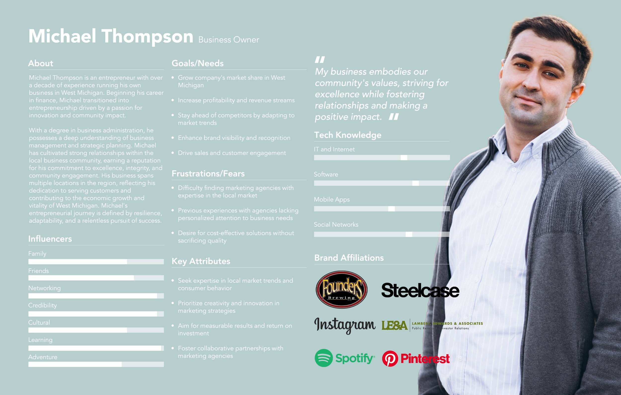
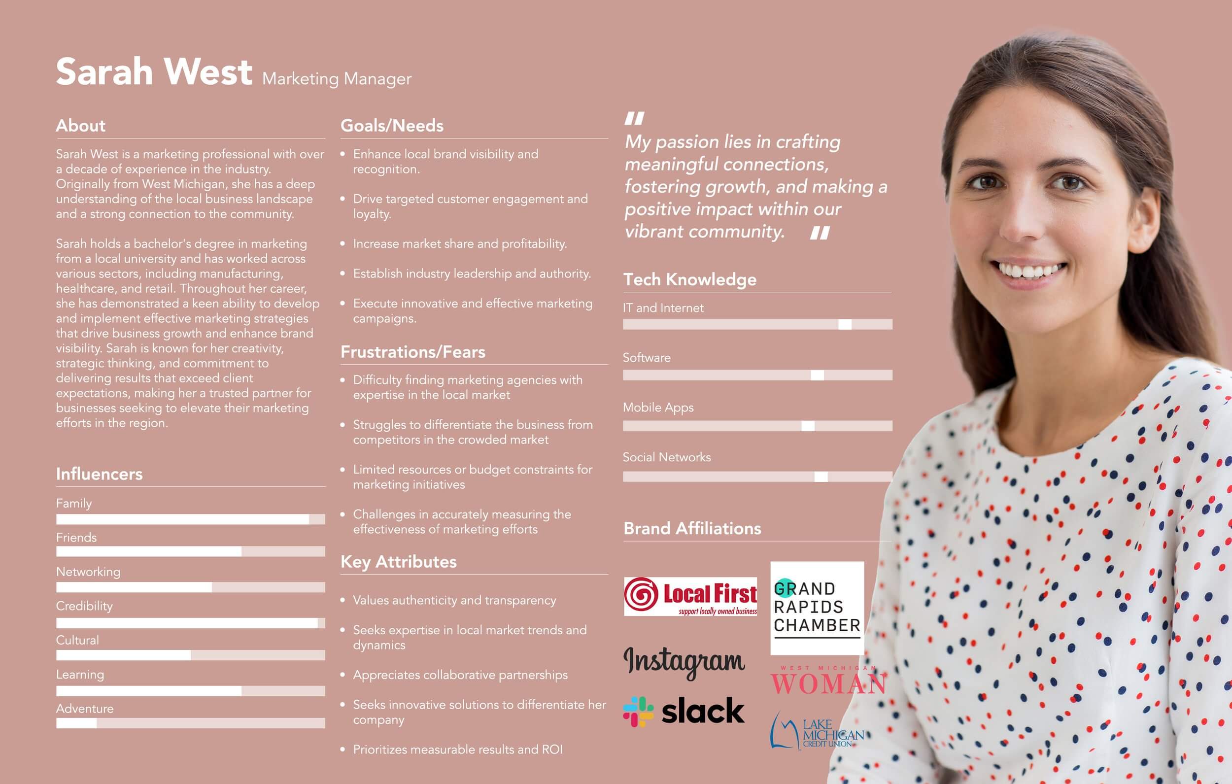
Personas
As part of the redesign process, I created two personas: one representing a business owner and the other a marketing manager. These personas help me better understand and visualize The Image Shoppe’s target audience. By stepping into their shoes, I can design a website that speaks to their goals, needs, and challenges to make sure the new site feels relevant, helpful, and authentic to the people who use it most.
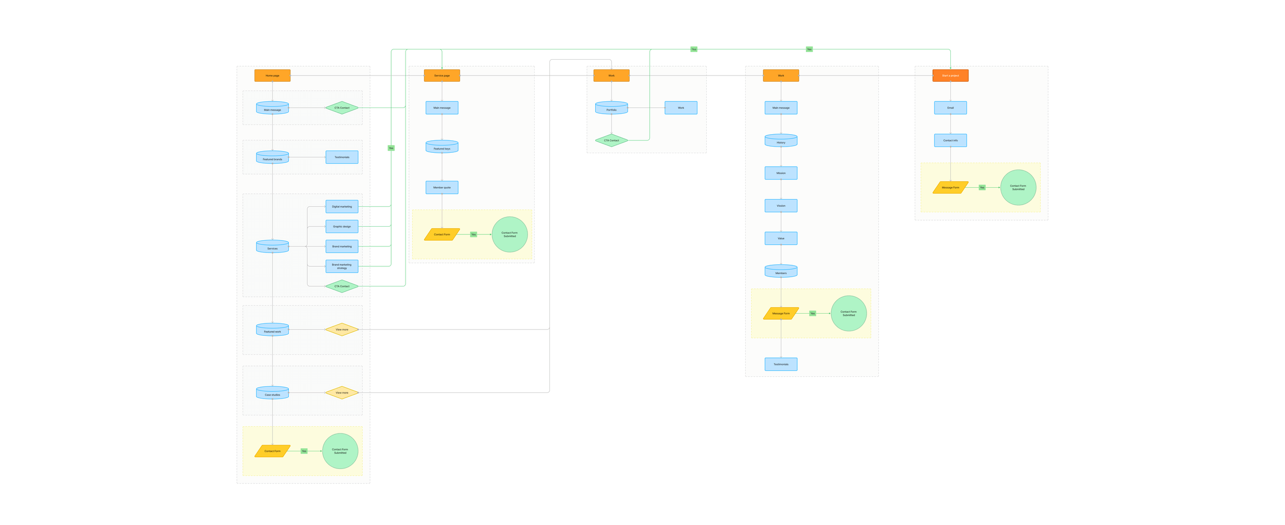
Flow Map
To plan how people will move through the new website, I created a flow map. This helped me lay out the main pages and show how users would navigate from one part of the site to another. It made it easier to spot any confusing paths or missing steps, so I could design a smoother, more logical experience for visitors.
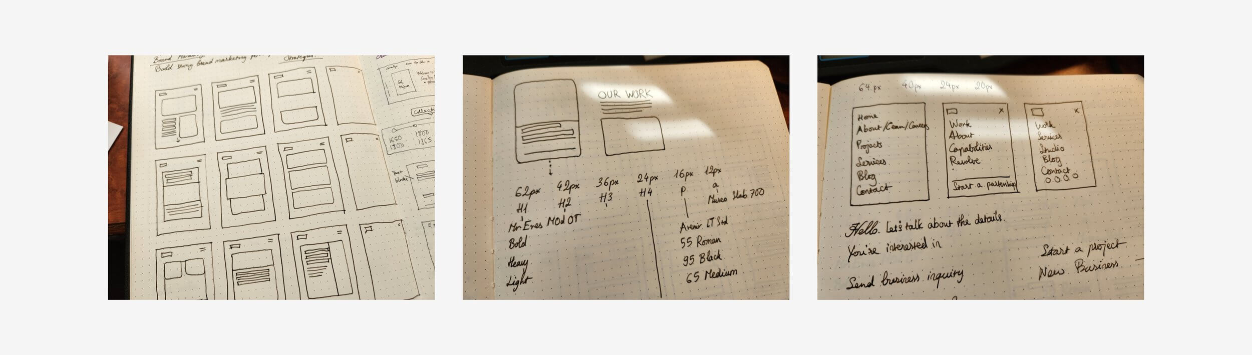
Wireframes
To start visualizing the layout of the new website, I sketched wireframes in my notebook. These quick drawings helped me map out where things like text, images, and buttons should go on each page. It was a simple way to test ideas and organize the content before moving on to more detailed design work.
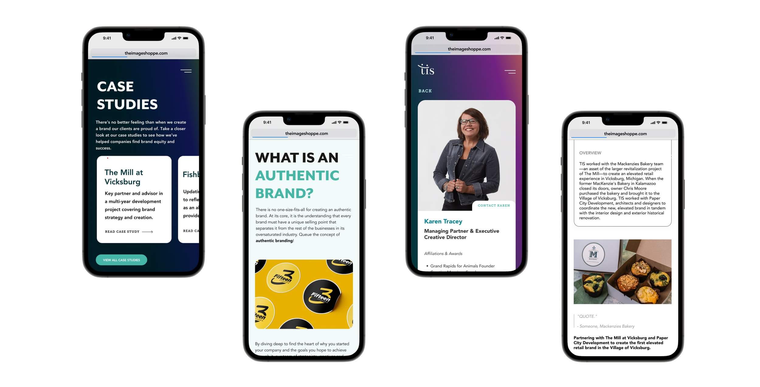
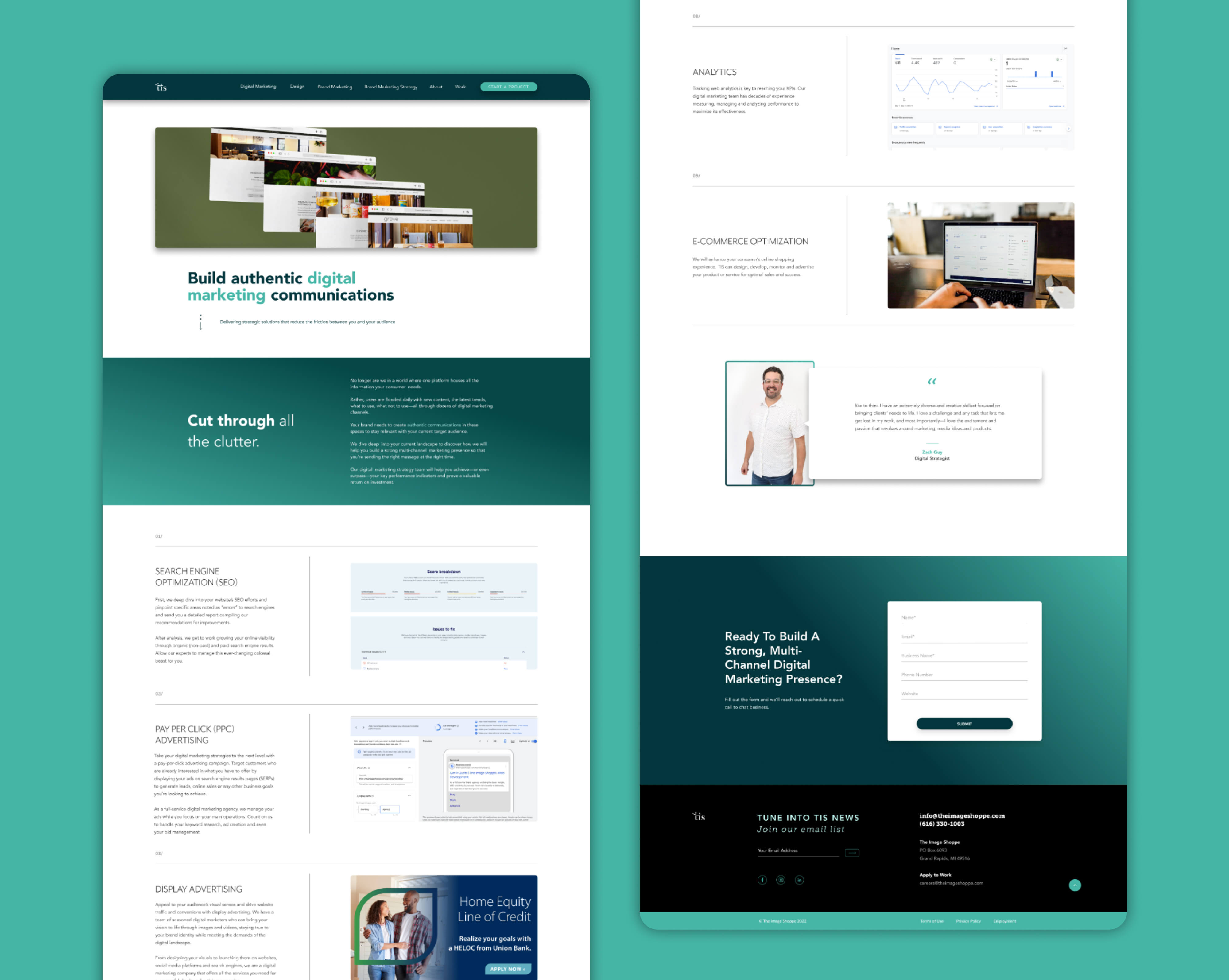
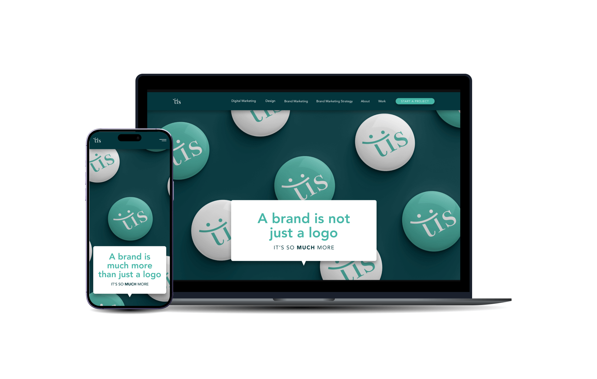
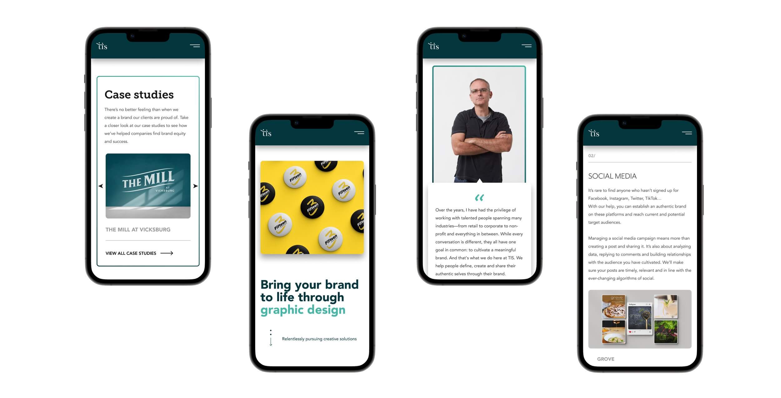
Bringing It All Together
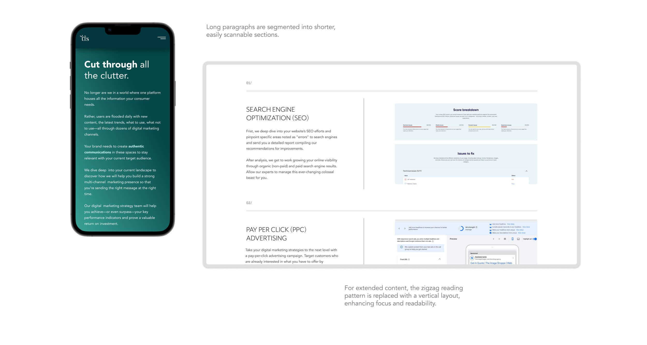
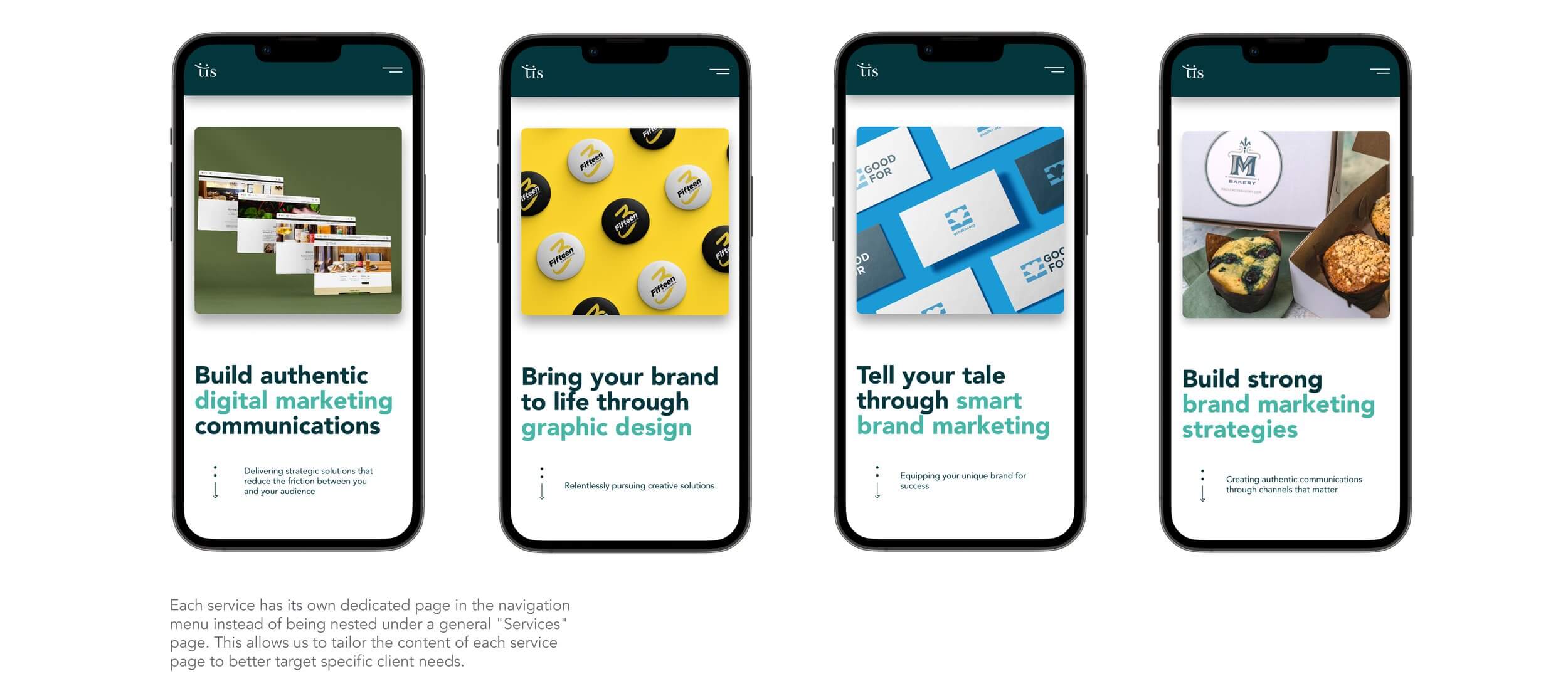
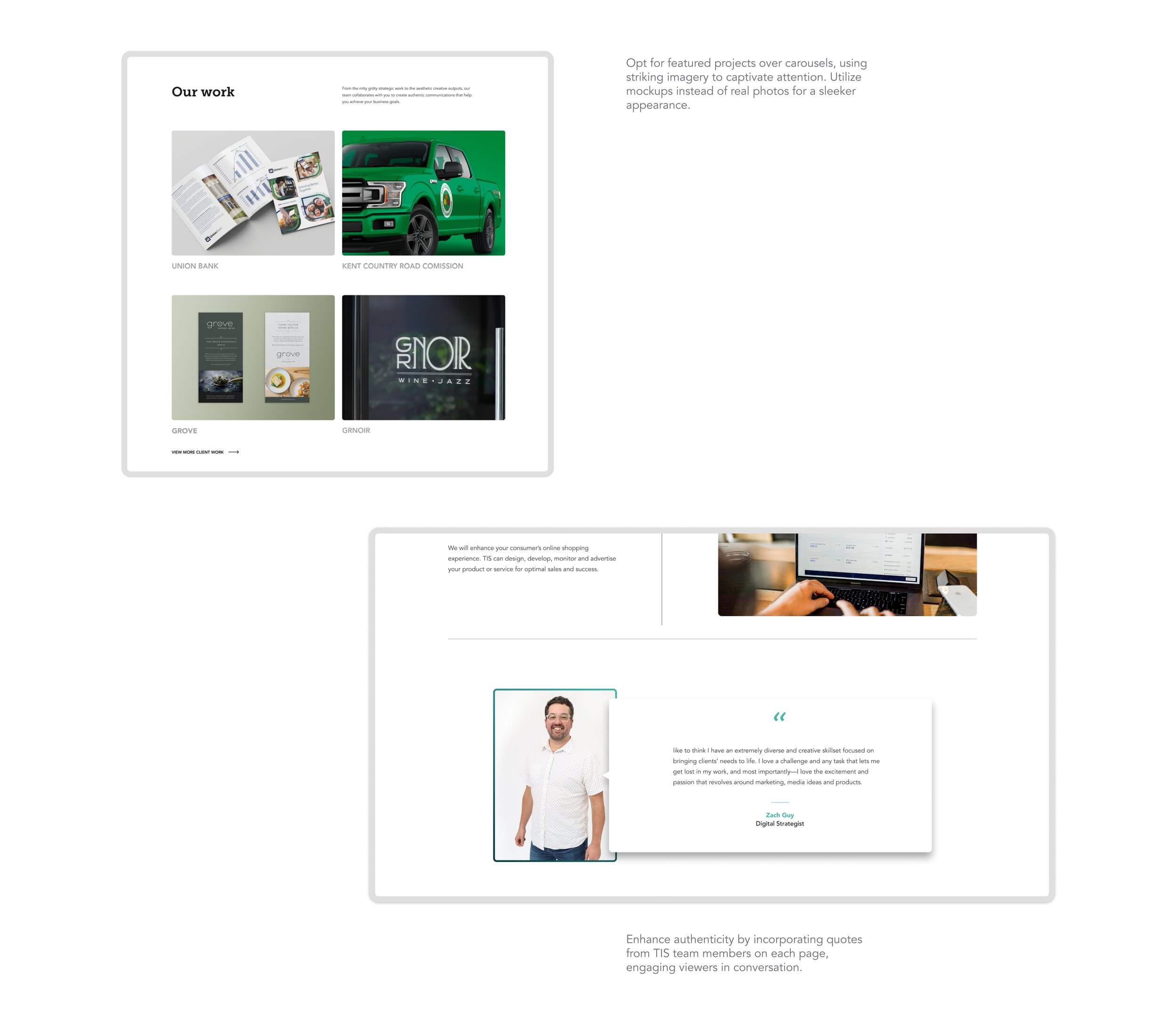
The final version brings together clean design, clear messaging, and a smooth user experience. It reflects the brand’s authentic and creative spirit while making it easy for visitors to explore services, meet the team, and get in touch. Every part of the site was built with real users in mind, creating a digital space that feels both professional and personal.
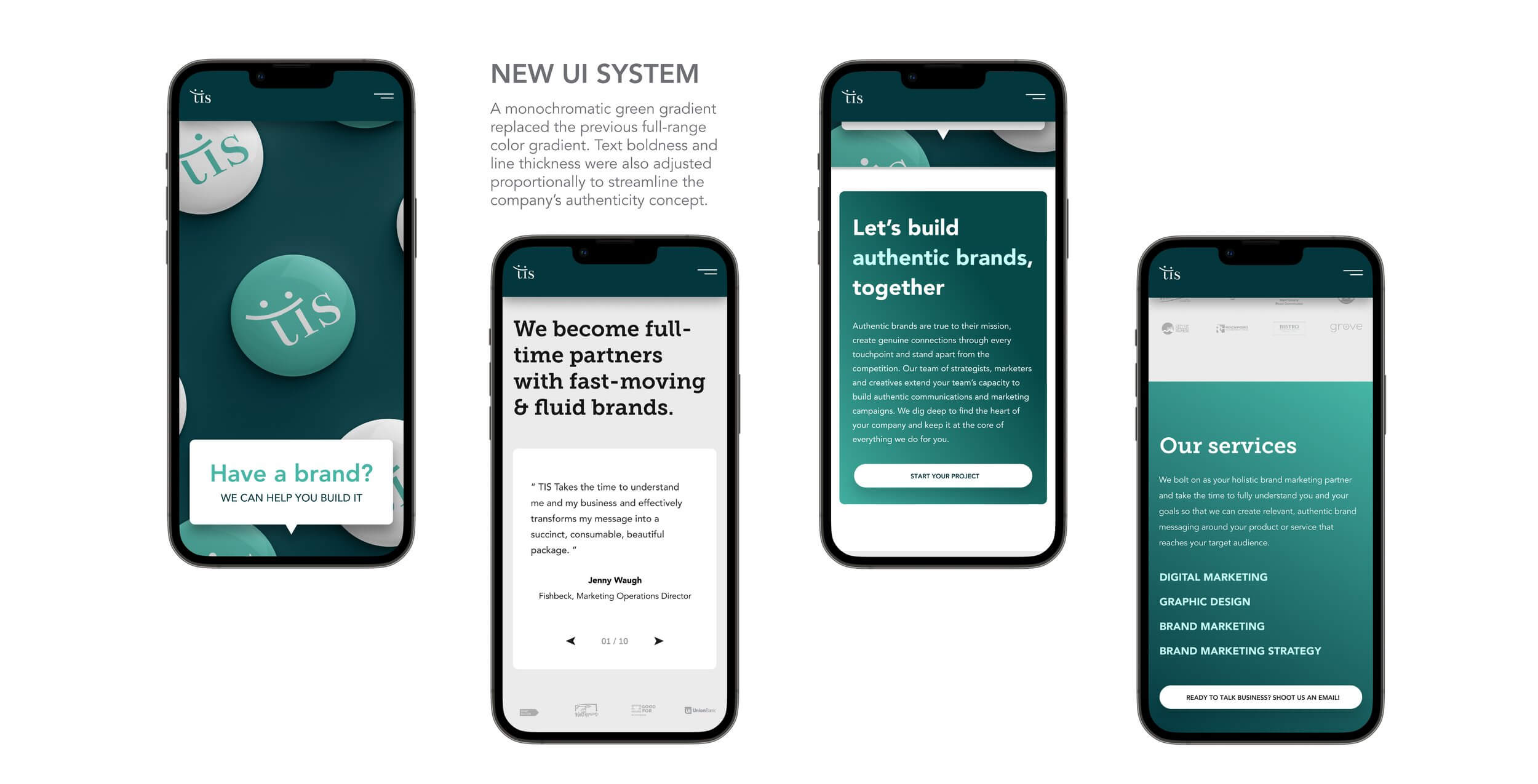
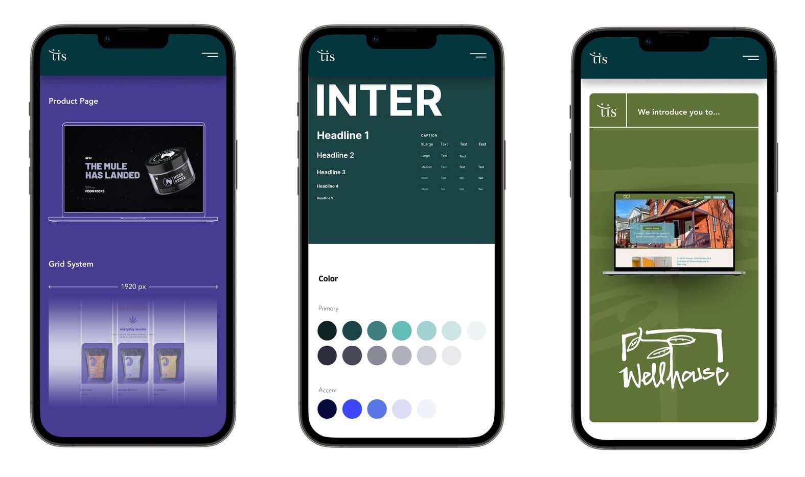
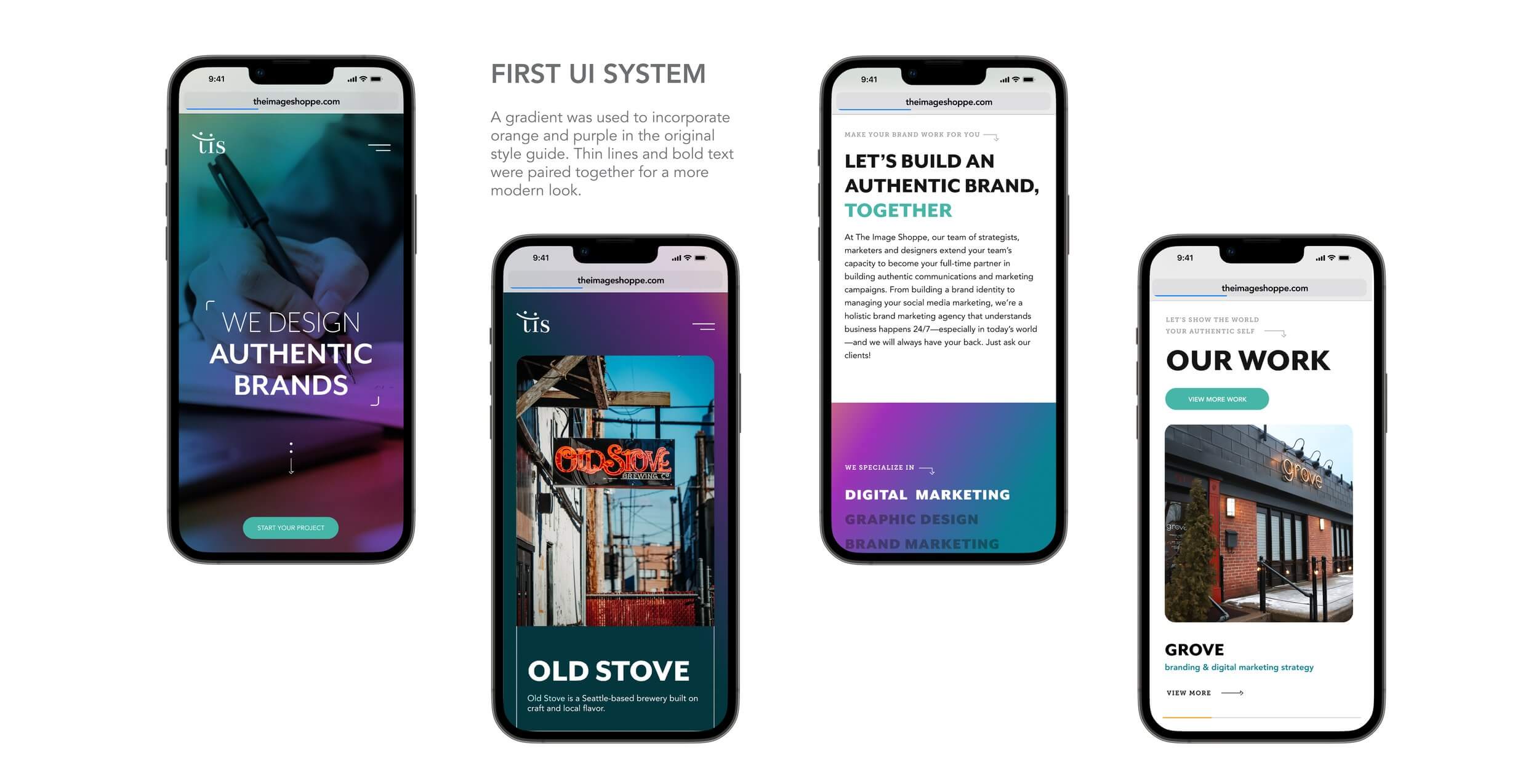
Refreshed Visual Identity
The new visual identity for TIS feels bold, clean, and true to the brand. I used strong typography, authentic imagery, and a cool, modern color palette to reflect their creative and down-to-earth personality. Every design choice was made to support their message of helping brands stay real and connect with people in a meaningful way.