Sebright Products Inc.
Crushing Impact
Overview
I had the opportunity to redesign the identity of their promotional materials to better reflect the company’s expertise in industrial waste compaction solutions. Sebright Products and its division, Bright Technologies, manufacture a range of heavy-duty equipment including compactors, dumpers, and material handling systems designed for efficiency and durability. My work focused on creating a cohesive visual identity that communicates their engineering strength, industry leadership, and commitment to quality, while modernizing the overall look and feel of their brand communications.
View Client SiteMy Role
- Graphic Design
- Pre Press
- Web Design
- Animator
Typeface
- Rockwell
- Avenir Lt Std
Personality
- Bold
- Industrial
- Structured
- Streamlined
Gather and Audit
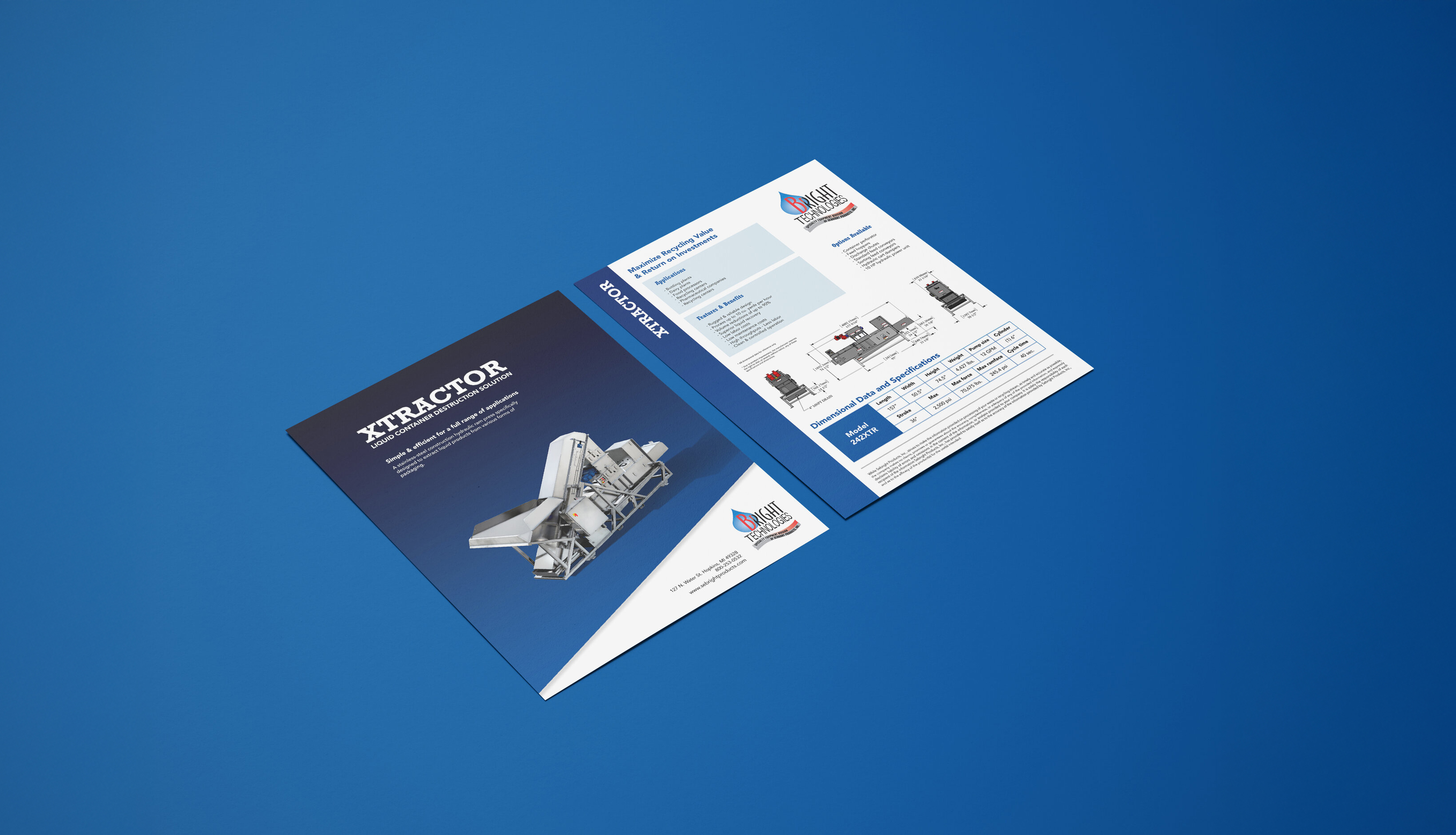
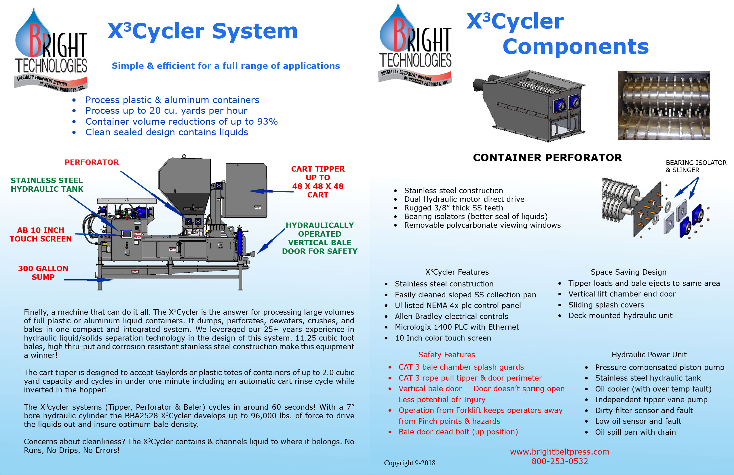
As part of the design process, I began by collecting and reviewing Sebright’s existing promotional materials. The flyers were oversized and in a wide landscape format, which made them impractical to print, carry, or read comfortably. The layout was cluttered, with scattered information, inconsistent structure, and excessive use of graphics that distracted from the content. Additionally, the simultaneous use of two different logos created brand confusion and weakened visual cohesion. This initial audit helped identify key areas for improvement and guided the direction of a more streamlined and professional redesign.
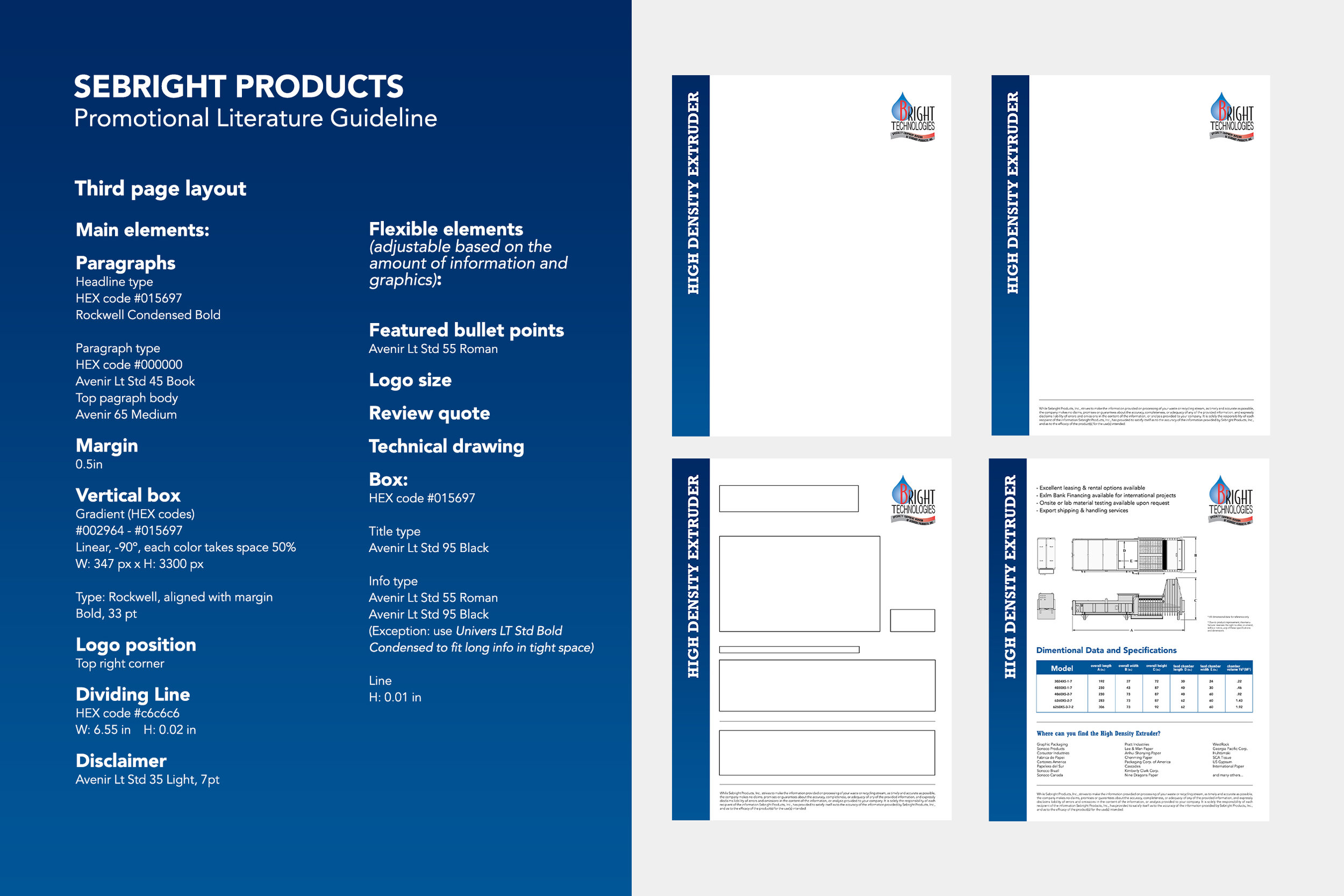
Create Guideline
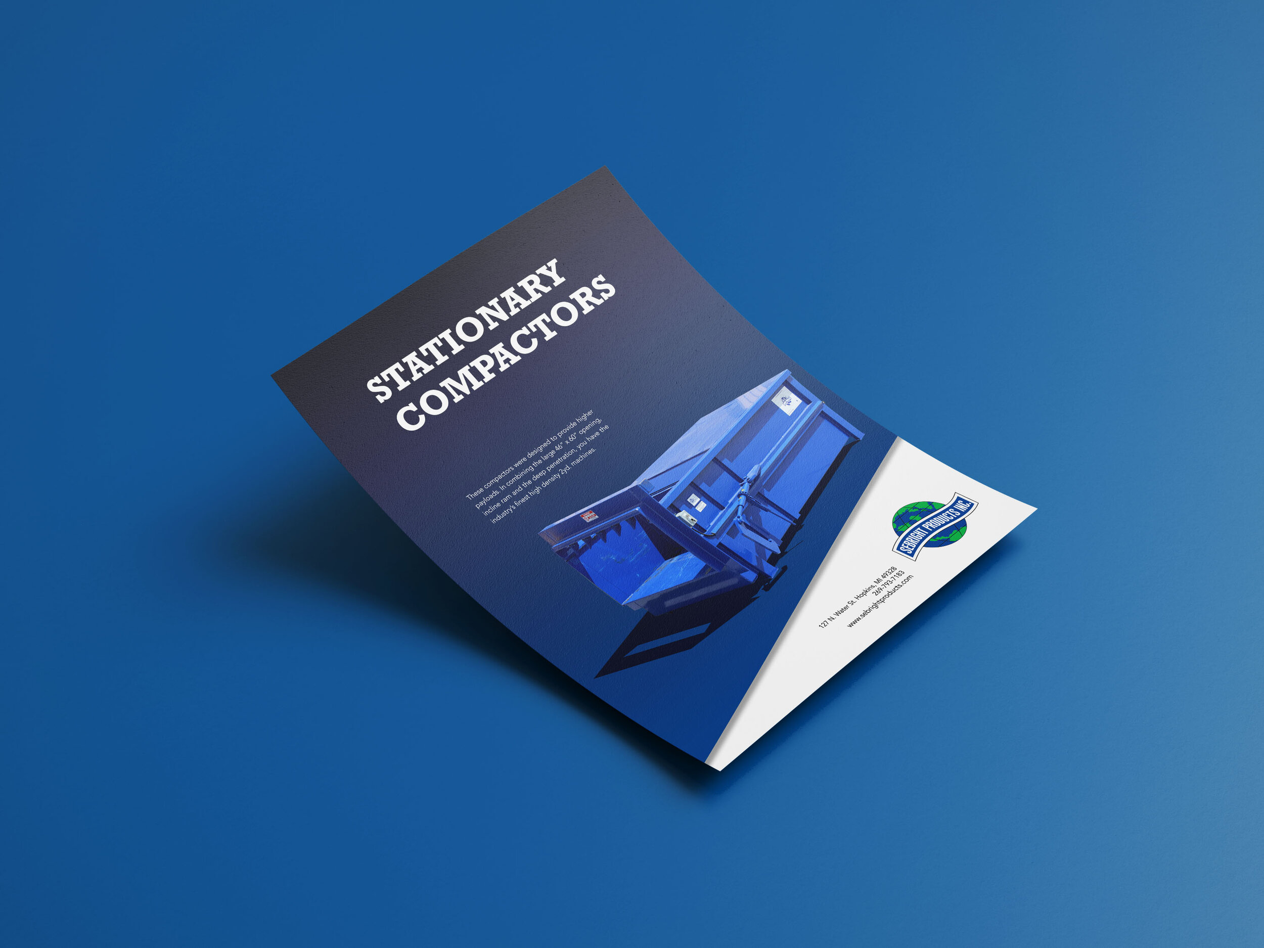
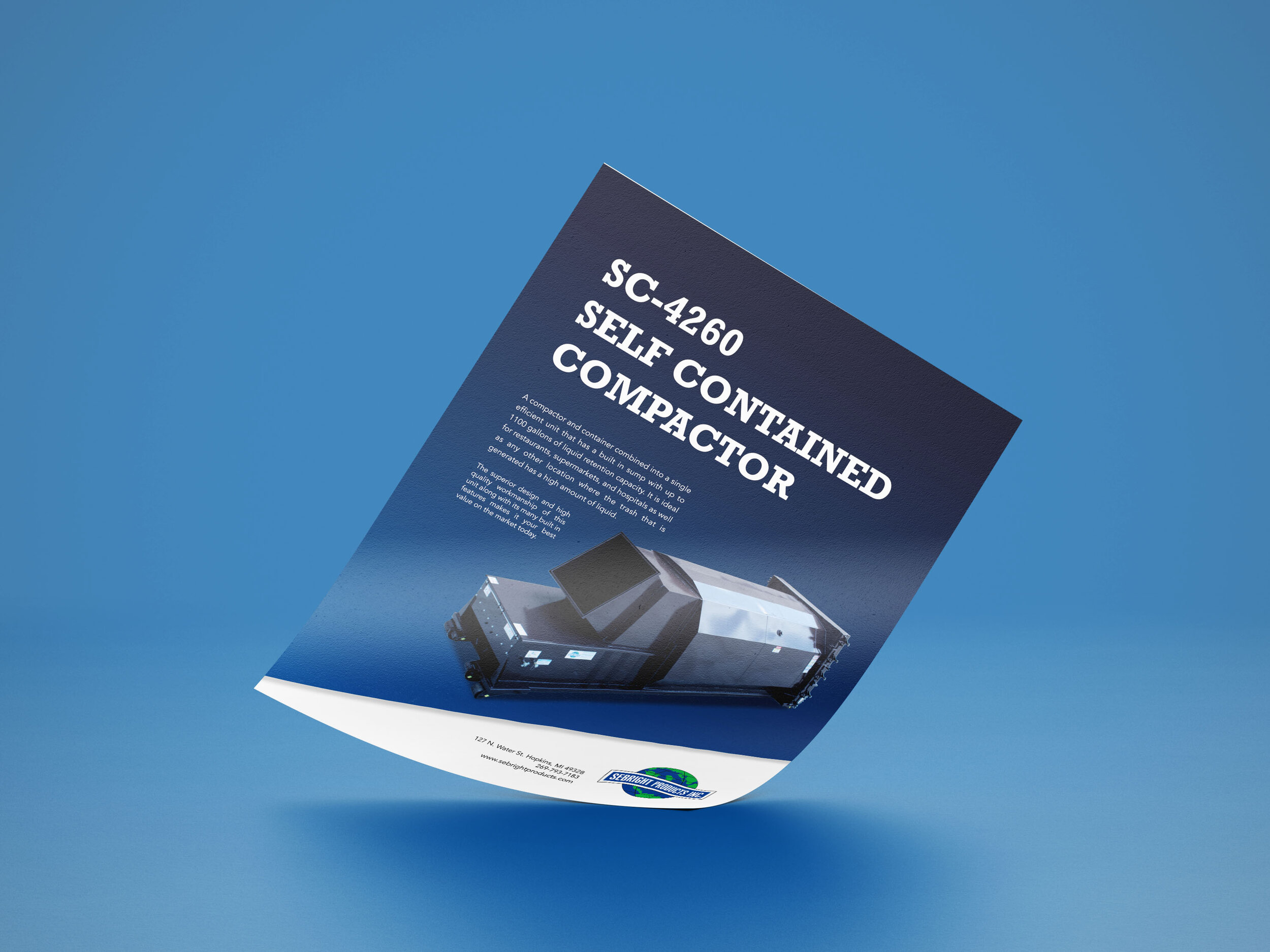
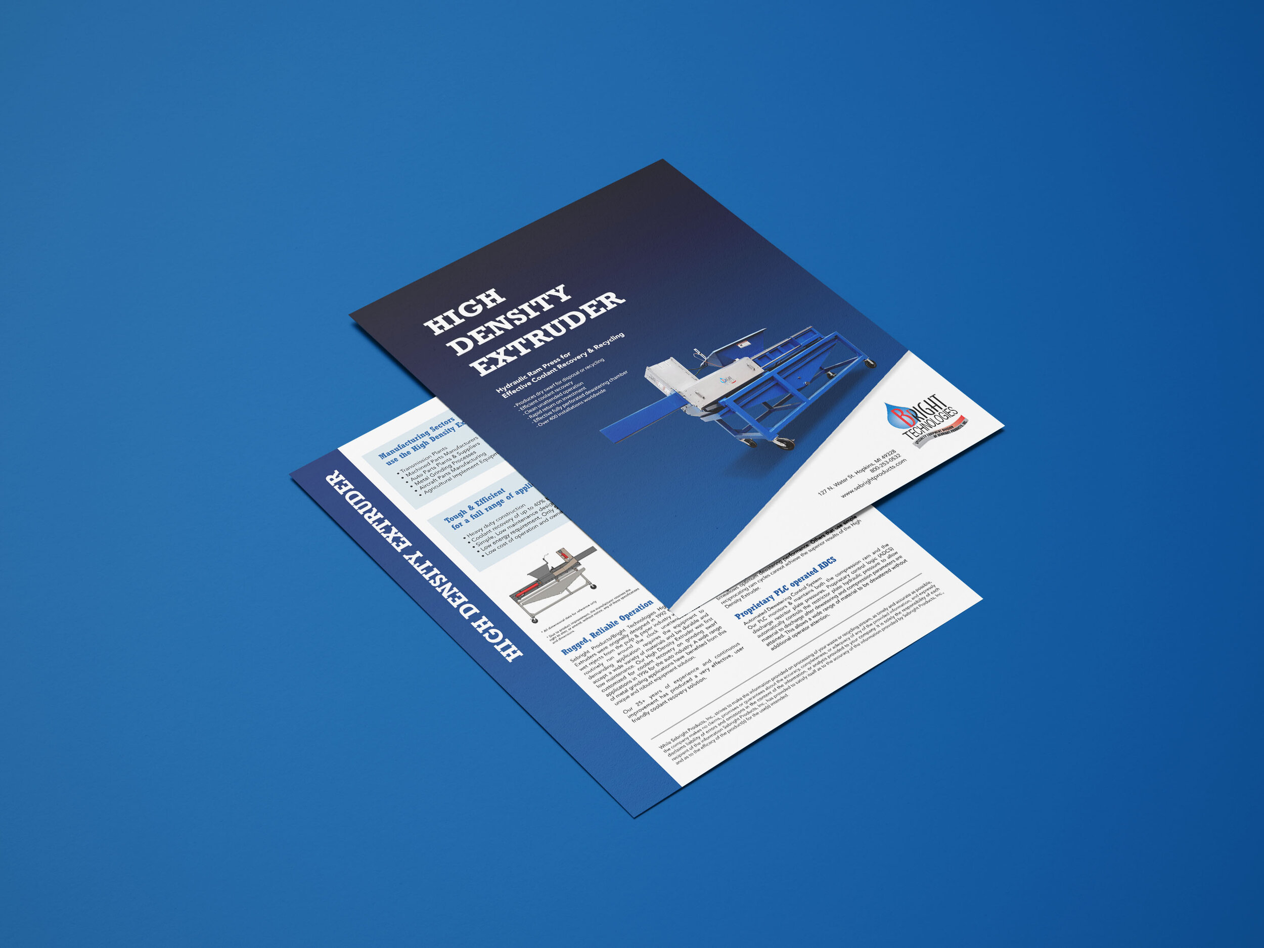
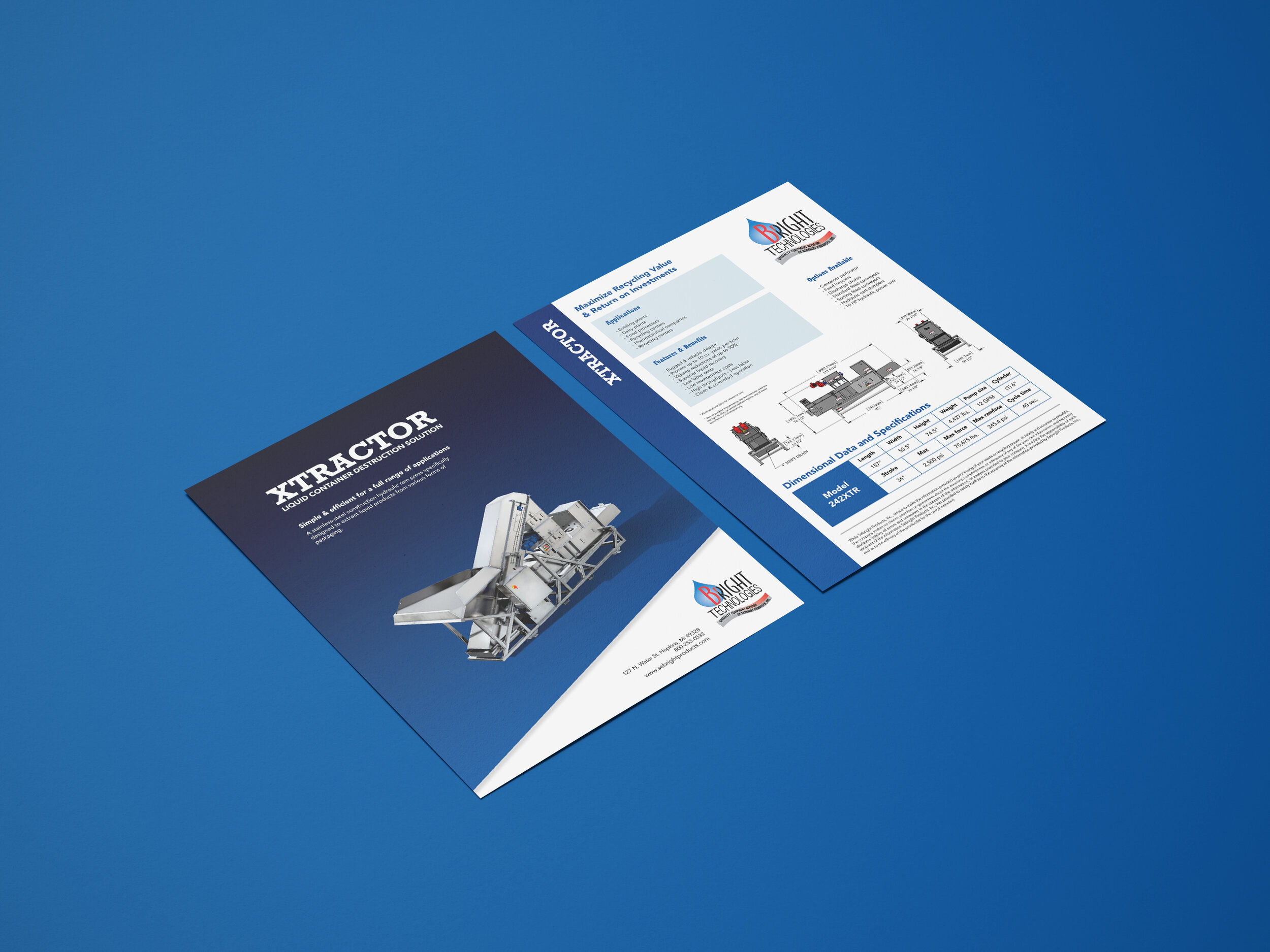
To bring clarity and consistency to Sebright’s promotional materials, I developed a comprehensive brand guideline that organizes and unifies their visual identity. The layout was redesigned in a portrait orientation using standard letter size for practicality and ease of use. Graphics were pared down to only what was necessary, ensuring they supported rather than overwhelmed the content. Logo placement became intentional and consistent, reinforcing brand recognition while maintaining a clean, professional look across all materials.
Equipment Materials
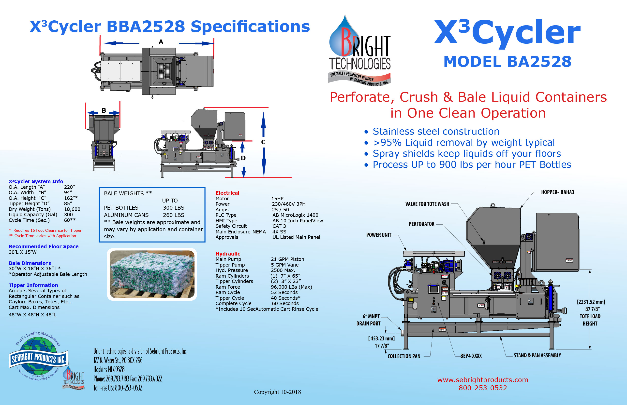
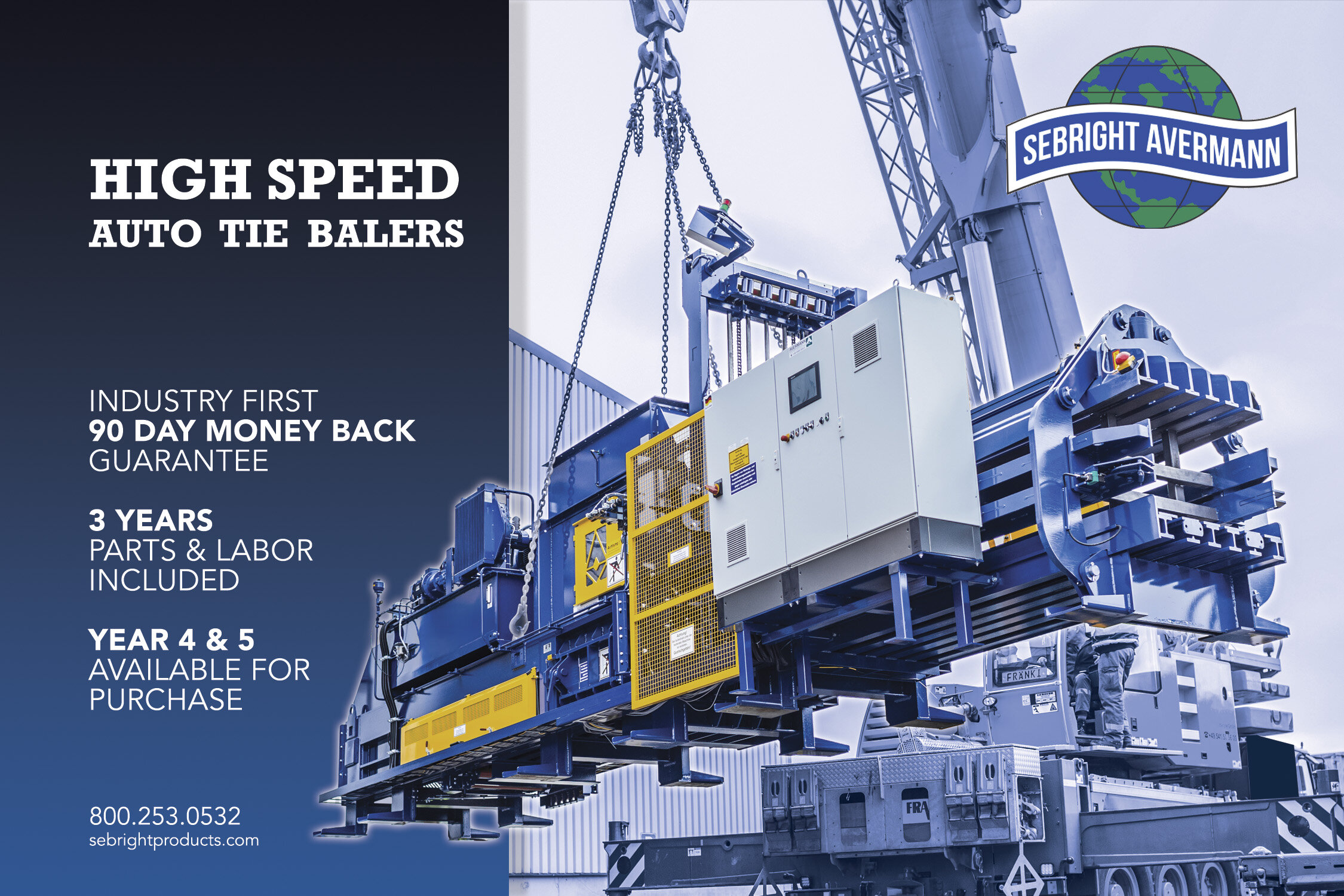
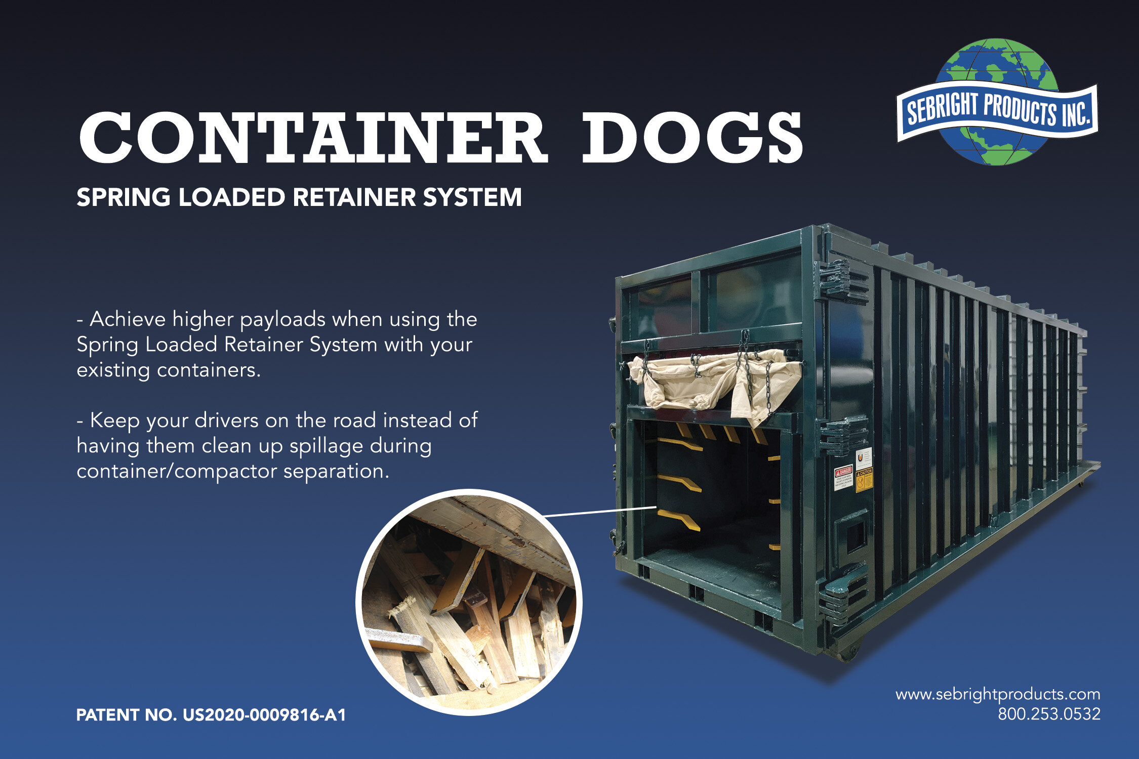
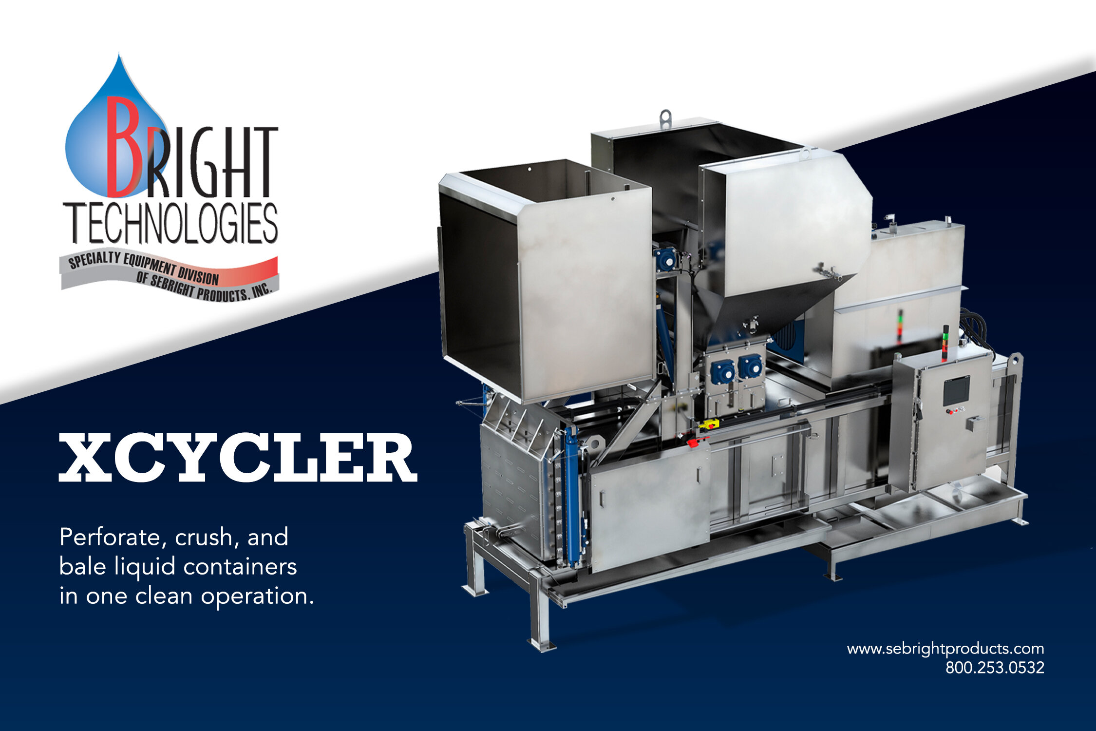
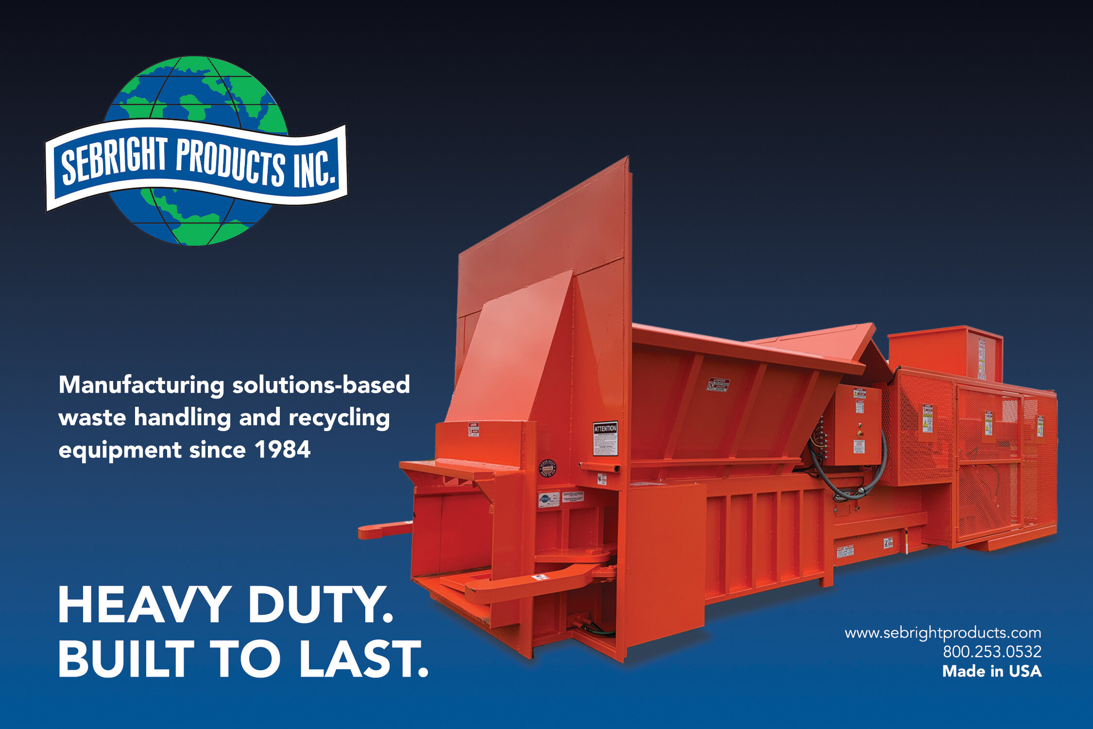
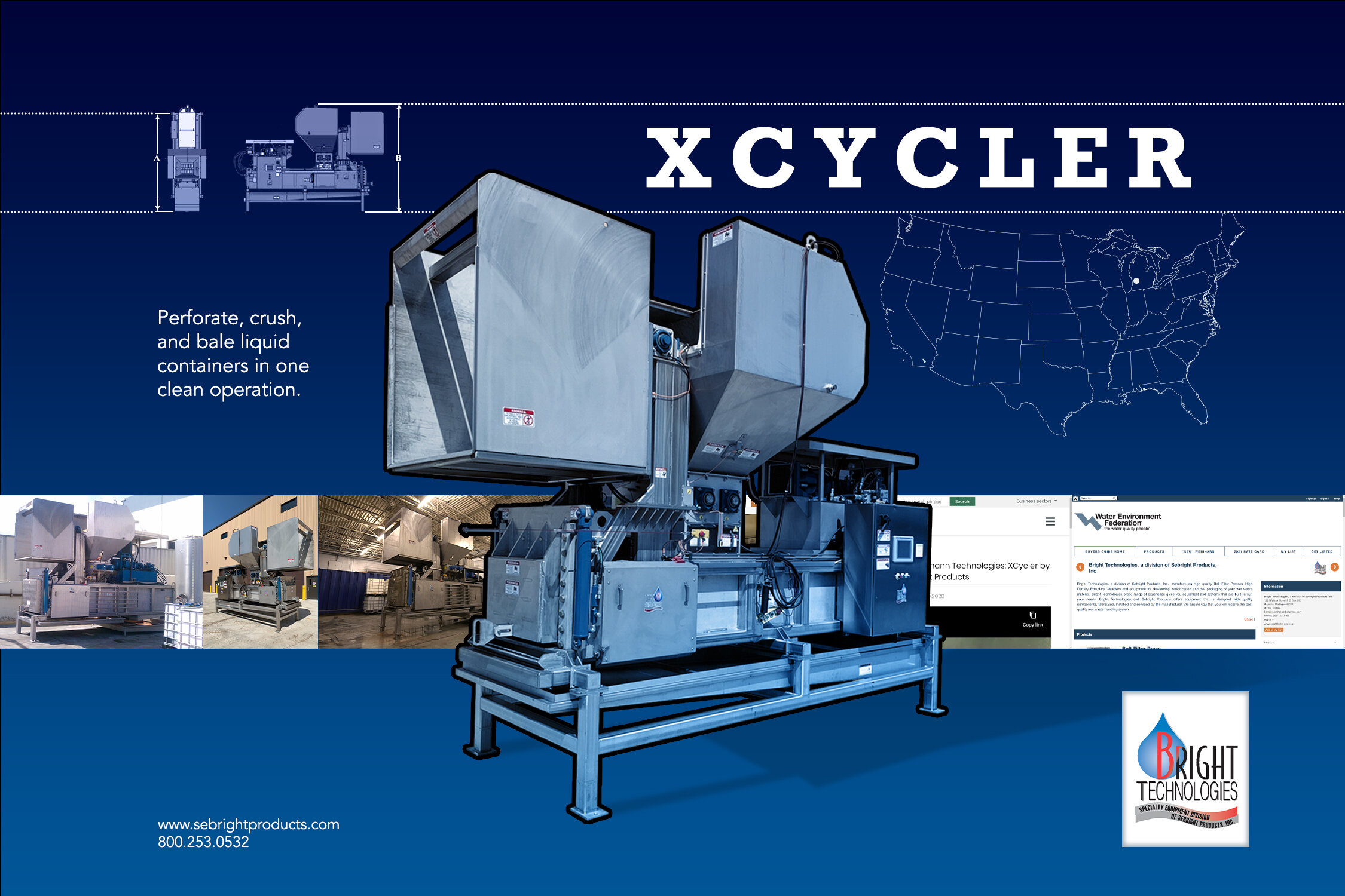
The final results of the redesign present a clear, professional identity for Sebright’s machine equipment materials. A consistent use of the brand’s signature blue reinforces brand recognition and creates visual unity across all pieces. The Rockwell typeface was selected to convey strength and reliability, aligning with the company’s industrial focus. Information is now organized into clearly grouped sections, making it easier to navigate. Clean, well-structured tables display technical specifications in a format that is straightforward and user-friendly, improving both readability and overall communication.
Visual Identity
The new design was also applied to Sebright’s ads in newspapers and magazines. Using the brand’s blue color and the strong Rockwell font, the ads now feel more professional and stand out better. The layout is clean and easy to read, with information clearly organized so readers can follow along easily. This update helps the ads fit with Sebright’s new look and makes them more effective in print.
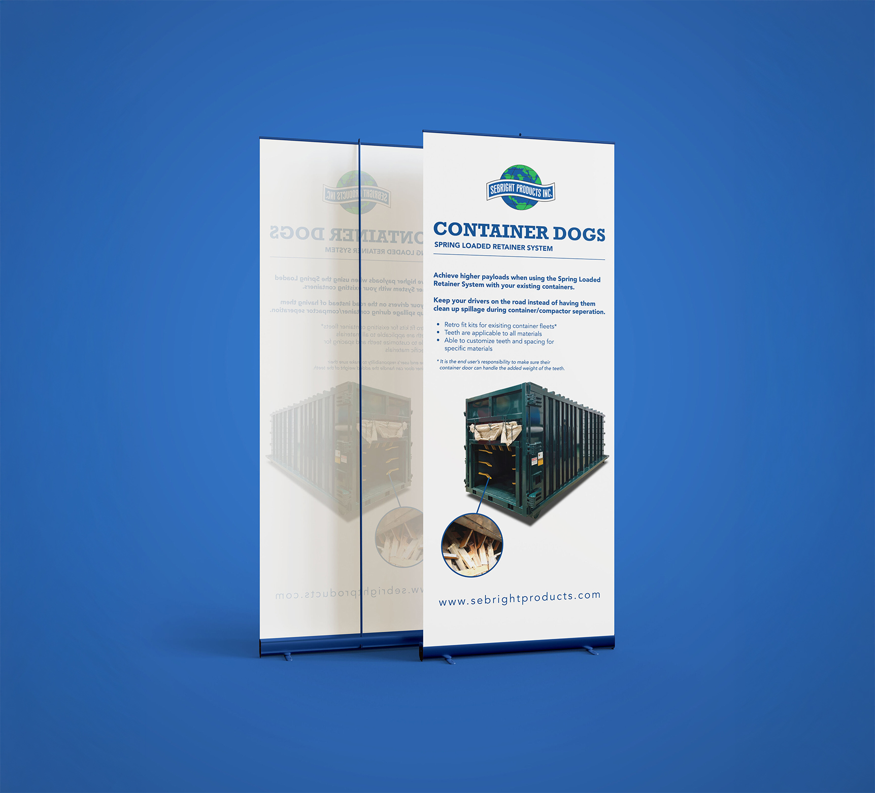
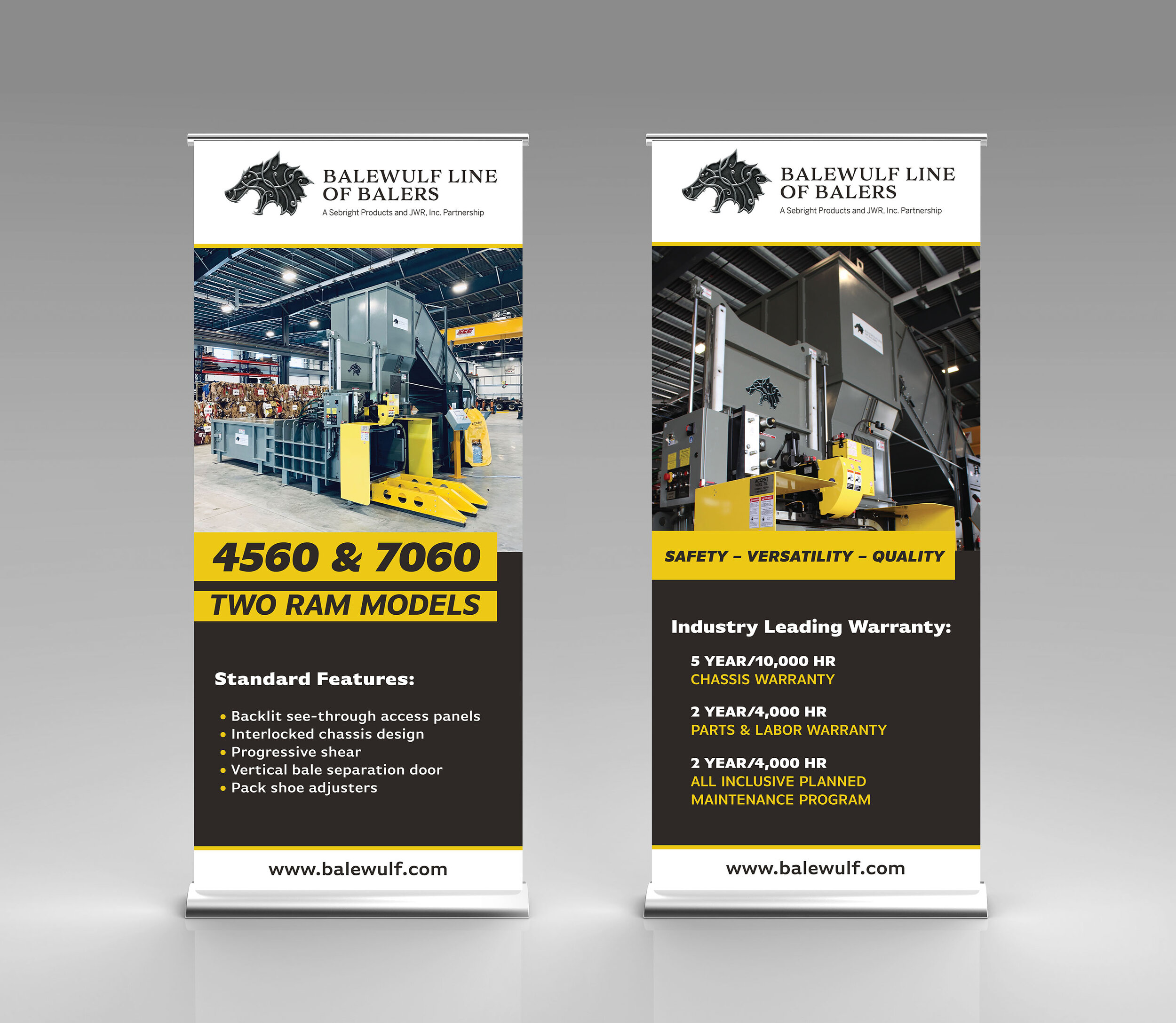
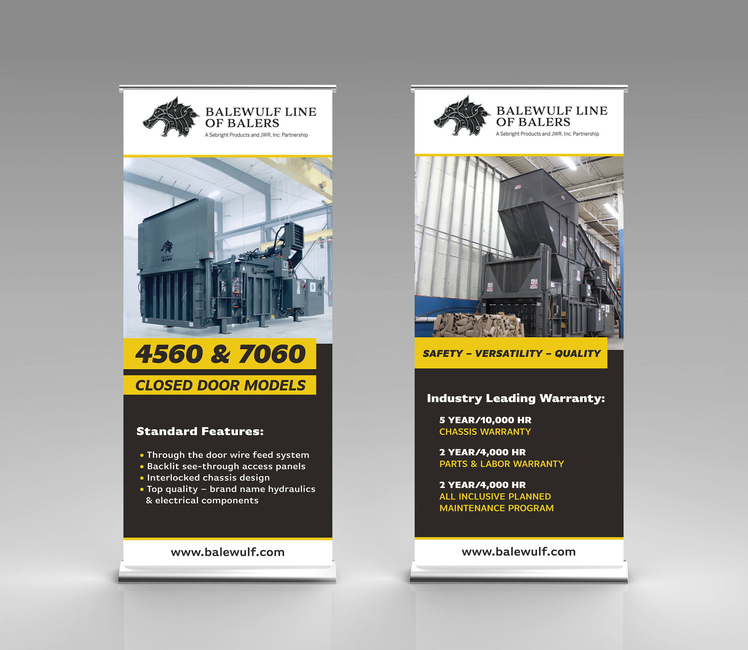
Event Booth and Banner Design
The design was also applied to banners and Sebright’s event booth to strengthen the brand’s presence at trade shows and exhibitions. With consistent use of the blue color and bold typography, the booth and banners now effectively showcase the company’s professional image. The clean, organized layout makes it easy for attendees to engage with the content, while the cohesive design ties everything together and enhances brand recognition at events.
HTML5 GIF Ad Design
I also created digital ads for Sebright’s machines, designed as HTML5 GIF ads that appear on various web pages. These ads maintain the same clean and professional look, using the brand’s blue color and bold typography to create a cohesive online presence. The GIF format allows for dynamic visuals that capture attention while effectively communicating key product features, making the ads both engaging and informative for potential customers.


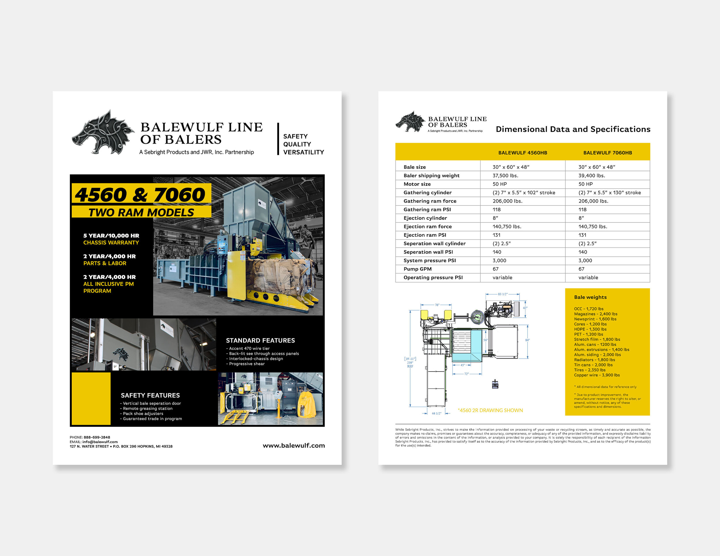
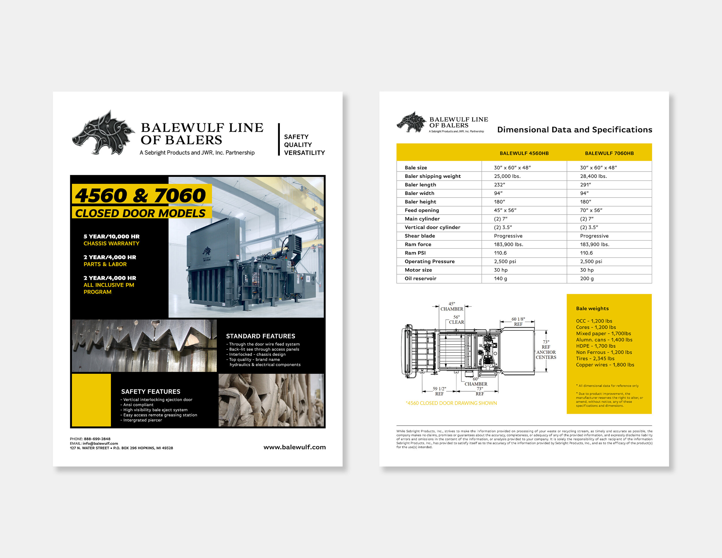
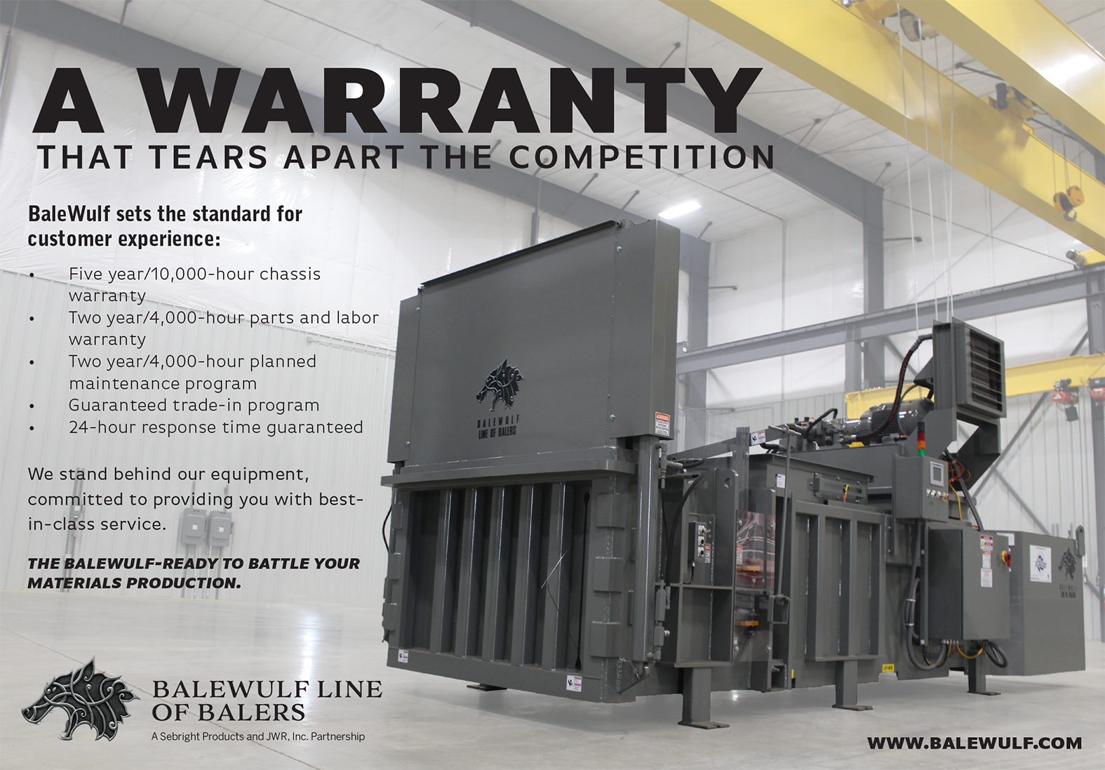
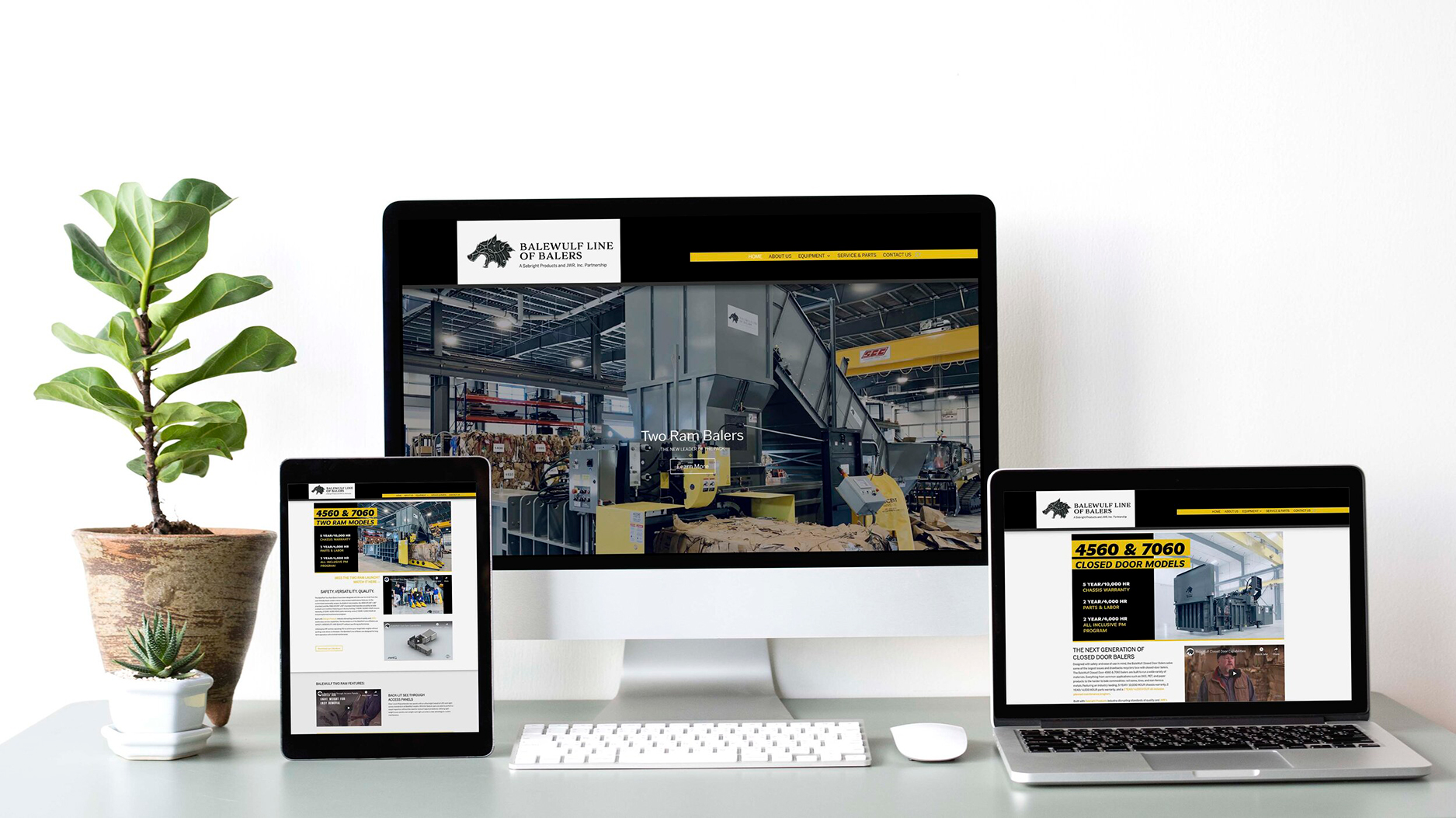
Balewulf Materials
As part of the design process for BaleWulf, I created a range of materials including equipment flyers, website elements, and promotional videos. The BaleWulf Line of Balers, developed by JWR Inc. and Sebright Products Inc., is designed to address the challenges faced by today’s recyclers. I focused on developing visuals and layouts that clearly communicate the innovative features and benefits of the BaleWulf equipment, while ensuring a cohesive and professional brand presence across all platforms, from print to digital media.
Brand and Marketing Materials
The final outcome of the design for BaleWulf successfully communicates the brand’s focus on innovation and efficiency in the recycling industry. The materials, including equipment flyers, website design, and promotional videos, work together to create a cohesive and professional brand presence. The website is user-friendly and visually appealing, with clear product information and engaging content. The flyers and videos effectively highlight the BaleWulf balers’ key features, making it easy for customers to understand their value.