Pietro's
Authentic Italian Rebrand
Overview
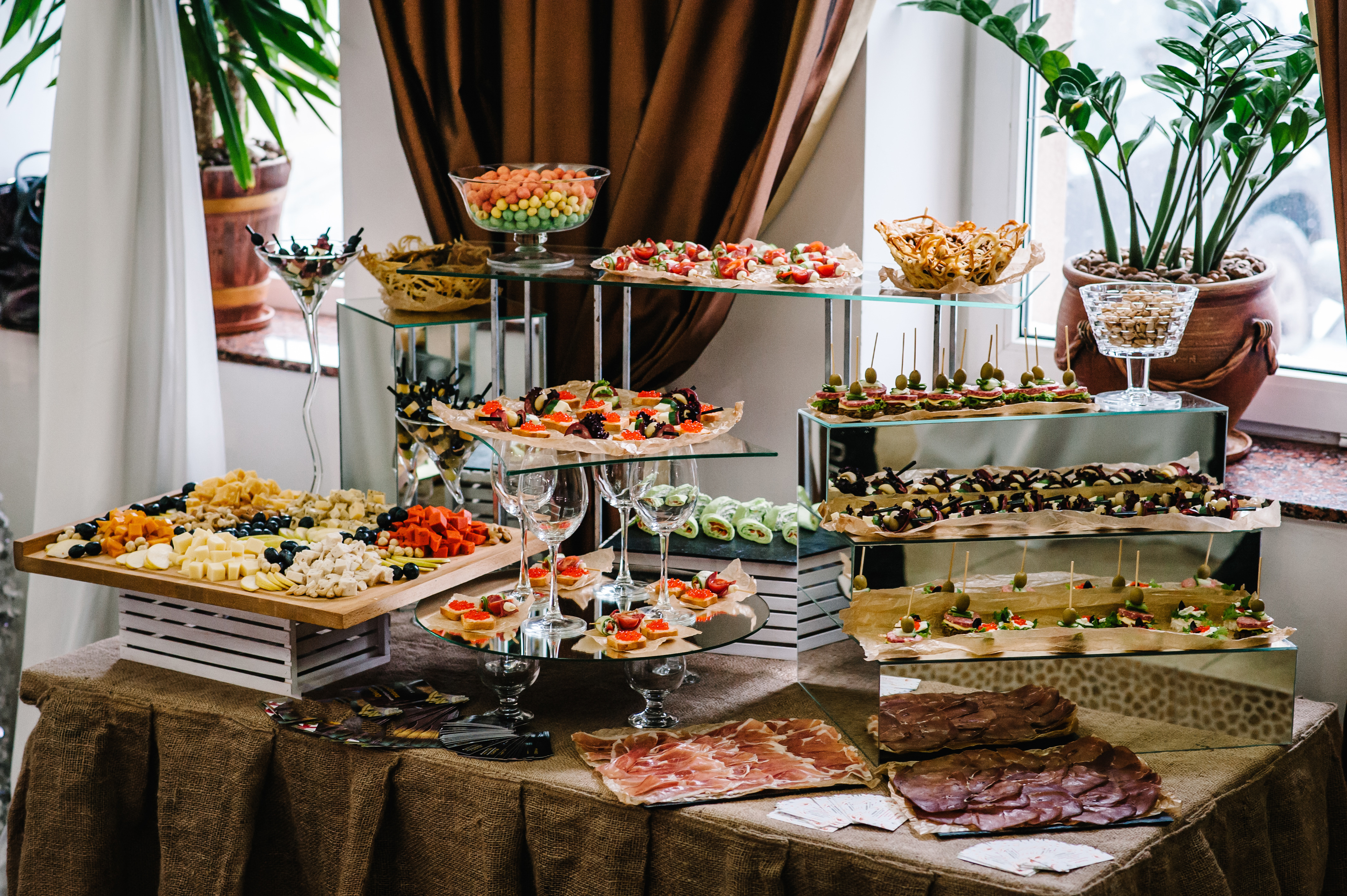
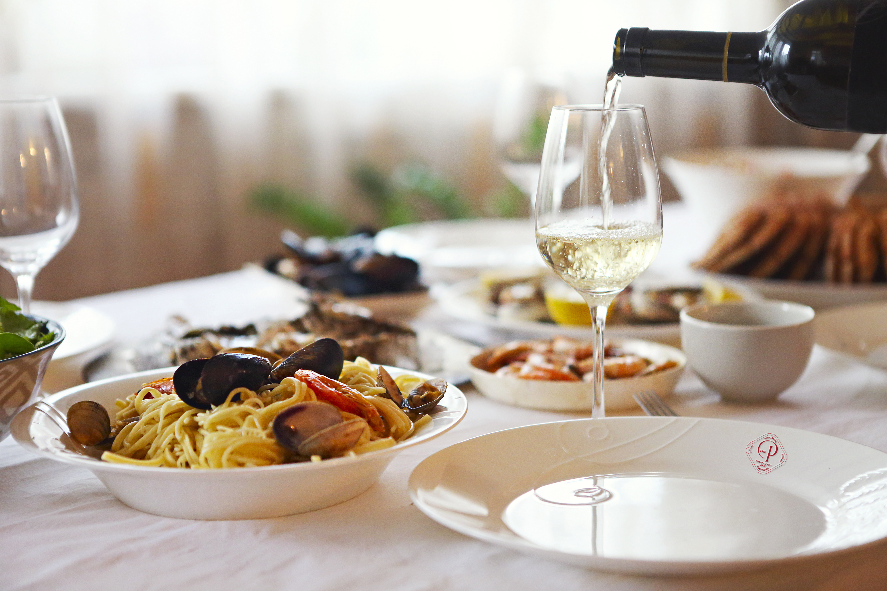
For my rebrand project for Pietro's, I aimed to elevate their visual identity to reflect the authentic, flavorful experience they offer. Although the restaurant’s food has always been a standout, the branding didn’t fully capture that same warmth and quality. I focused on creating a fresh, sophisticated design that mirrors the essence of their Italian cuisine: simple, fresh, and full of character. The goal was to align the visual style with the inviting, family-friendly atmosphere and the genuine taste of their food, ensuring it resonated with both regulars and newcomers.
View Project SiteMy Role
- Graphic Design
- Illustrator
- Concept Development
Typeface
- Hello Paris
- Gilroy
- ITC New Baskerville Std
Personality
- Elegant
- Friendly
- Cozy
- Timeless
Brand Audit & Discovery
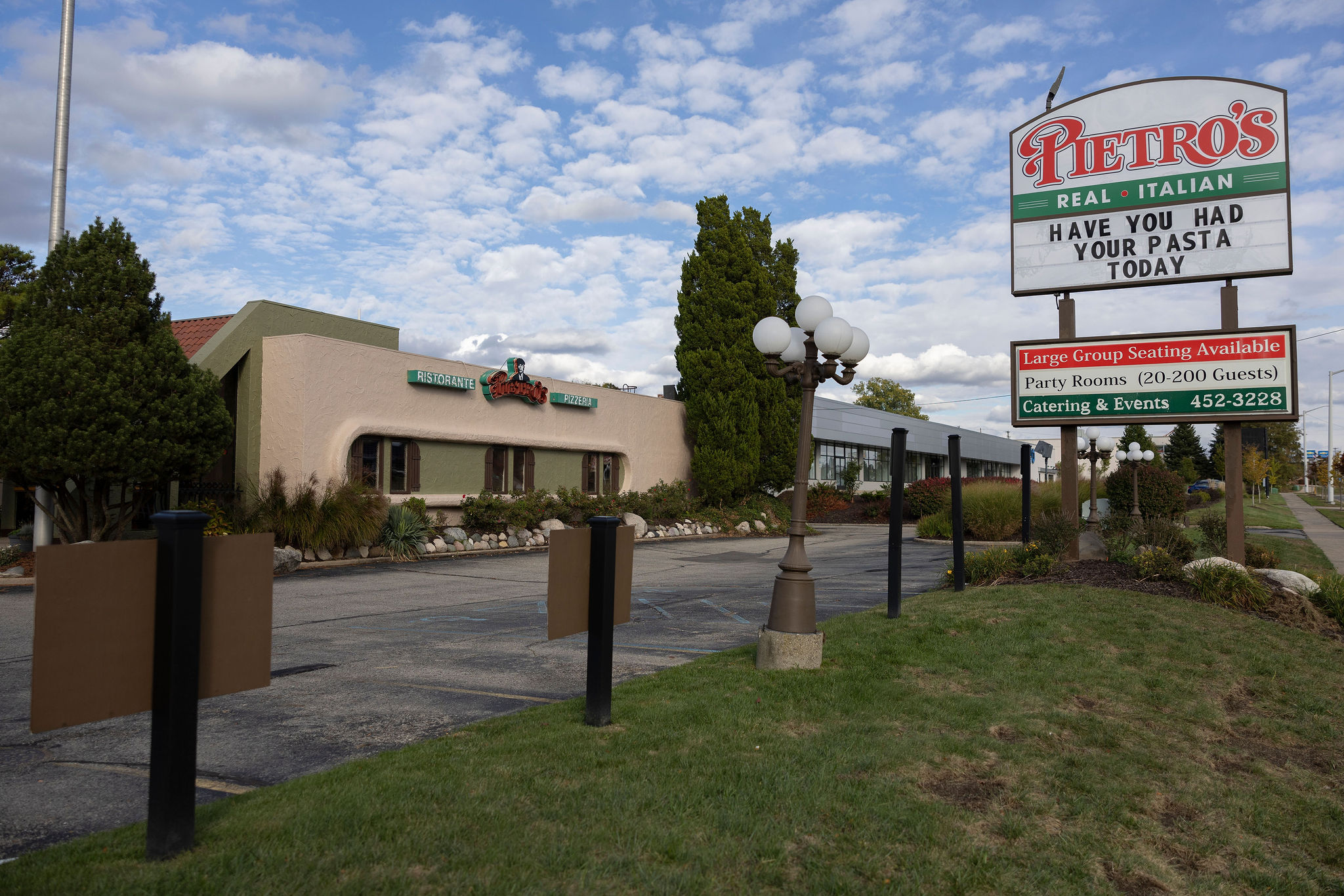
The first step in the rebrand project was gathering all of Pietro’s current brand materials to understand how they present themselves visually and verbally. I collected assets from their website, physical menus, signage, billboards, and social media to get a full picture of their existing identity. This helped me see what elements were working, what felt outdated, and where there were gaps between the visual style and the high quality of their food. It also gave me a clear starting point and direction for creating a refreshed look that better reflects their warm, authentic Italian experience.
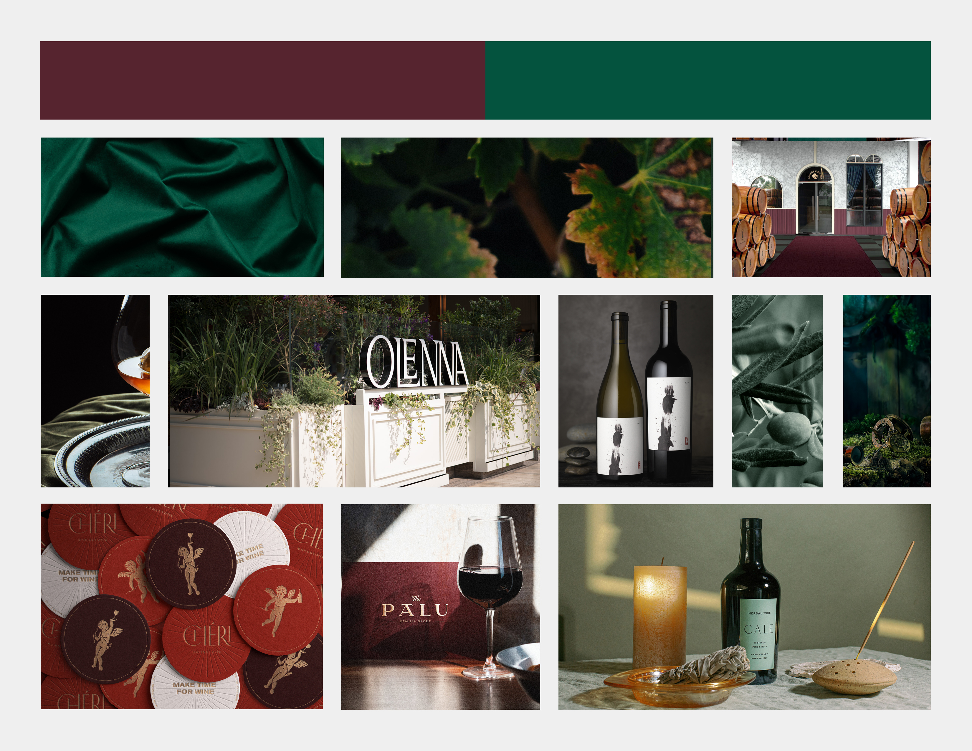
Moodboard
For the moodboard, I focused on evolving Pietro’s existing style rather than starting from scratch. I wanted the refreshed brand to feel familiar yet more refined. Key elements like the distinctive curves in the "P" and "R" were preserved to maintain brand recognition. I kept the traditional red and green color palette but toned the shades down to give it a more modern, sophisticated feel. The original serif and sans-serif font pairing was also retained, offering a balance of tradition and clarity. Overall, the moodboard served as a bridge between Pietro’s rich heritage and a more contemporary, polished identity.
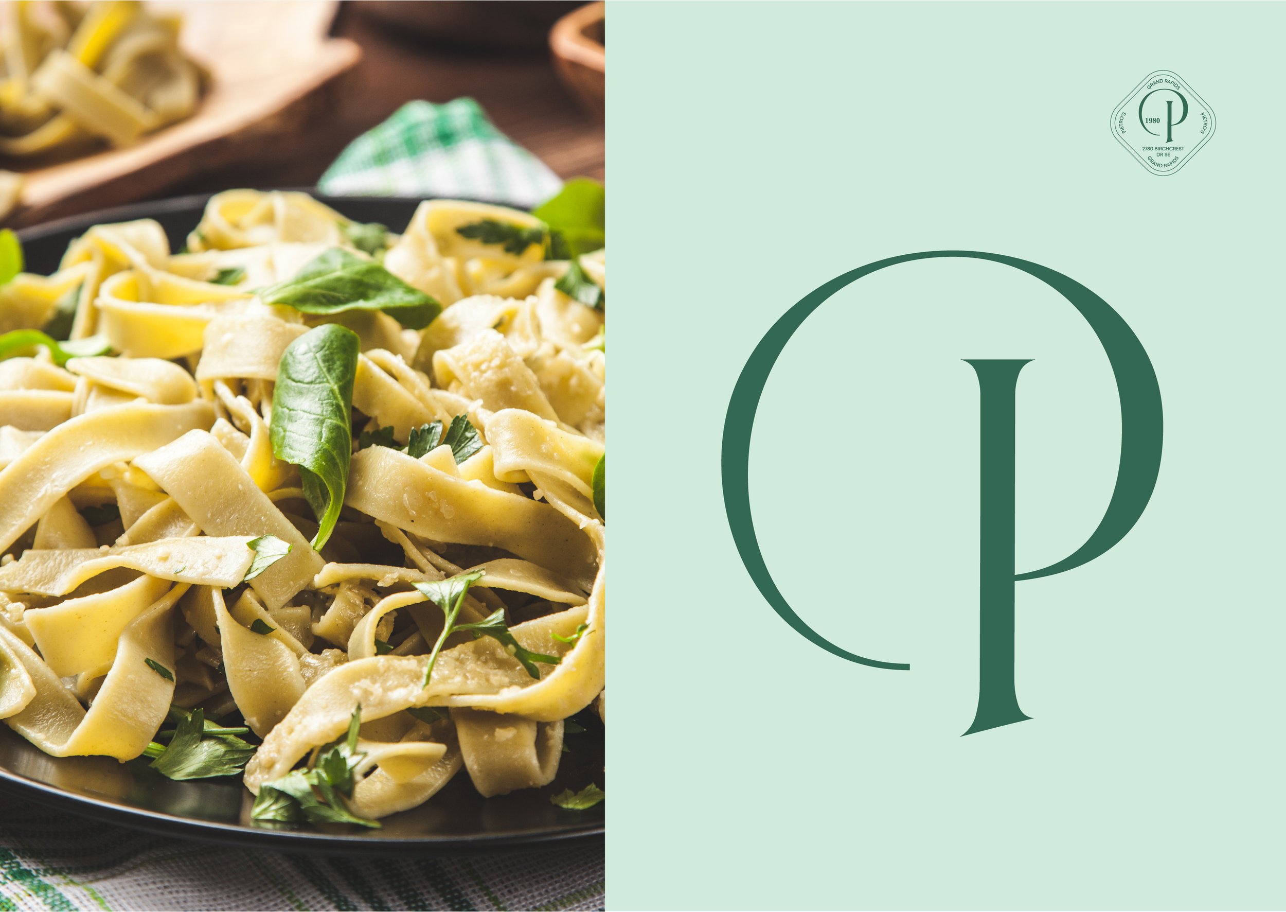
Logo and Visual Element
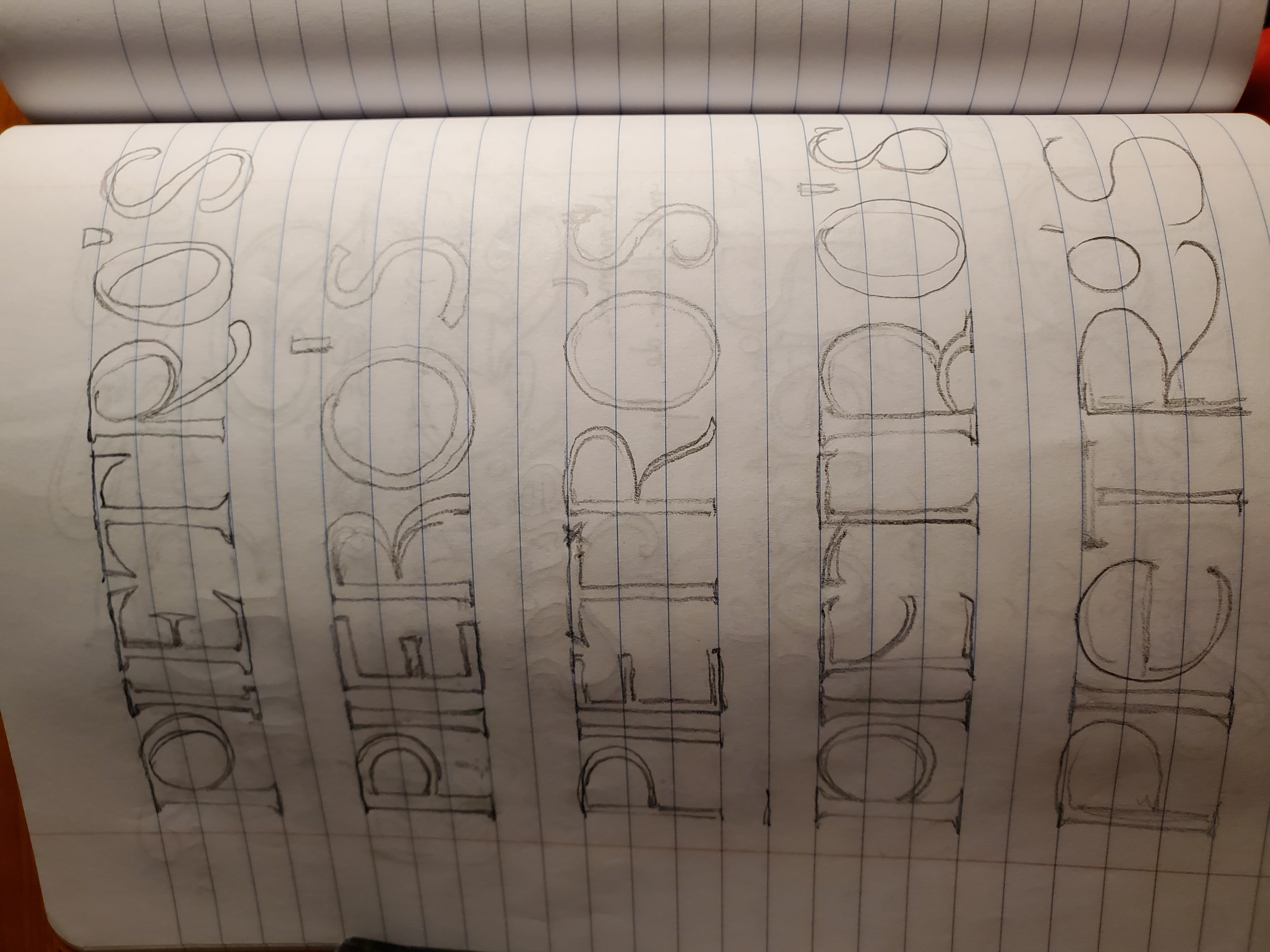
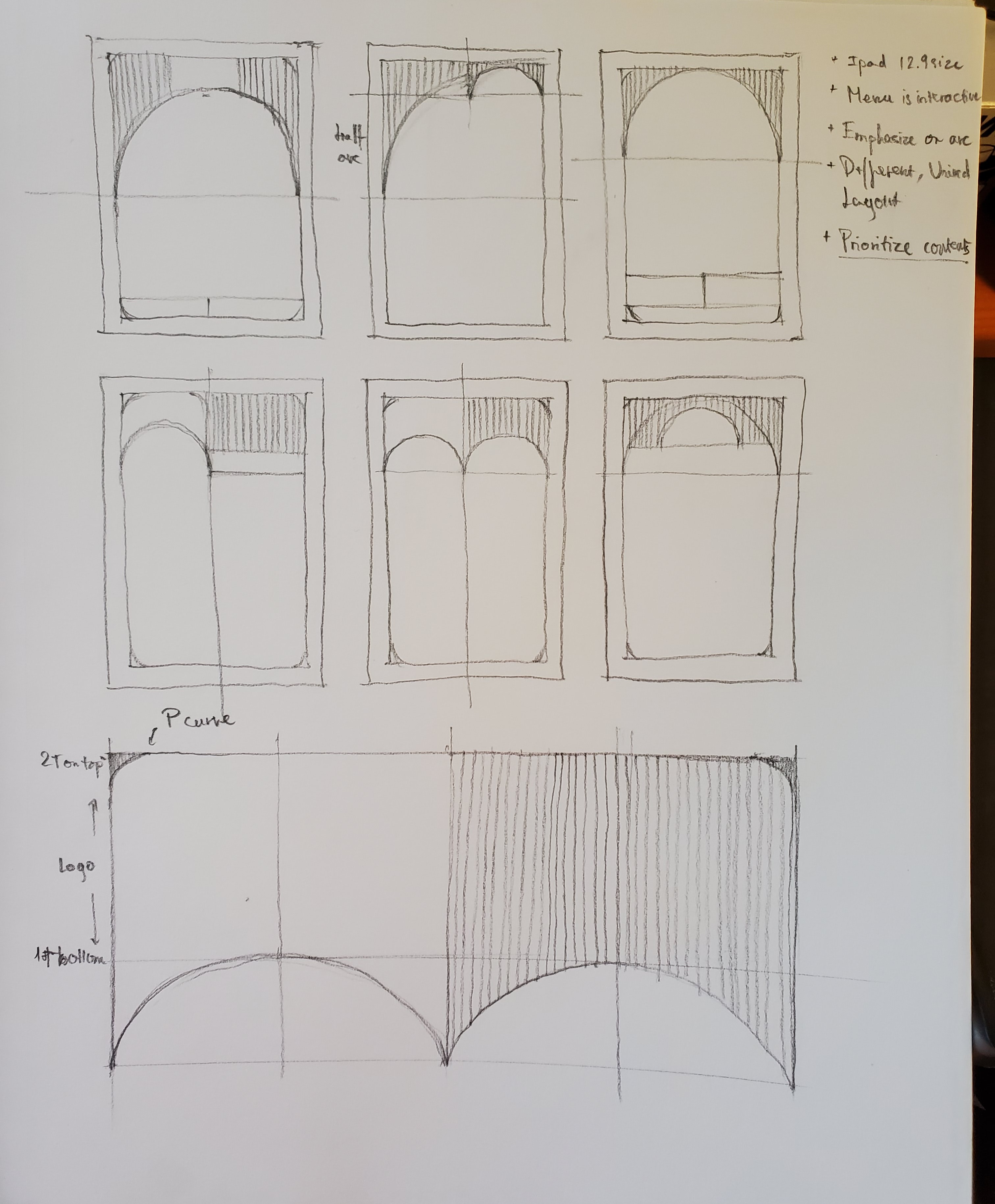
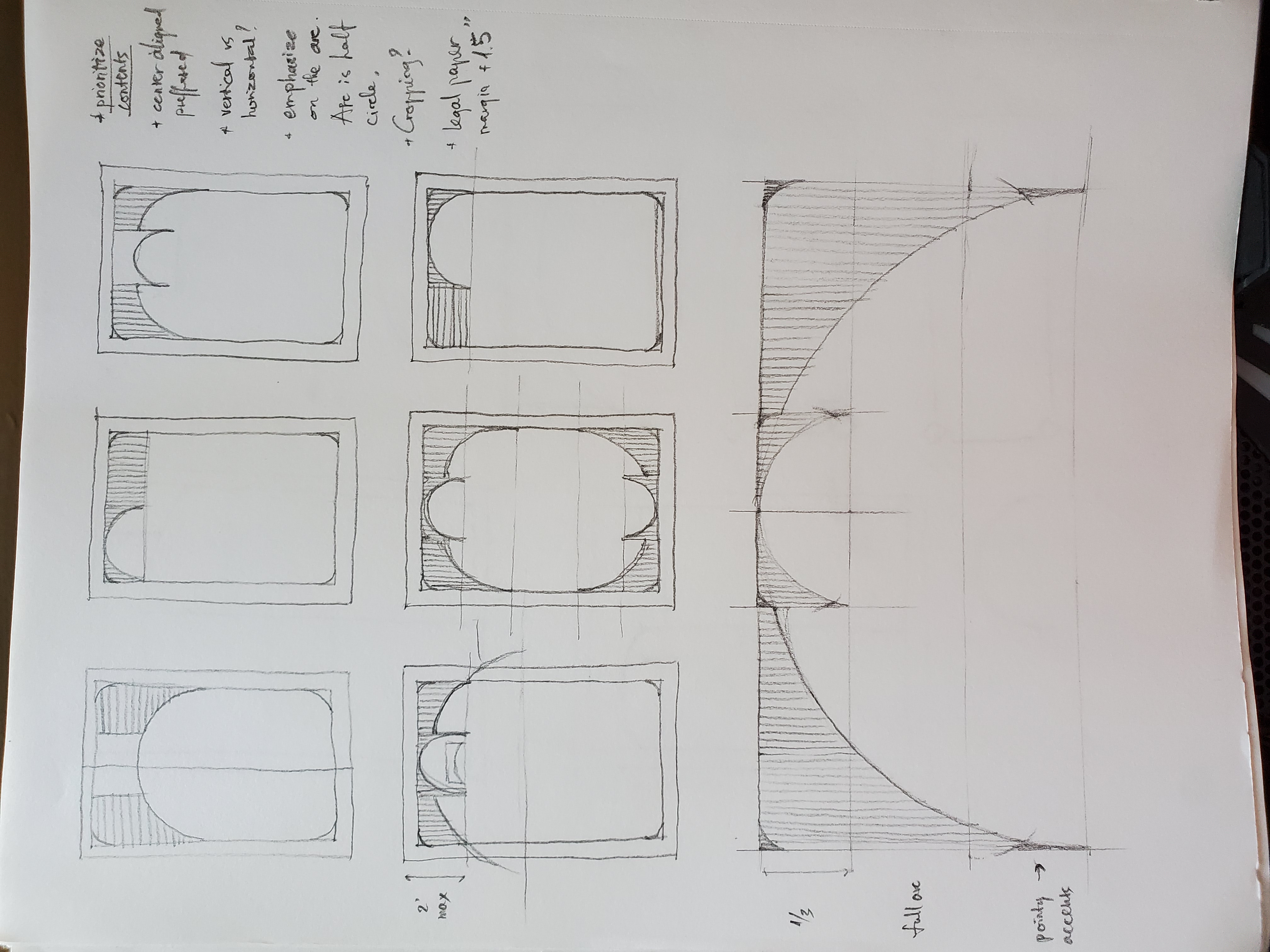
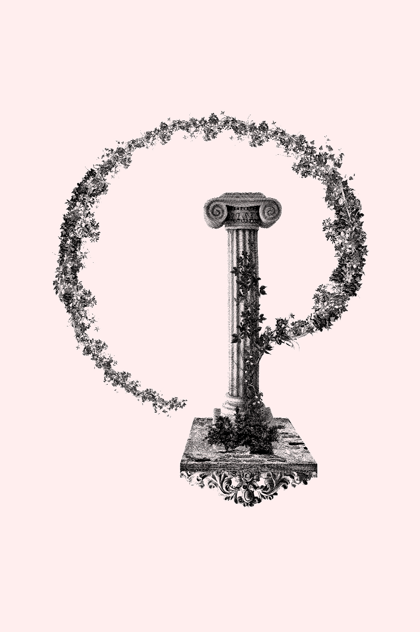
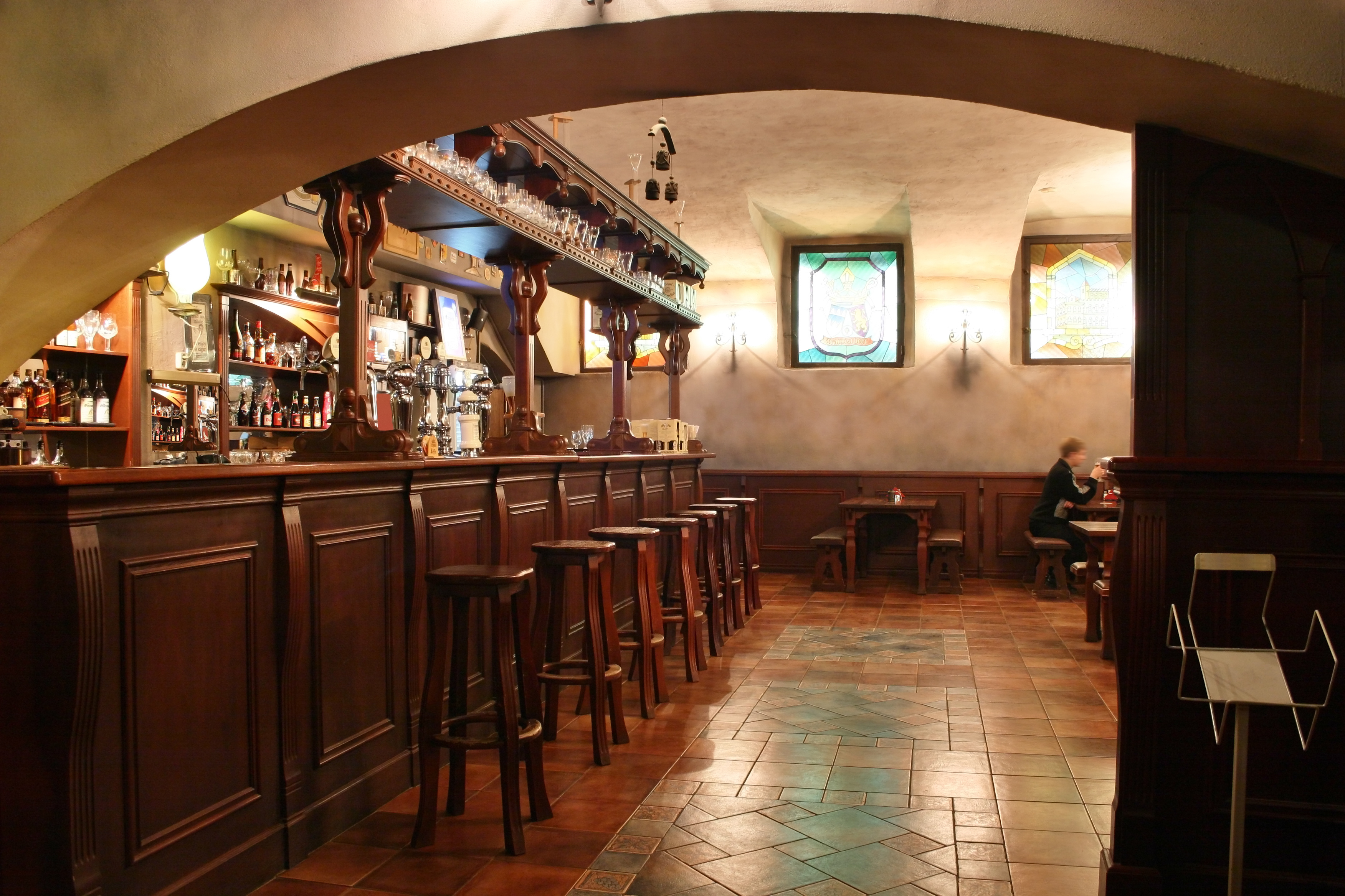
During the logo and visual element ideation phase, I explored different font styles and compositions through hand-drawn sketches to get a feel for what suited the brand’s personality. I paid close attention to how different type treatments could convey warmth, tradition, and modern elegance. Inspired by the beautiful arches in Pietro’s restaurant architecture, I brought that shape into the design as a subtle graphic element. It adds a sense of structure and charm that ties the visuals back to the physical space, creating a cohesive and thoughtful connection between the brand and its environment.
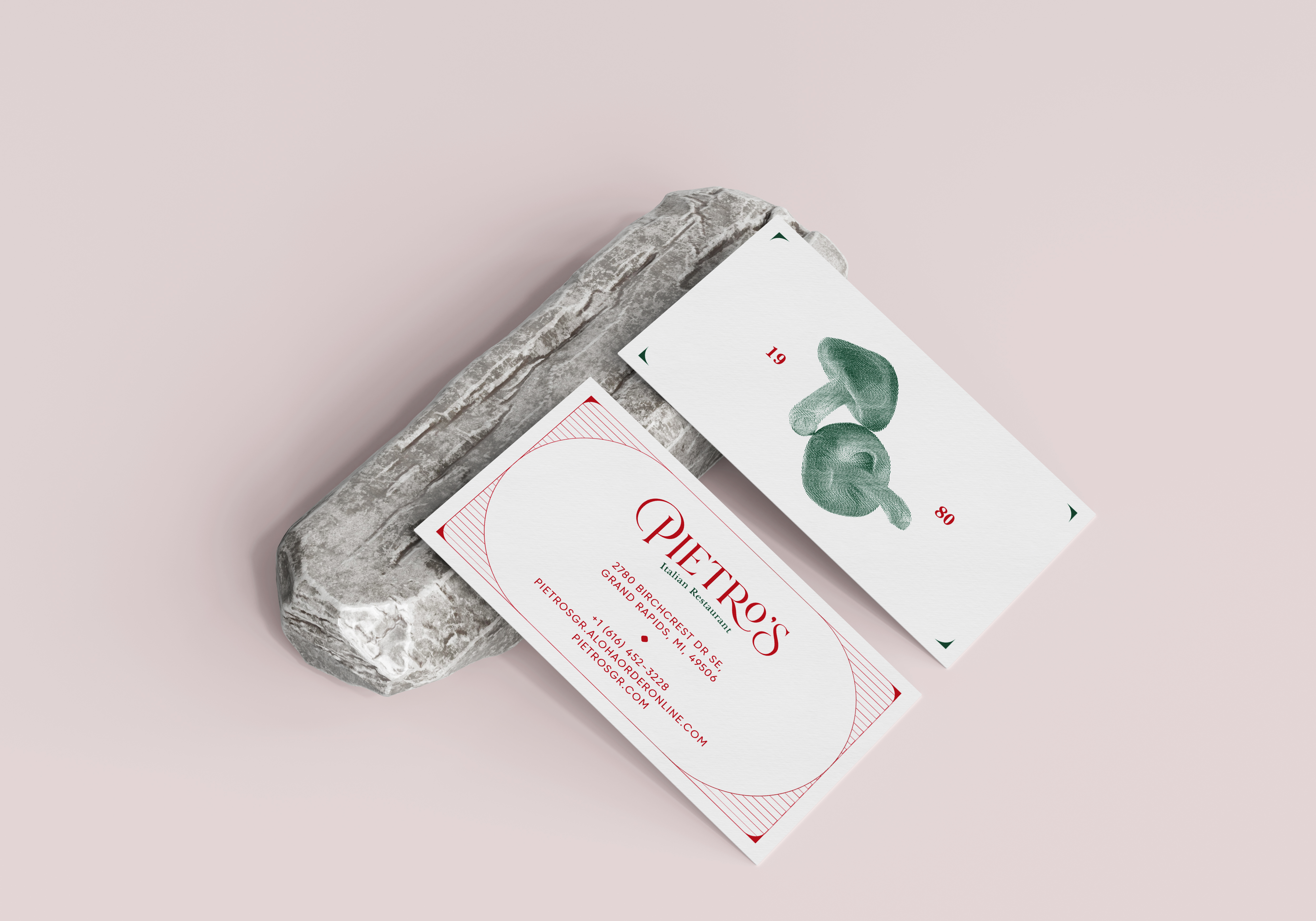
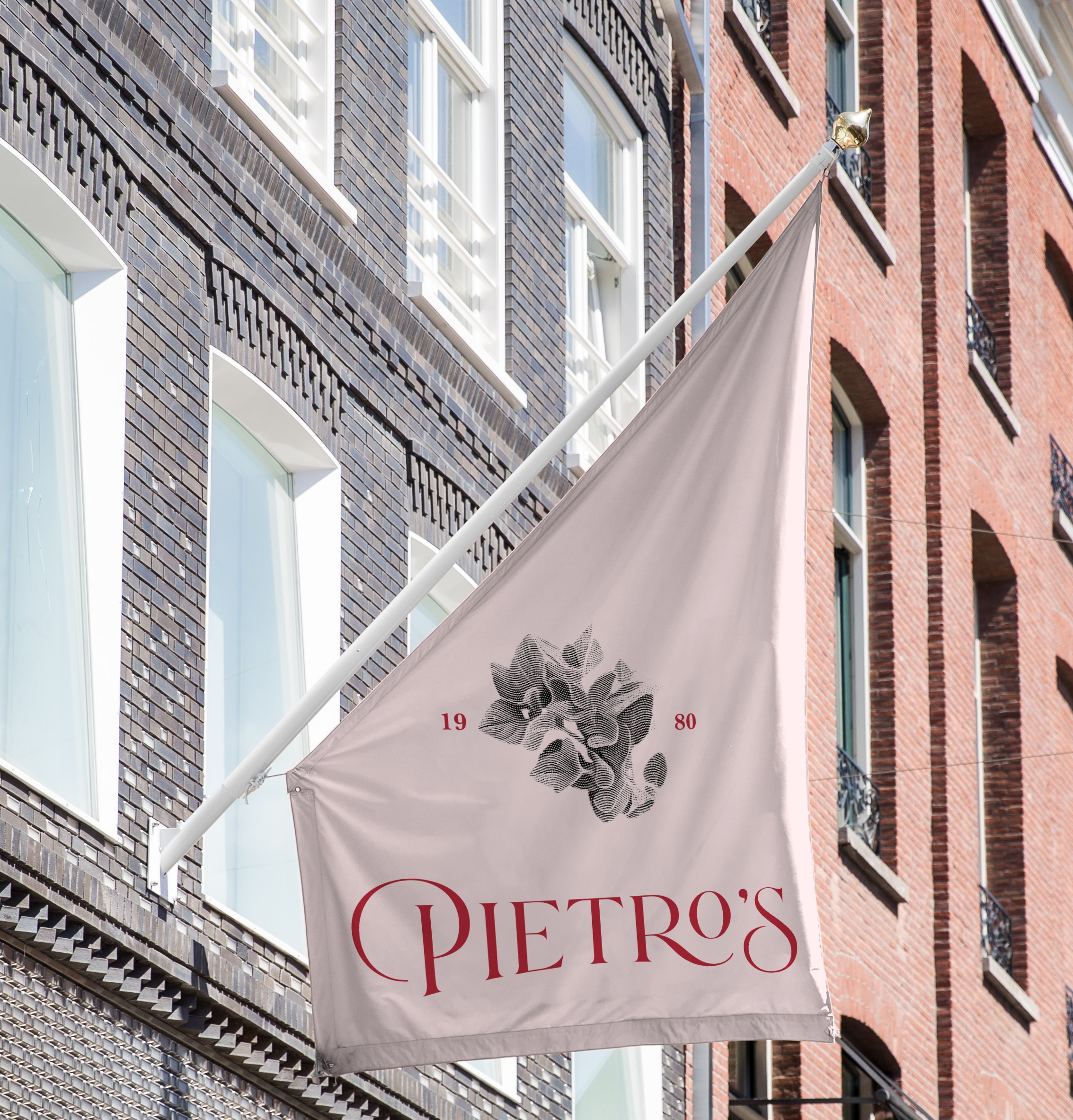
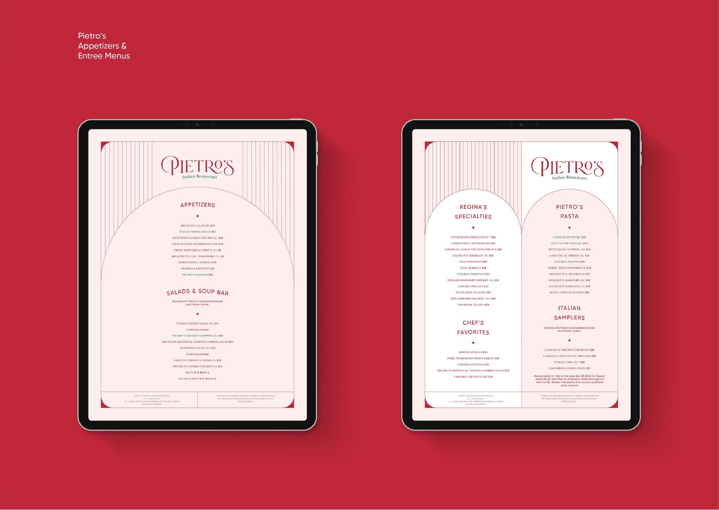
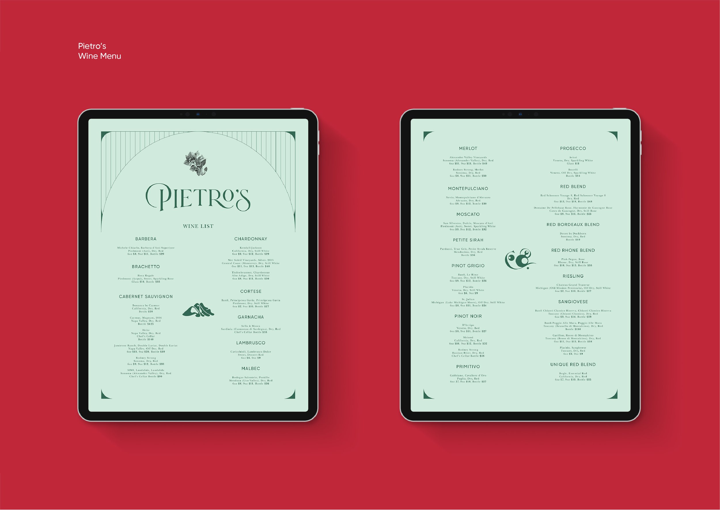
Primary and Secondary Logo Design
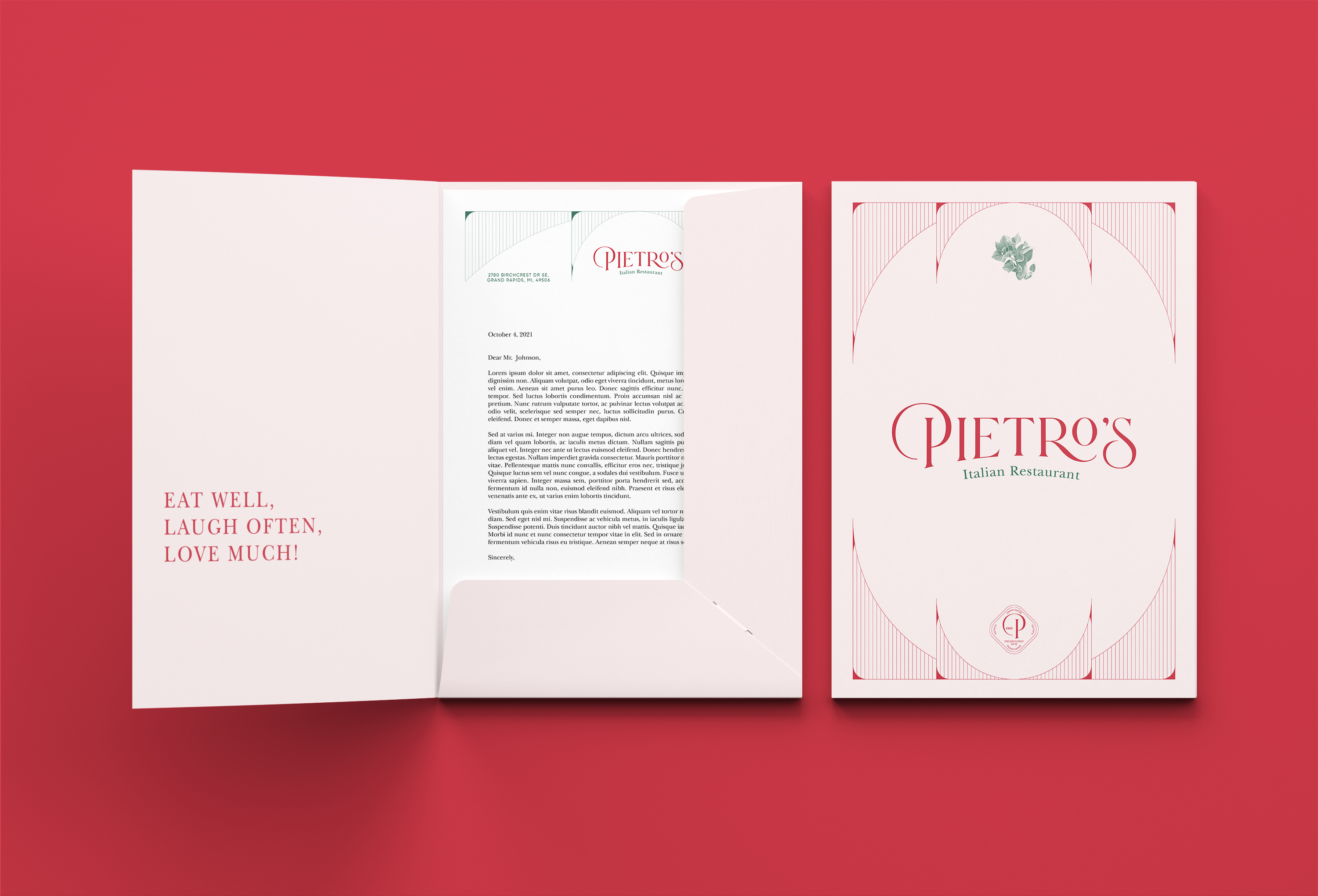
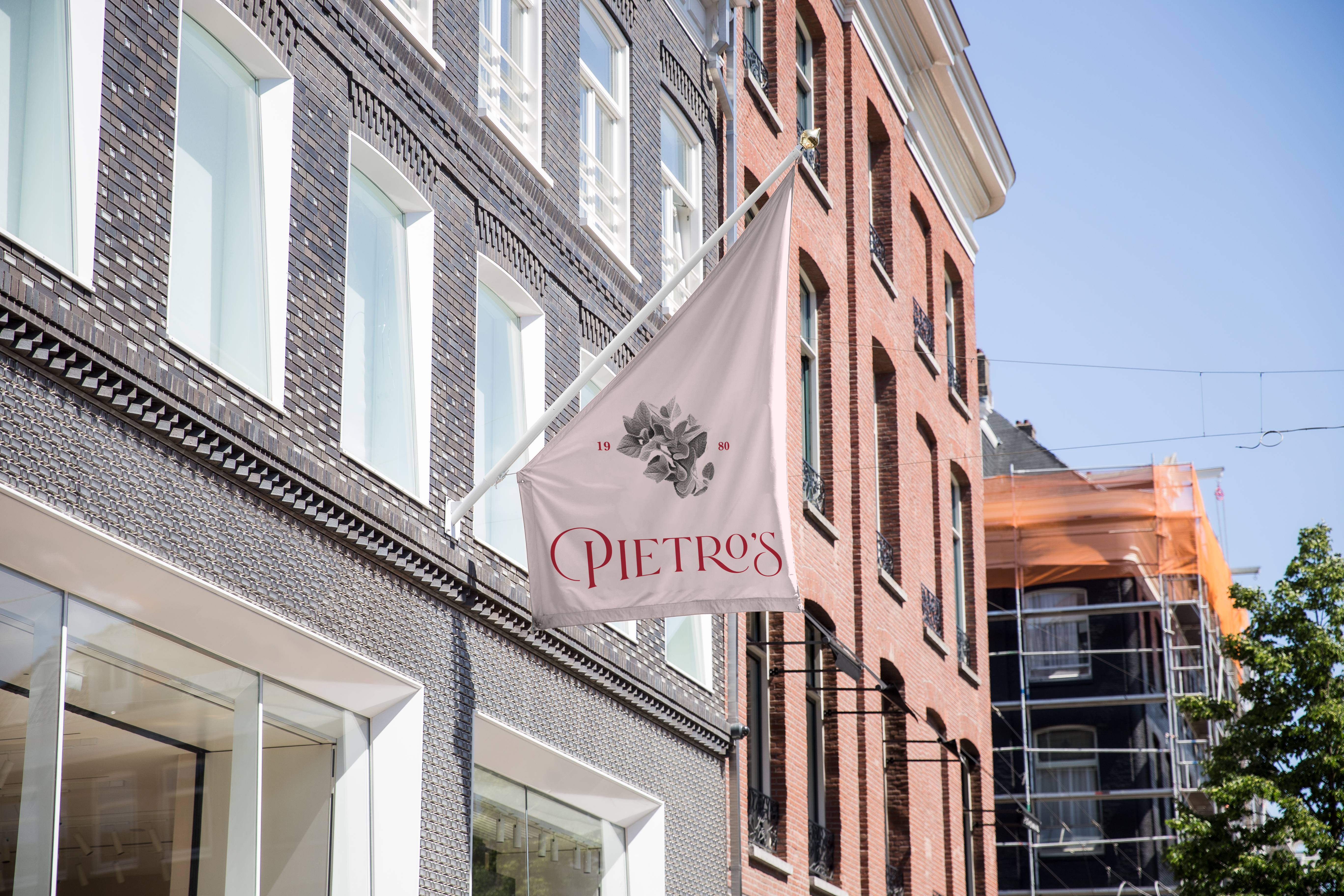
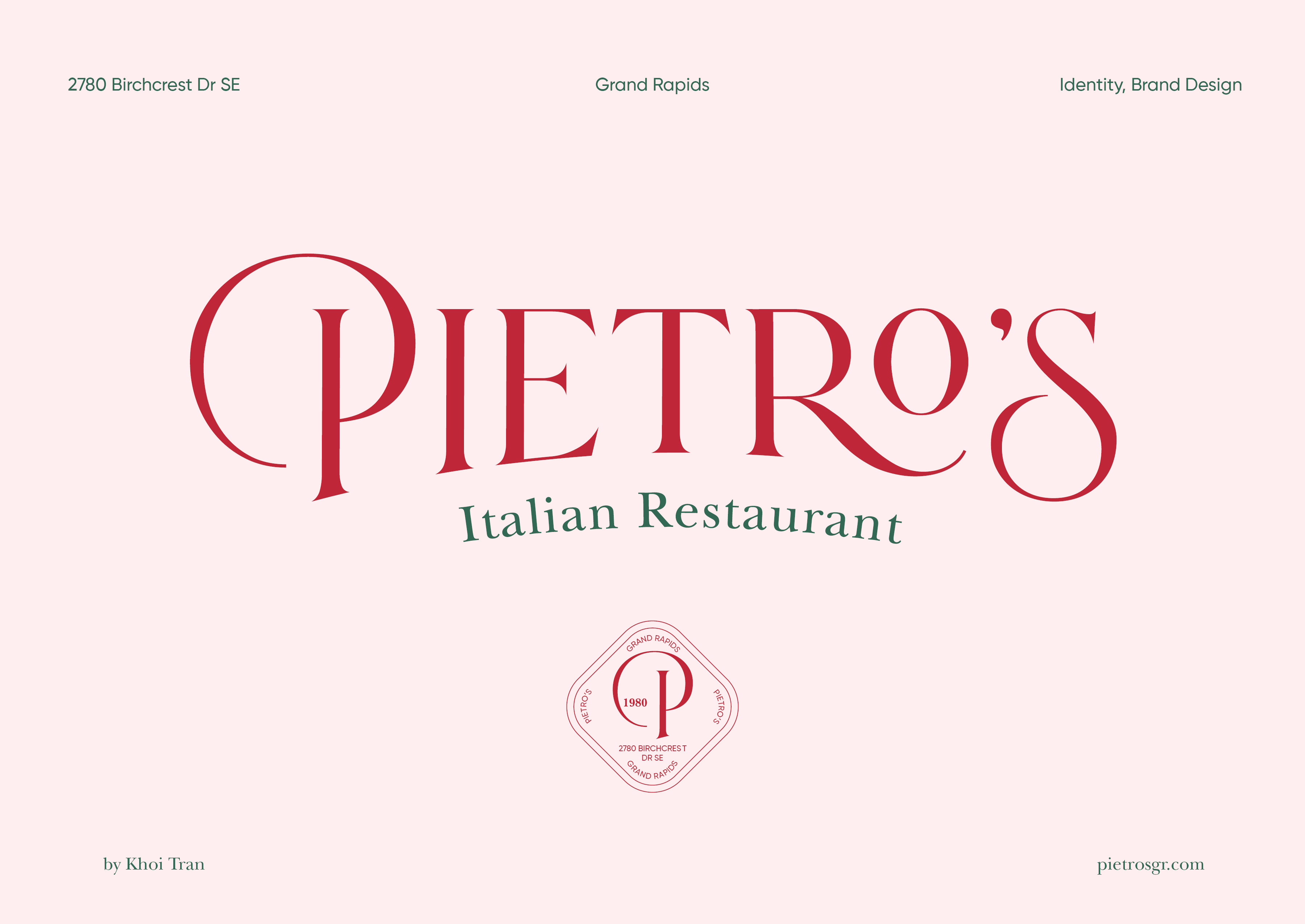
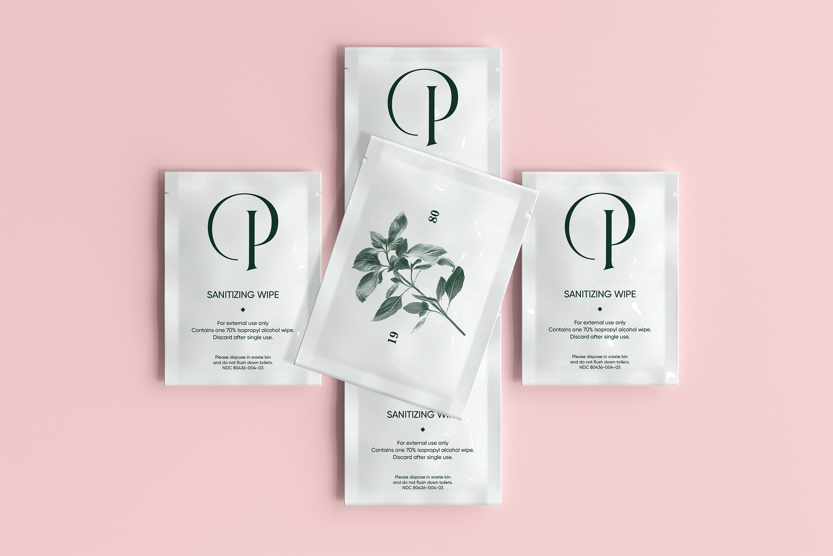
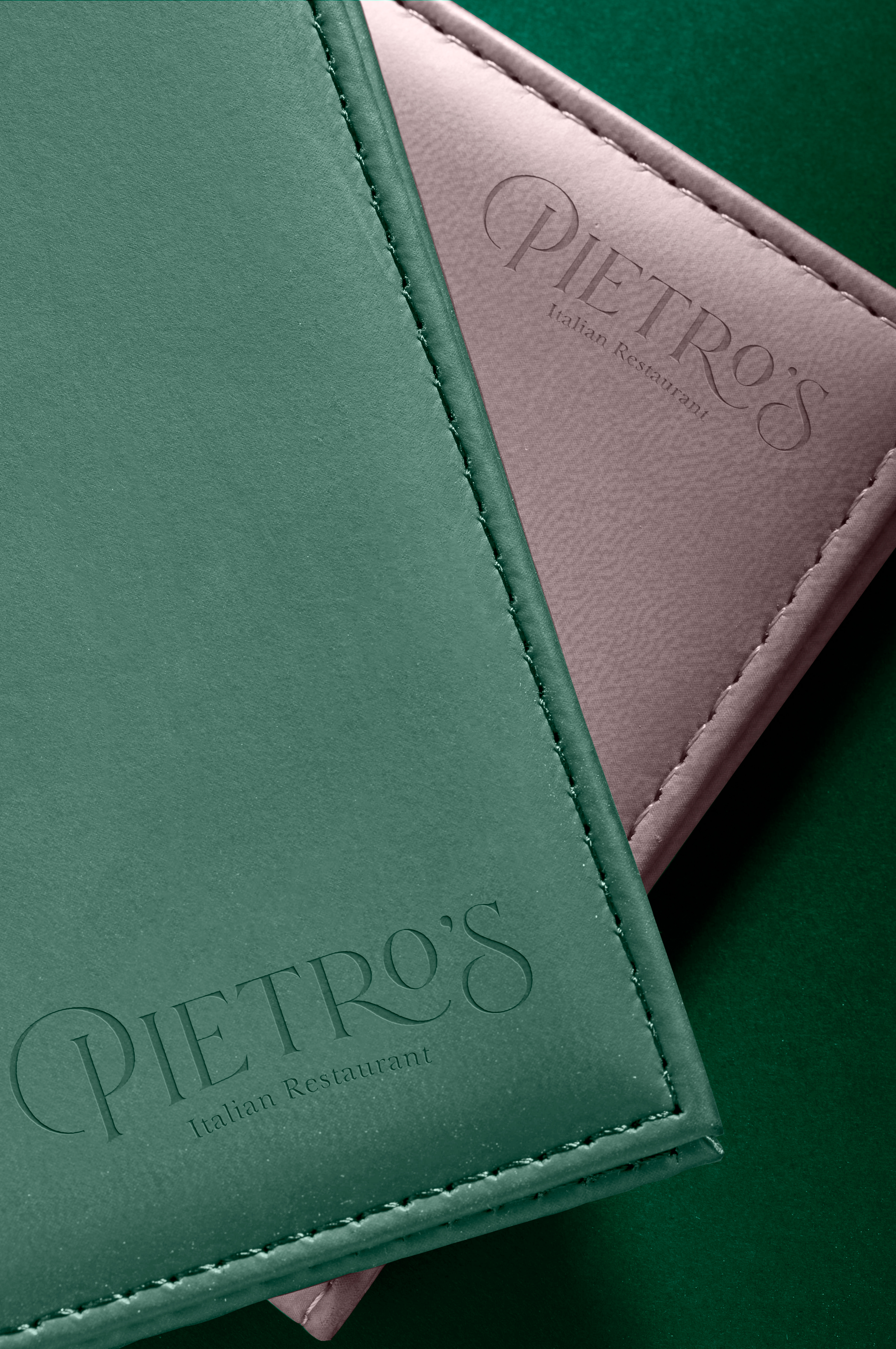
The primary logo retains the classic arc and signature red and green colors from the original brand, offering a sense of continuity while introducing a refined, modern touch. It consists of a wordmark paired with a tagline, using a swirly serif typeface with strong contrast between thick and thin strokes. This gives the logo a sense of elegant movement that feels both classic and elevated. The tagline supports the brand message, enhancing clarity and sophistication without straying from Pietro’s established identity. Designed for flexibility, the logo is entirely typographic, making it easy to apply across various materials while remaining recognizable and consistent.
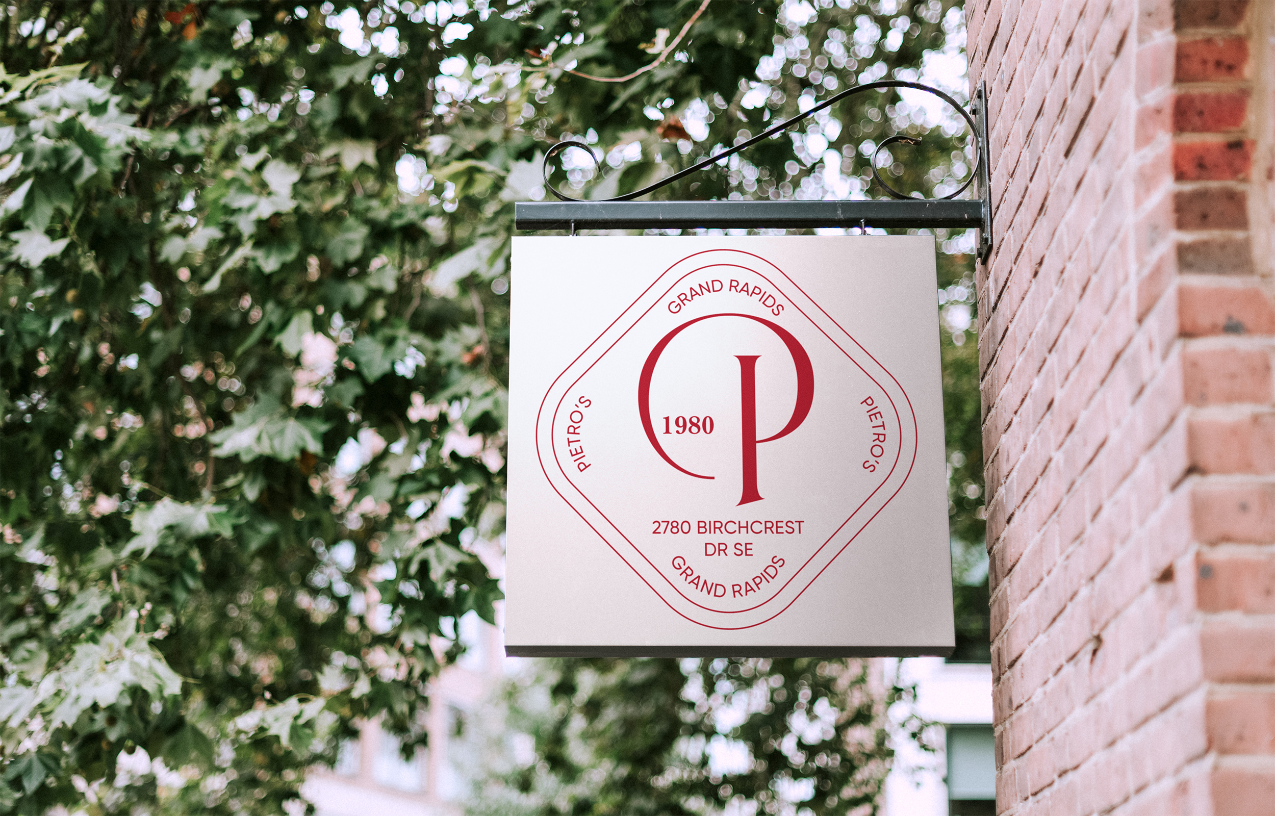
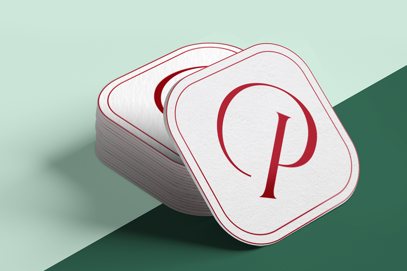
The secondary logo takes the form of a diamond-shaped badge, inspired by traditional Italian signage and vintage restaurant stamps. It serves as a compact visual mark for smaller applications where the full wordmark might not be practical, such as stickers, coasters, or social media icons. The diamond shape adds a bold but timeless flair, and its geometric form offers a strong visual anchor while still feeling cohesive with the primary logo’s curves and tone. It’s a useful brand element that reinforces identity in a versatile and visually striking way.
Supporting Design Elements
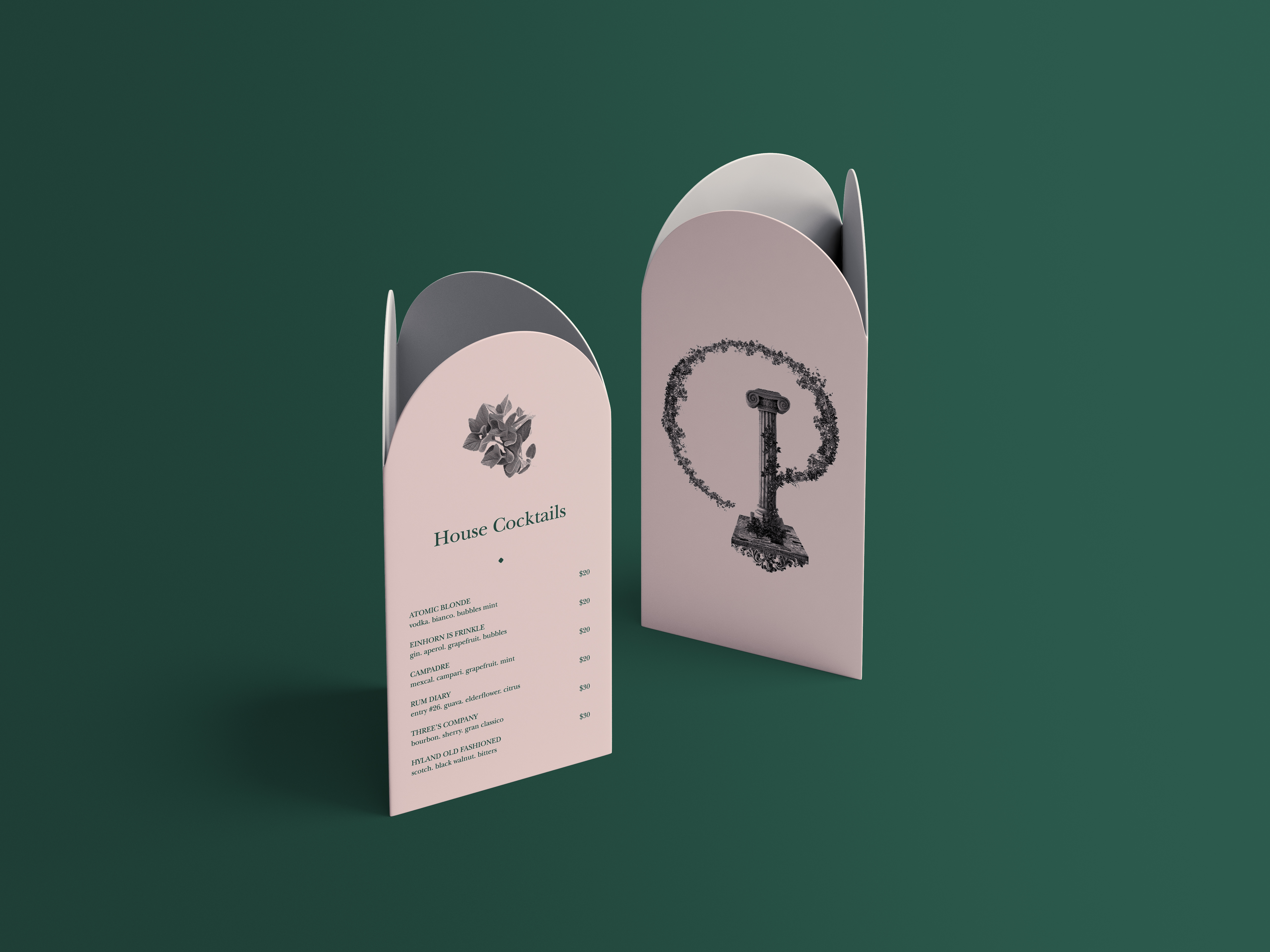
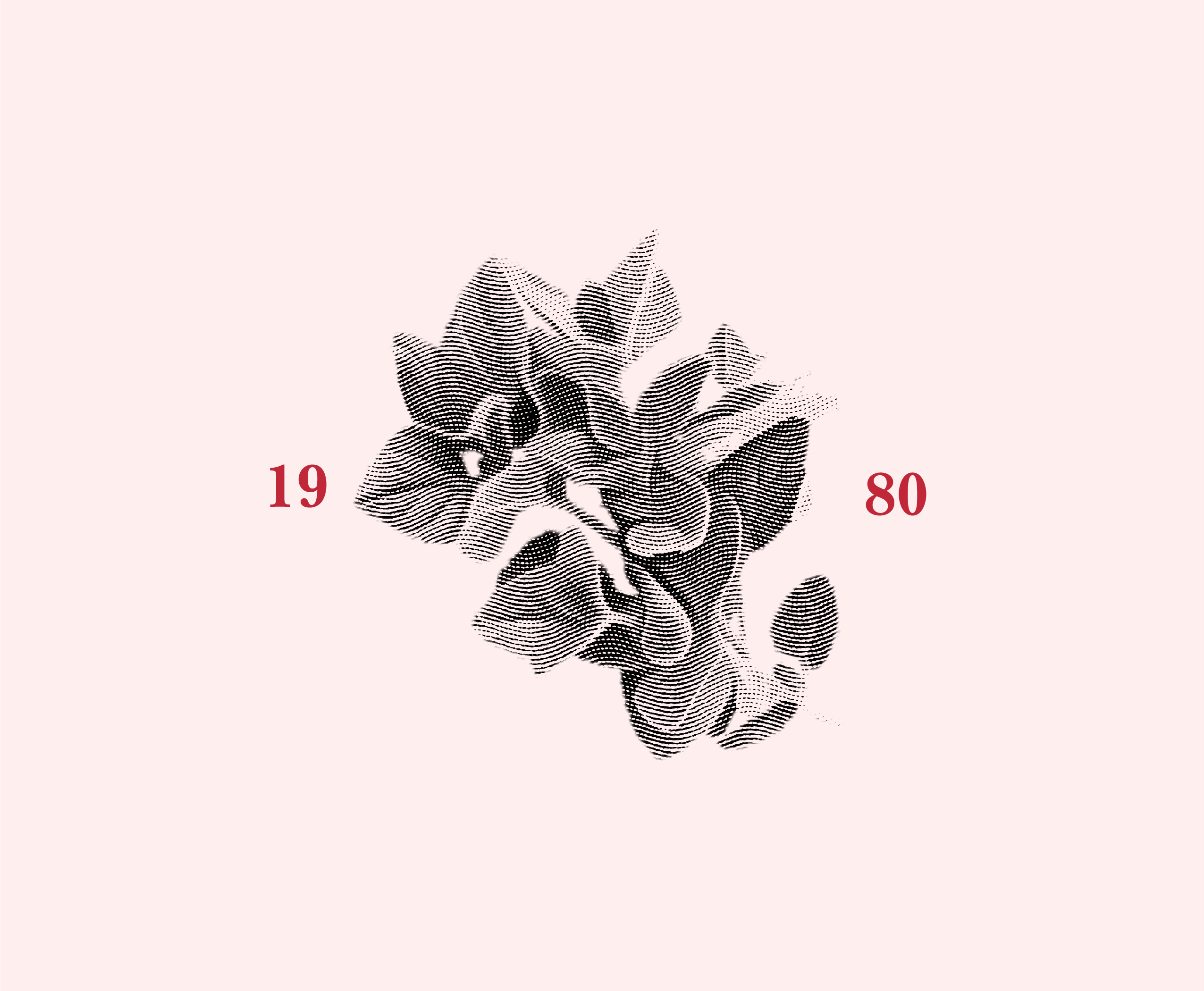
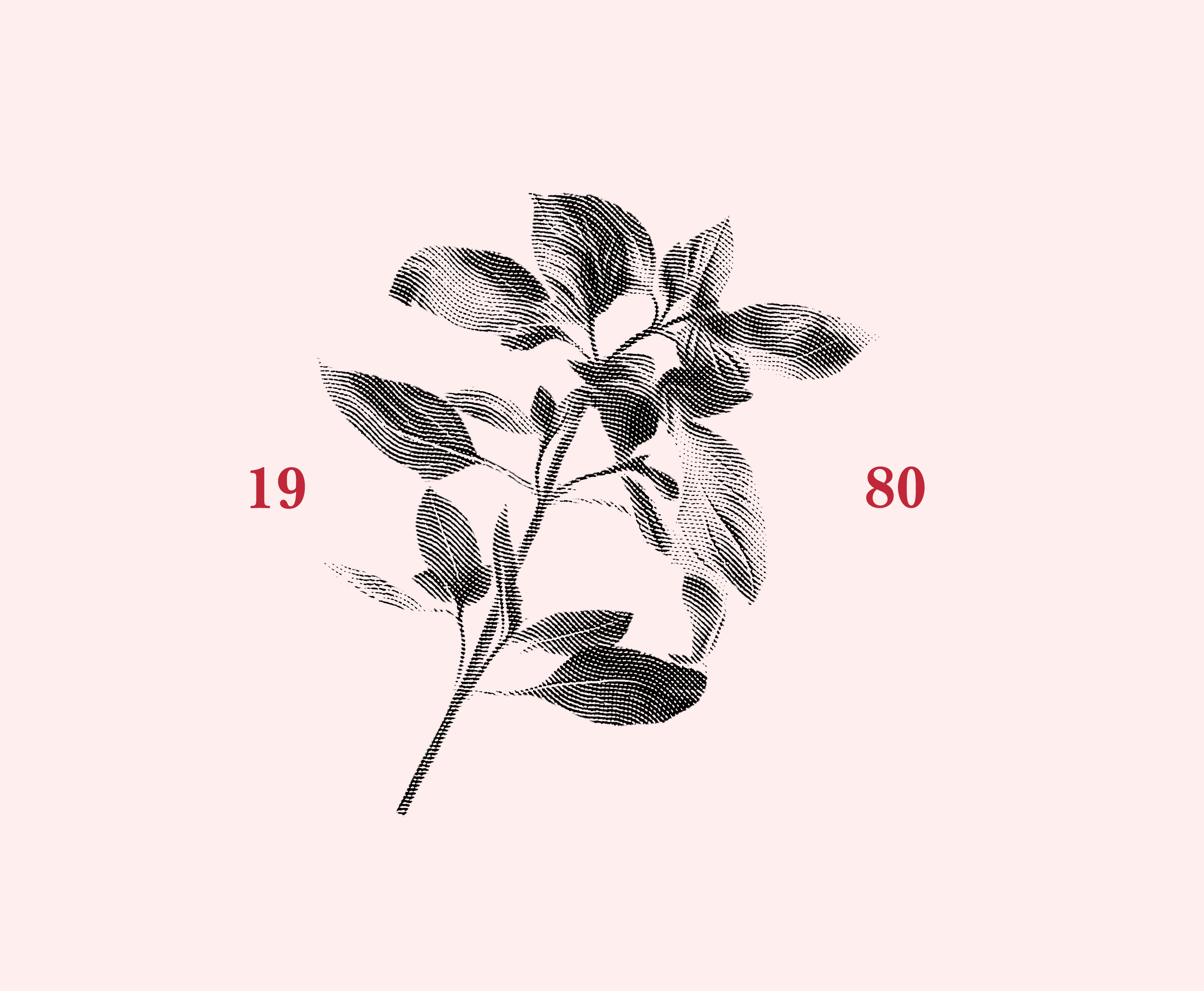
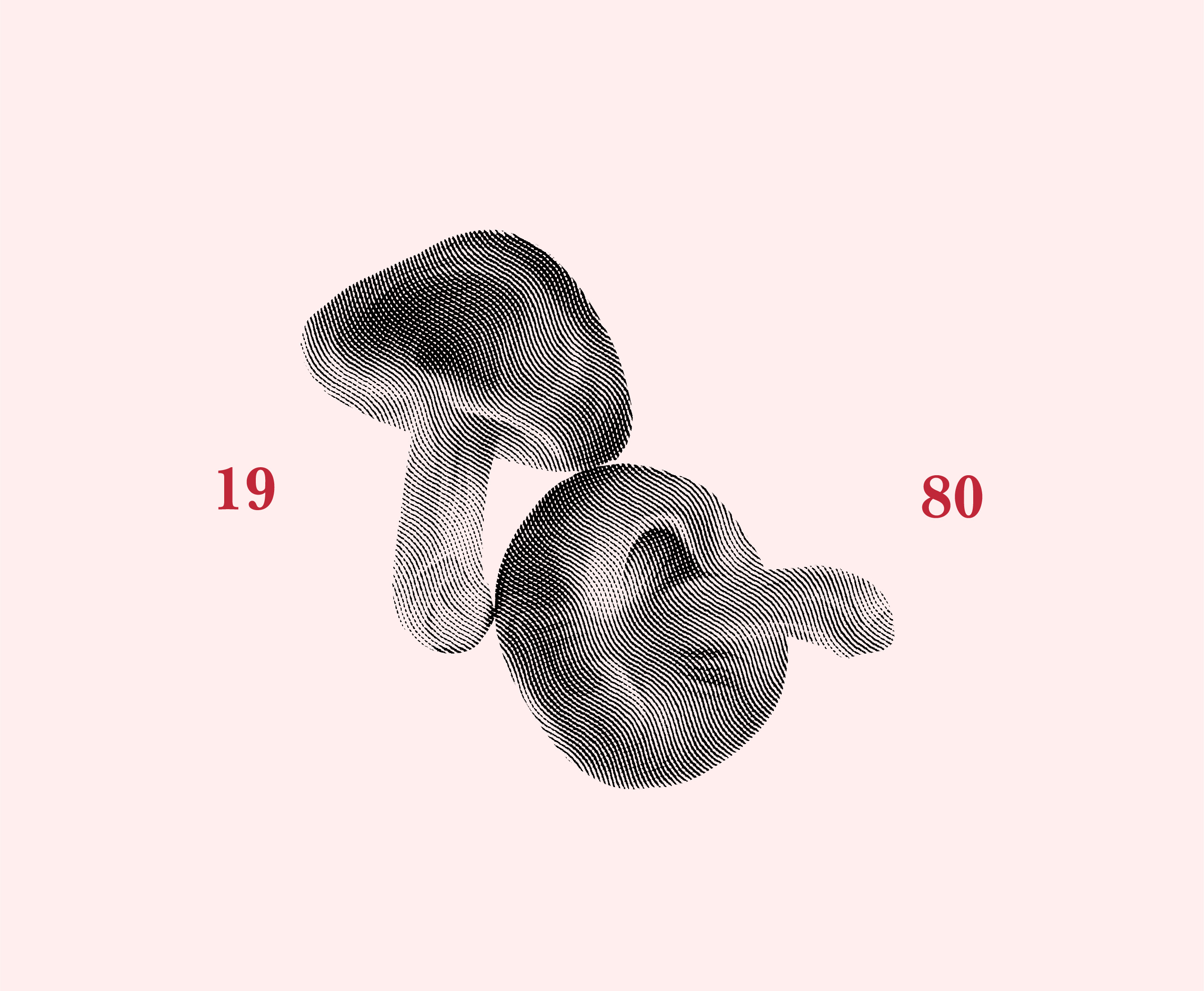
Arches, inspired by the restaurant's interior, serve as a key supporting design element, reinforcing the connection between the brand and its physical space. Illustrations of popular Italian ingredients like oregano, basil, and mushrooms are presented in crosshatch style, symbolizing the handmade care and authenticity of the restaurant’s dishes. These elements are thoughtfully applied across various materials, from menus to signage, ensuring a cohesive visual experience that feels consistent yet never repetitive or disconnected.
Color Palette and Design Inspiration
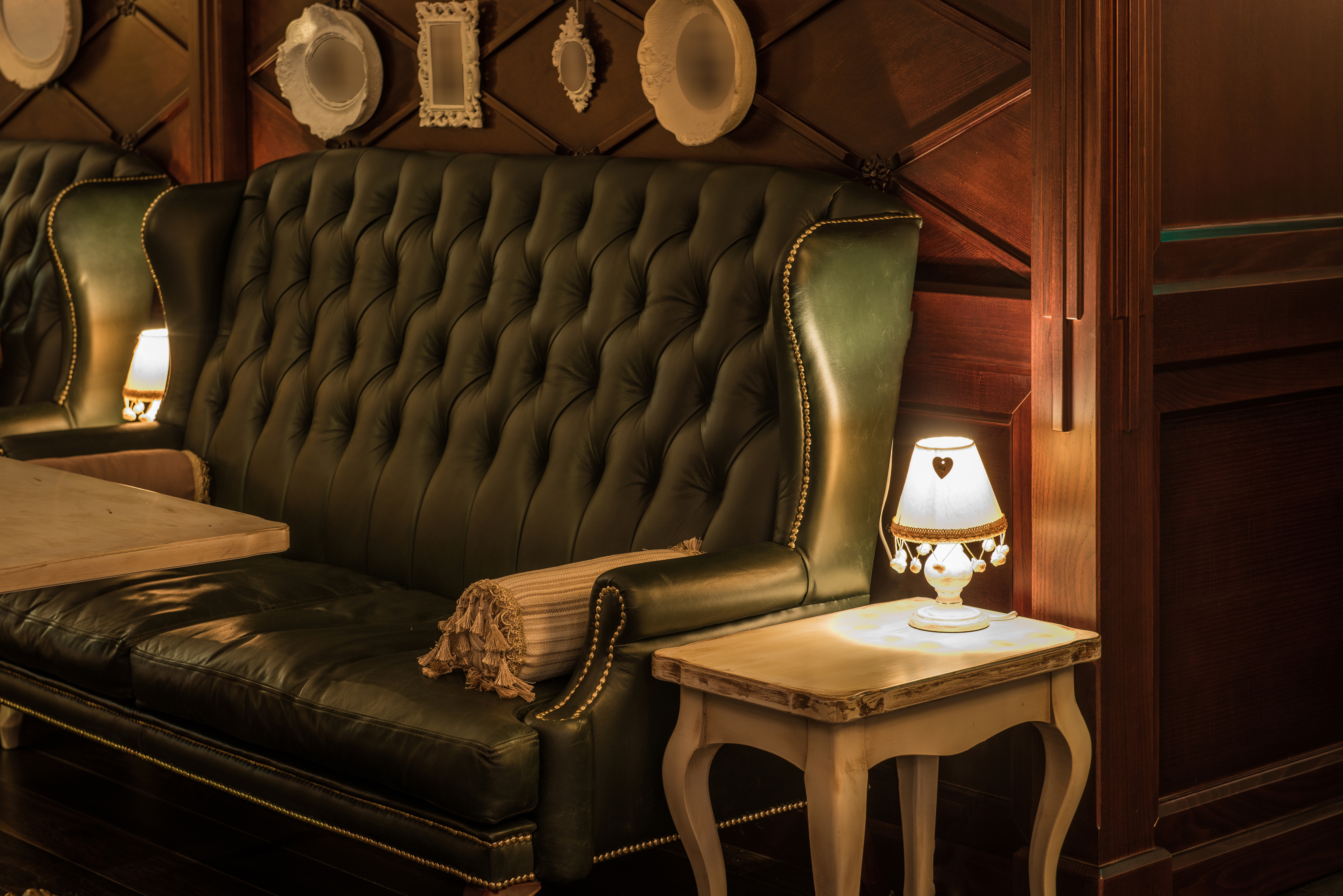
Color is a key part of Pietro’s refreshed identity, drawing from the classic red and green of the Italian flag while softening the tones for a more modern feel. These colors not only evoke fresh ingredients like tomatoes and herbs, but also create a warm, inviting atmosphere. Ruby and Pine are the primary tones used for typography, while Crepe and Mint support background and accent needs. Charcoal serves as a subtle backup. This palette balances tradition with elegance, helping the brand feel both familiar and elevated. In addition, architectural elements from Pietro’s interior—like the soft arches and rich wood textures—inspired supporting design motifs, creating a visual language that feels connected to the physical space and overall dining experience.
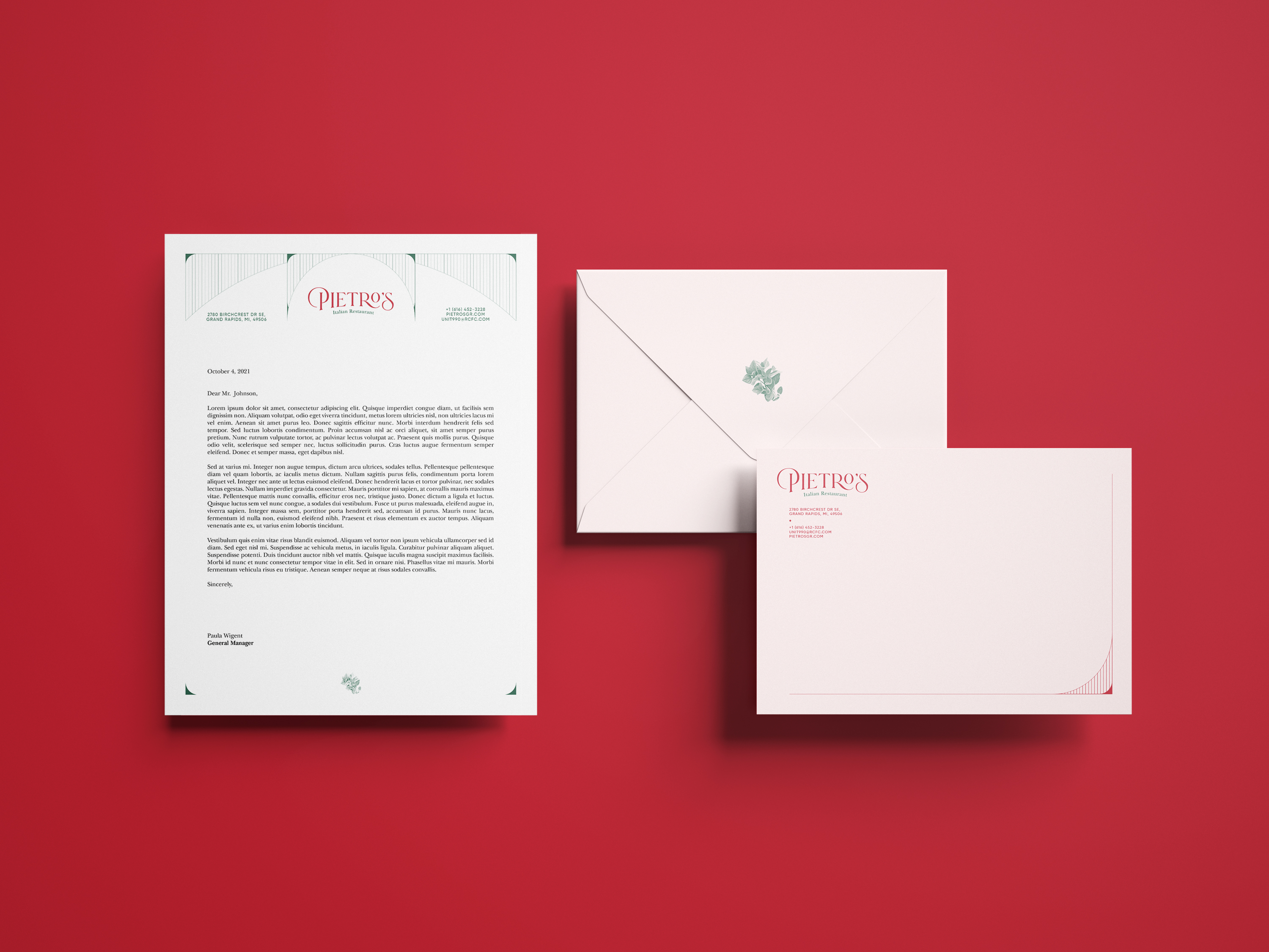
At Every Touchpoint
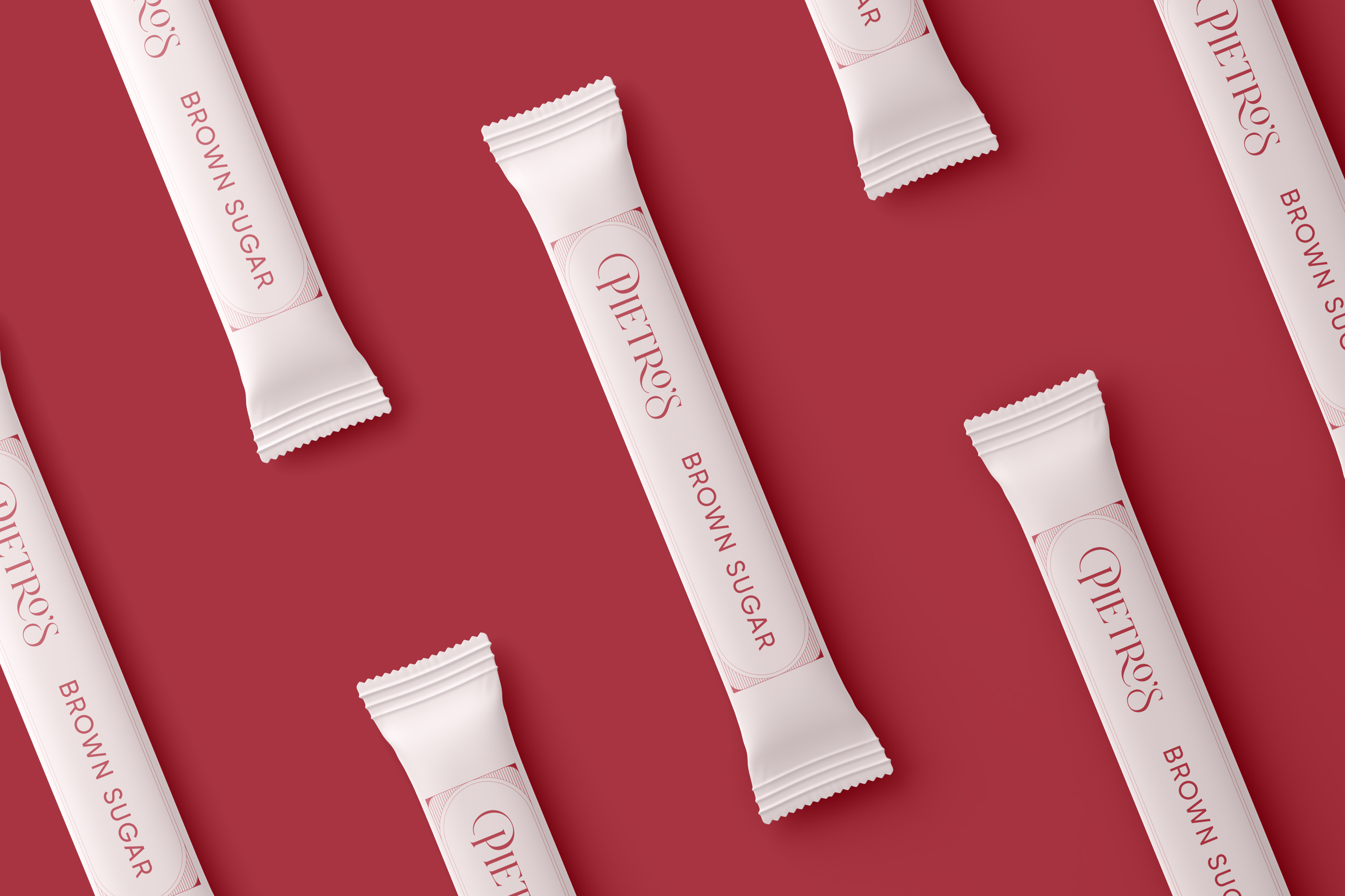
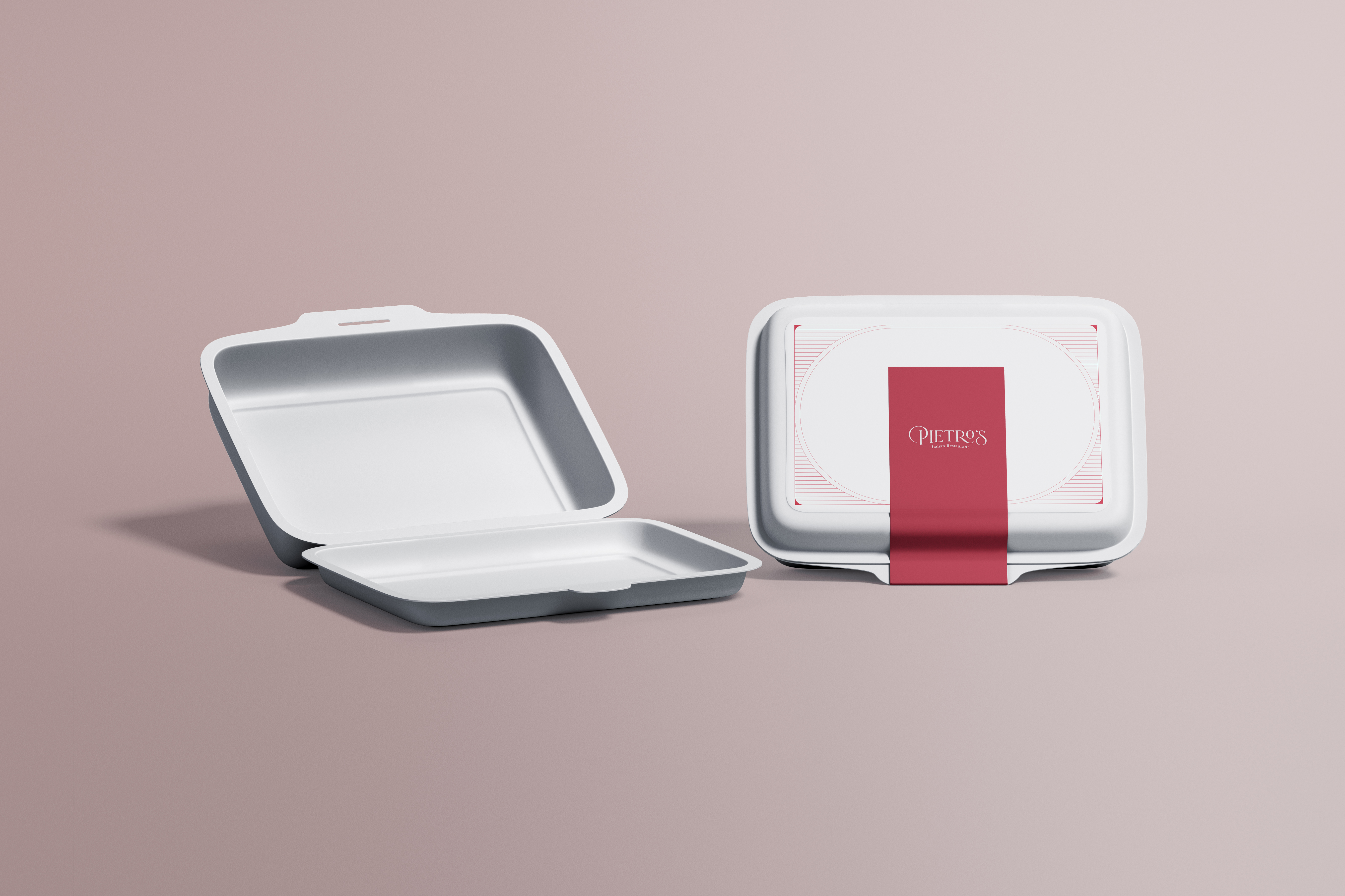
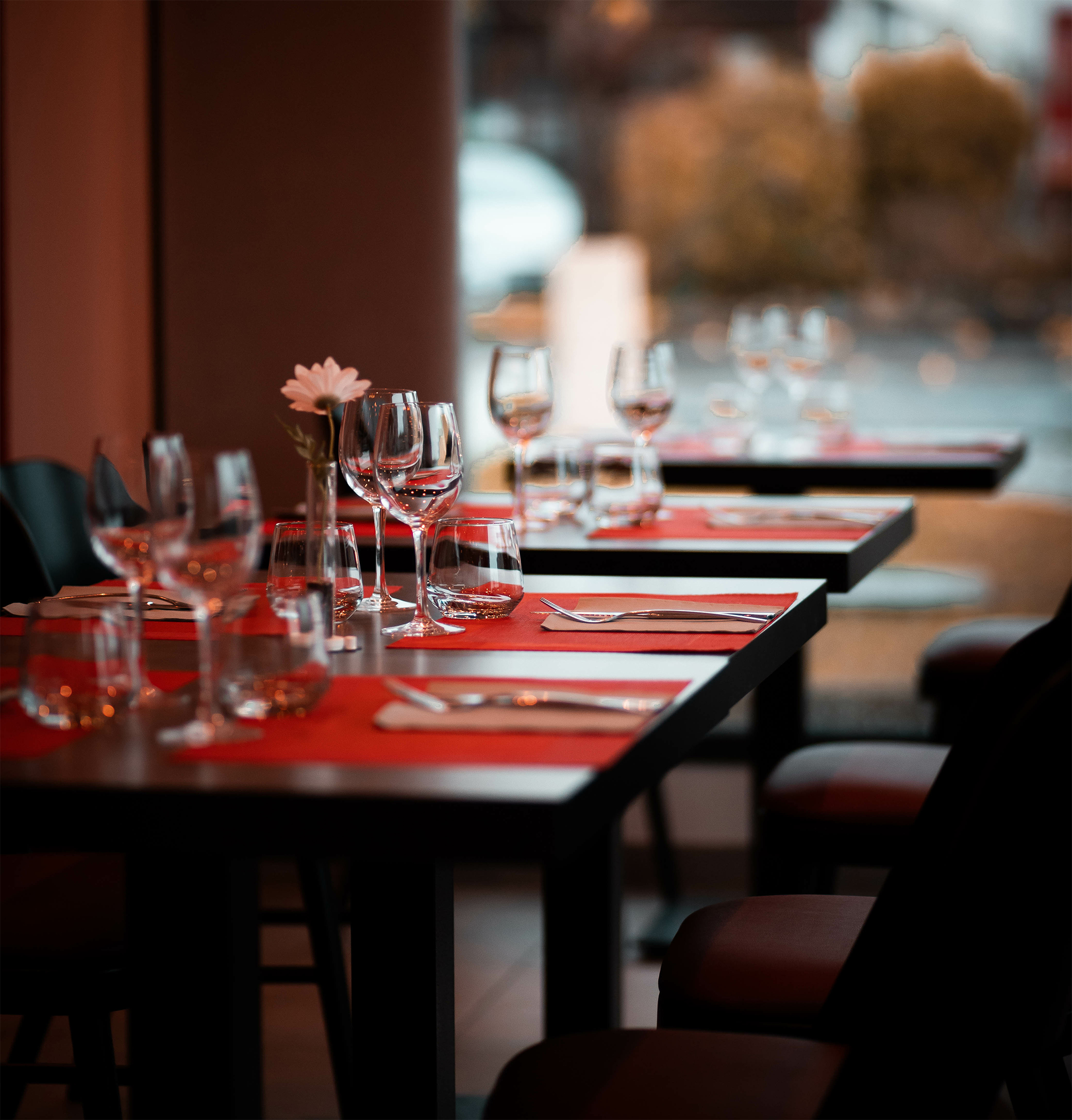
Designing stationery materials, from business cards to office essentials like letterheads, envelopes, and folders, ensured a seamless brand experience throughout every touchpoint. Even the smallest items like sugar packets, to-go boxes, and table tents were thoughtfully designed to contribute to the overall brand identity. Every detail, no matter how small, was carefully crafted to leave a lasting, cohesive impression, ensuring Pietro’s branding felt unified and impactful in all customer interactions.