Frederick Construction
Building a Strong Presence

Overview
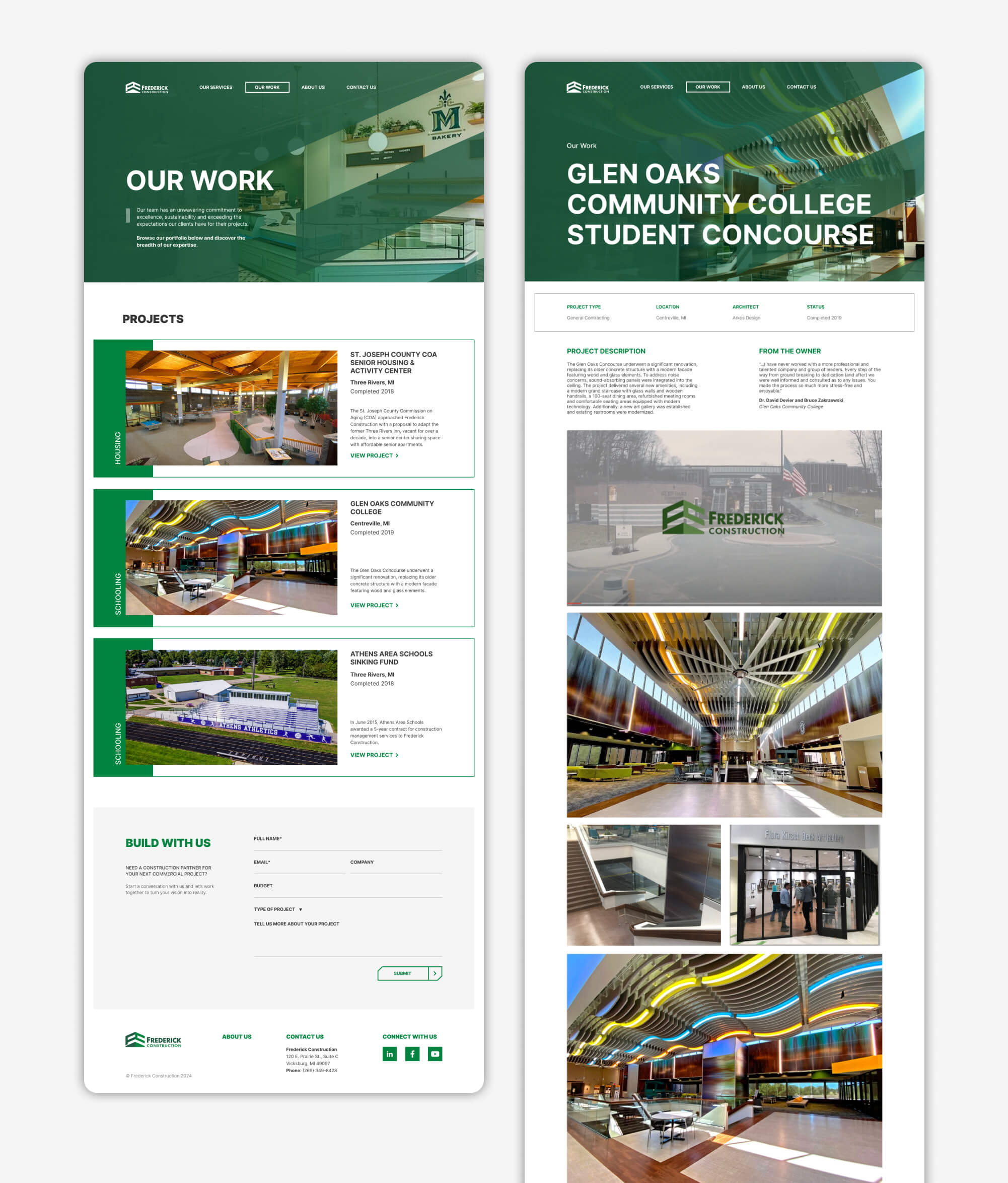
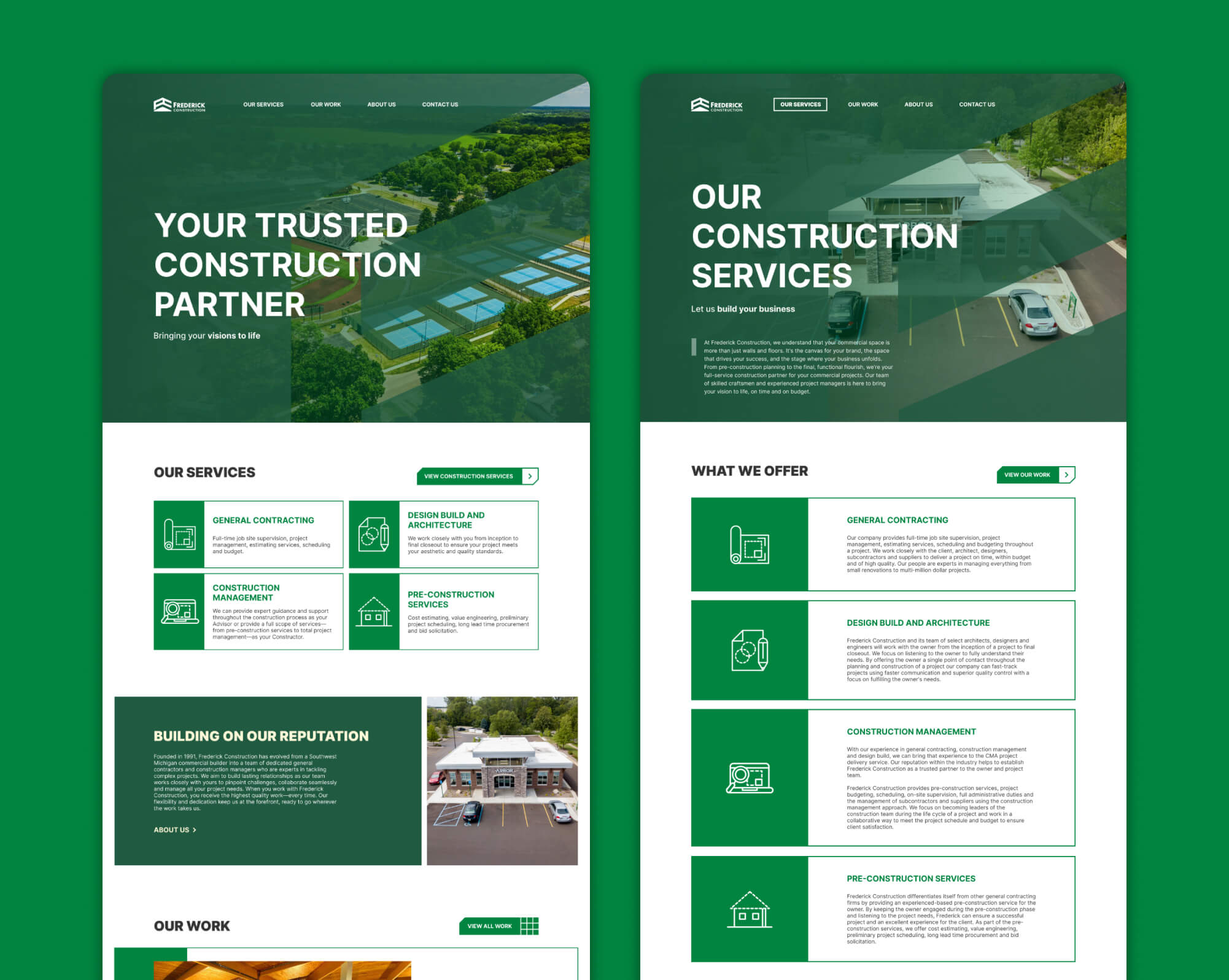
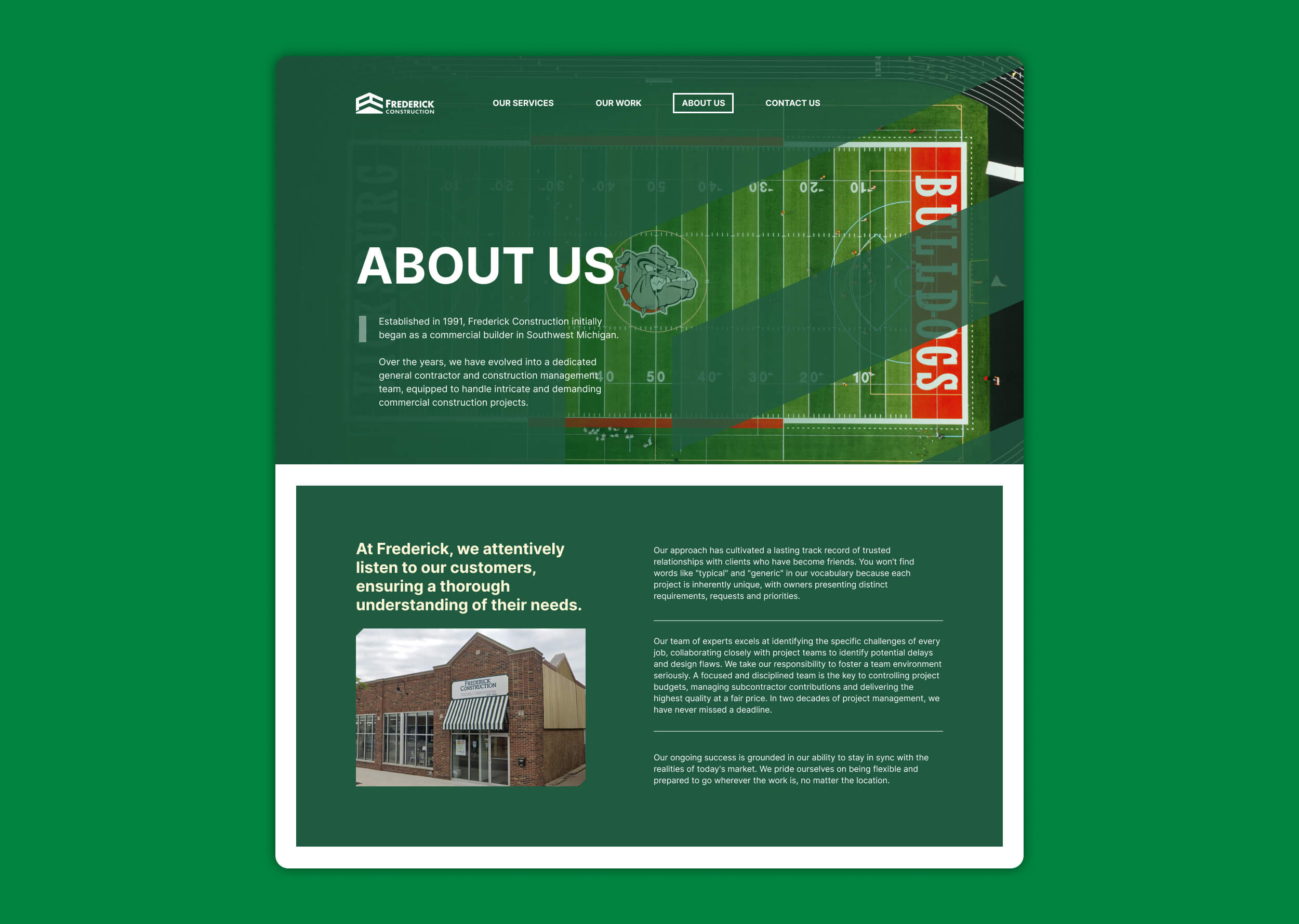
Frederick Construction has a strong reputation for professionalism and quality work, but the original website didn’t do justice to that. As a portfolio, it lacked the functionality to effectively showcase projects, with outdated images, a cluttered layout, and confusing navigation. This made it difficult for visitors to get the full picture of what the company could do, so I saw an opportunity to redesign the site for a better user experience.
For the redesign, I focused on creating a clean, easy-to-navigate website that highlights Frederick Construction’s work in a more professional and confident way. The new site now functions as a streamlined portfolio, with updated images, clear project previews, and simple navigation. My goal was to make it easier for users to see the company’s skills and trust their work, all while staying on schedule and within budget.
View Live SiteMy Role
- Website Design
- Digital Experience
Typeface
- Inter
Personality
- Serious
- Informative
- Human-centered
- Engaging
Wireframes
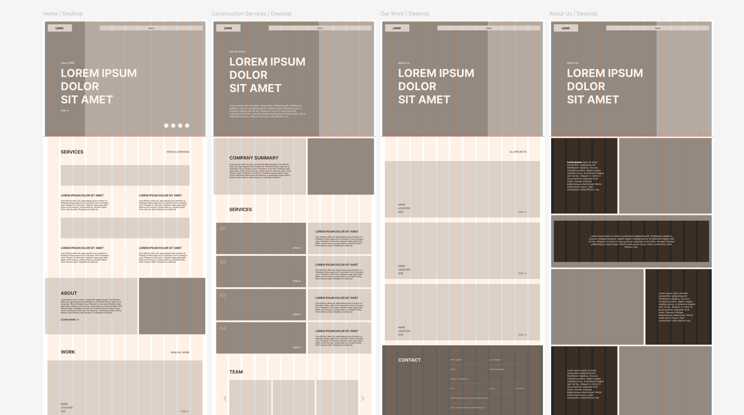
During the wireframing process, I chose a "block" style to reflect the structured, reliable nature of the construction industry. Each section of the site was designed as a distinct block, making the layout easy to navigate and visually consistent. This approach helped create a strong foundation for both usability and design clarity.
Built for Browsing
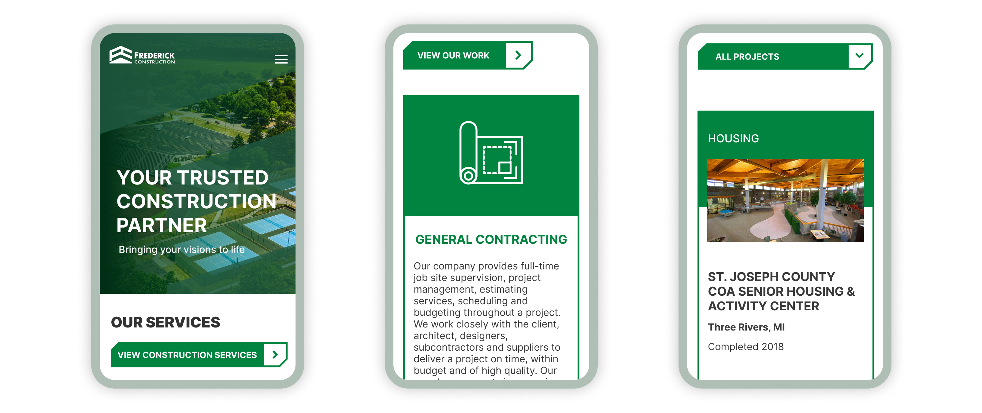
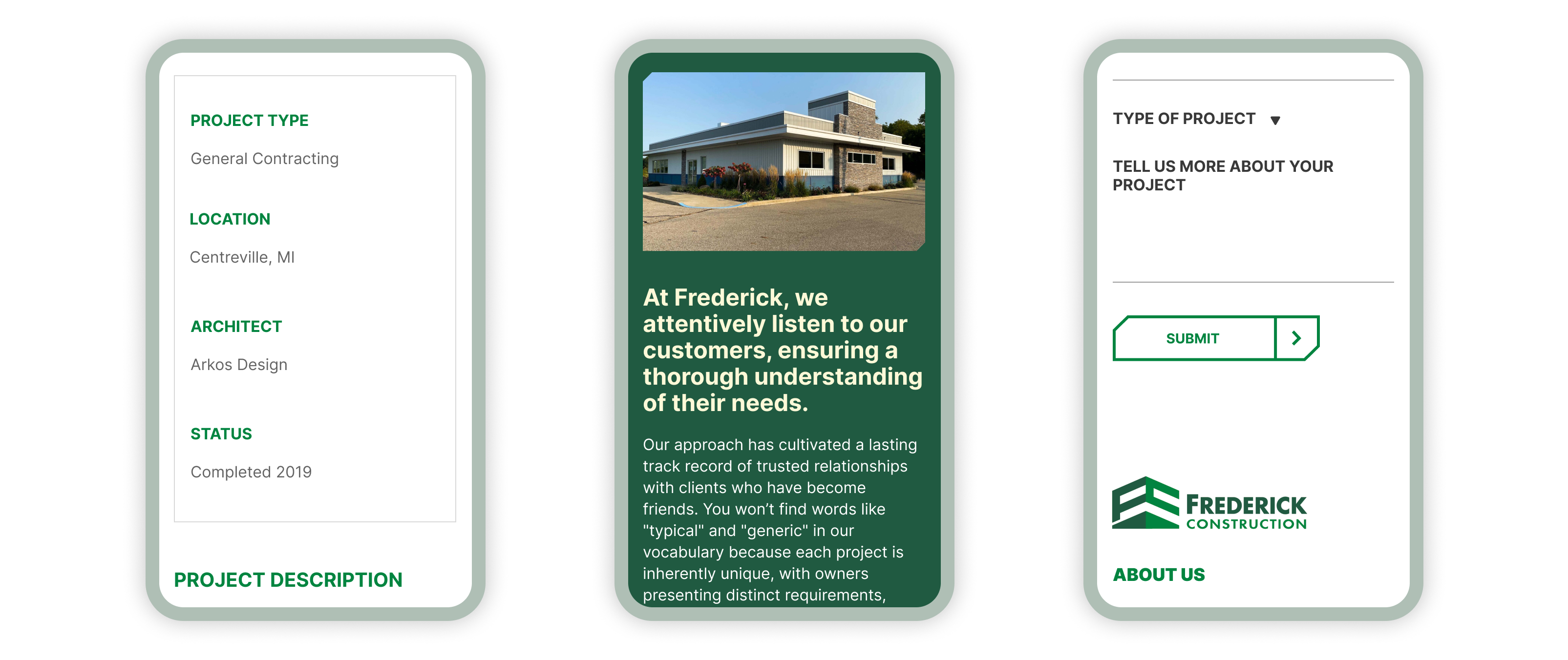
The website was designed to work smoothly on all devices and offer a simple and easy-to-use experience. I focused on making sure the site was fast, responsive, and clear so users could easily browse through projects and services. Every part of the site was created to be user-friendly, giving visitors a smooth experience that reflects the care and quality put into the construction work itself.
Structured Aesthetic
The web design follows a clean, grid-based layout that reflects the order and precision of construction work. I used a neutral color palette, bold typography, and strong visual hierarchy to highlight key content and guide users naturally through the site. The result is a polished, professional look that builds trust at first glance.