Diverse Global
From Friction to Flow
Overview
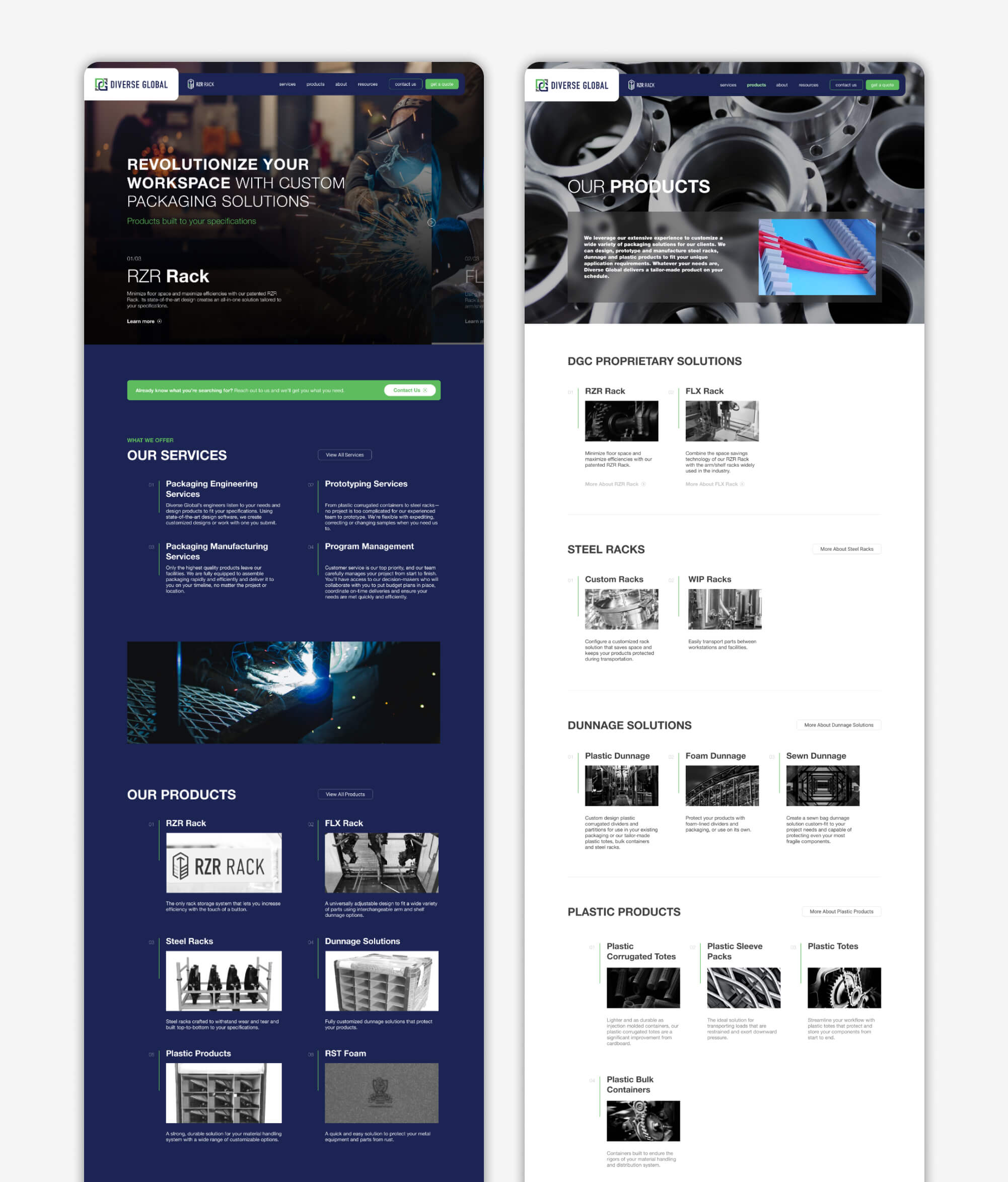
The website redesign for Diverse Global was driven by several important usability and visual issues in the initial site. The initial site lacked a straightforward navigation system, and users were not able to readily access information about the company's custom packaging and storage solutions. Outdated graphics and inconsistent branding also failed to present the company as innovative or professional, which decreased user trust and engagement.
The new design revolves around creating a modern, user-centric experience that communicates more effectively Diverse Global's values and offerings. Clean navigation, responsive designs, and brief call-to-actions guide users through product information, case studies, and quote requests seamlessly. The visual identity has been refreshed to reflect the company's forward-thinking image, helping to build credibility and improve user satisfaction.
View Live SiteMy Role
- Website Design
- Digital Experience
Typeface
- Helvetica
Personality
- Professional
- Informative
- Streamlined
- Engaging
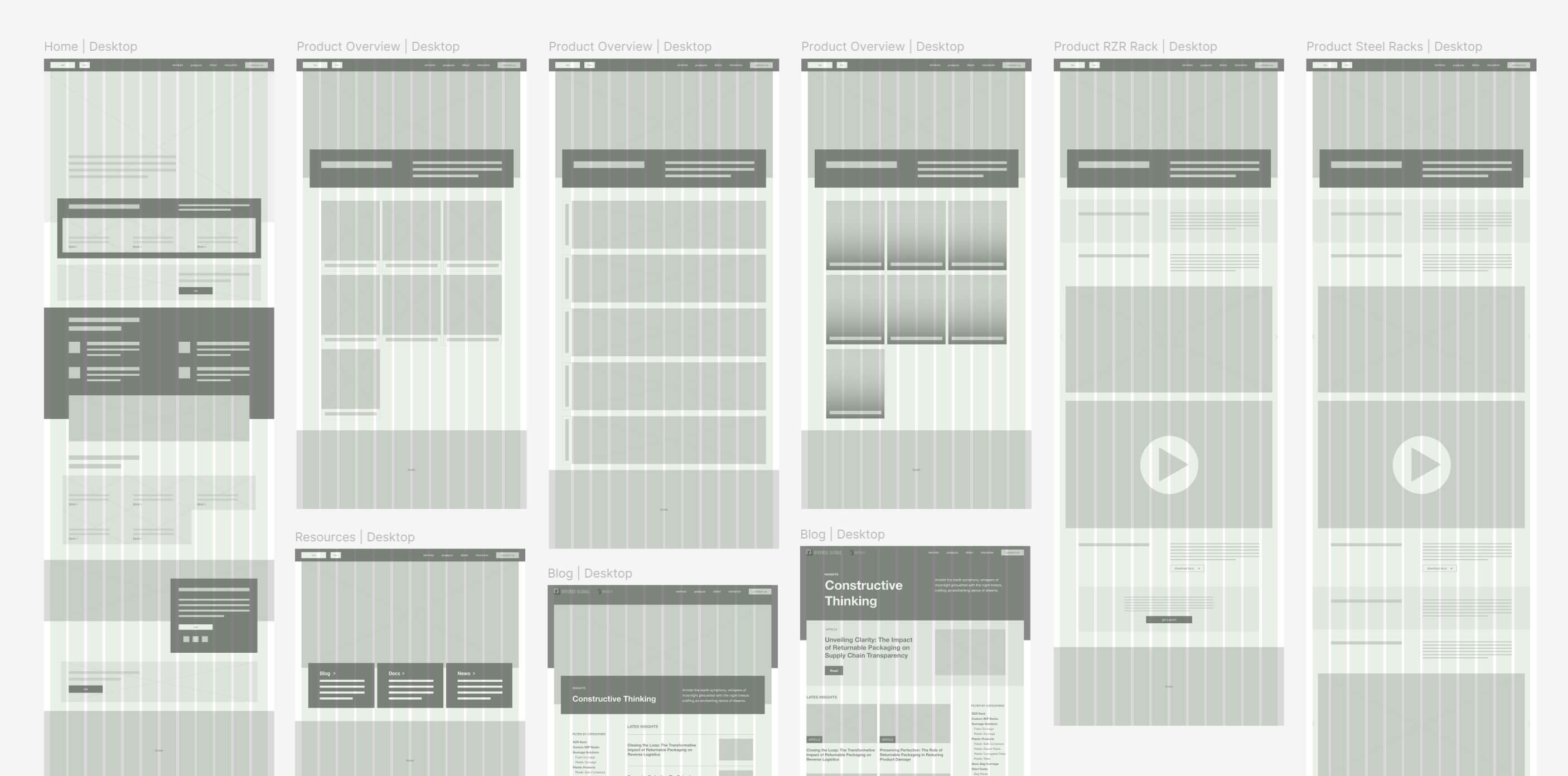
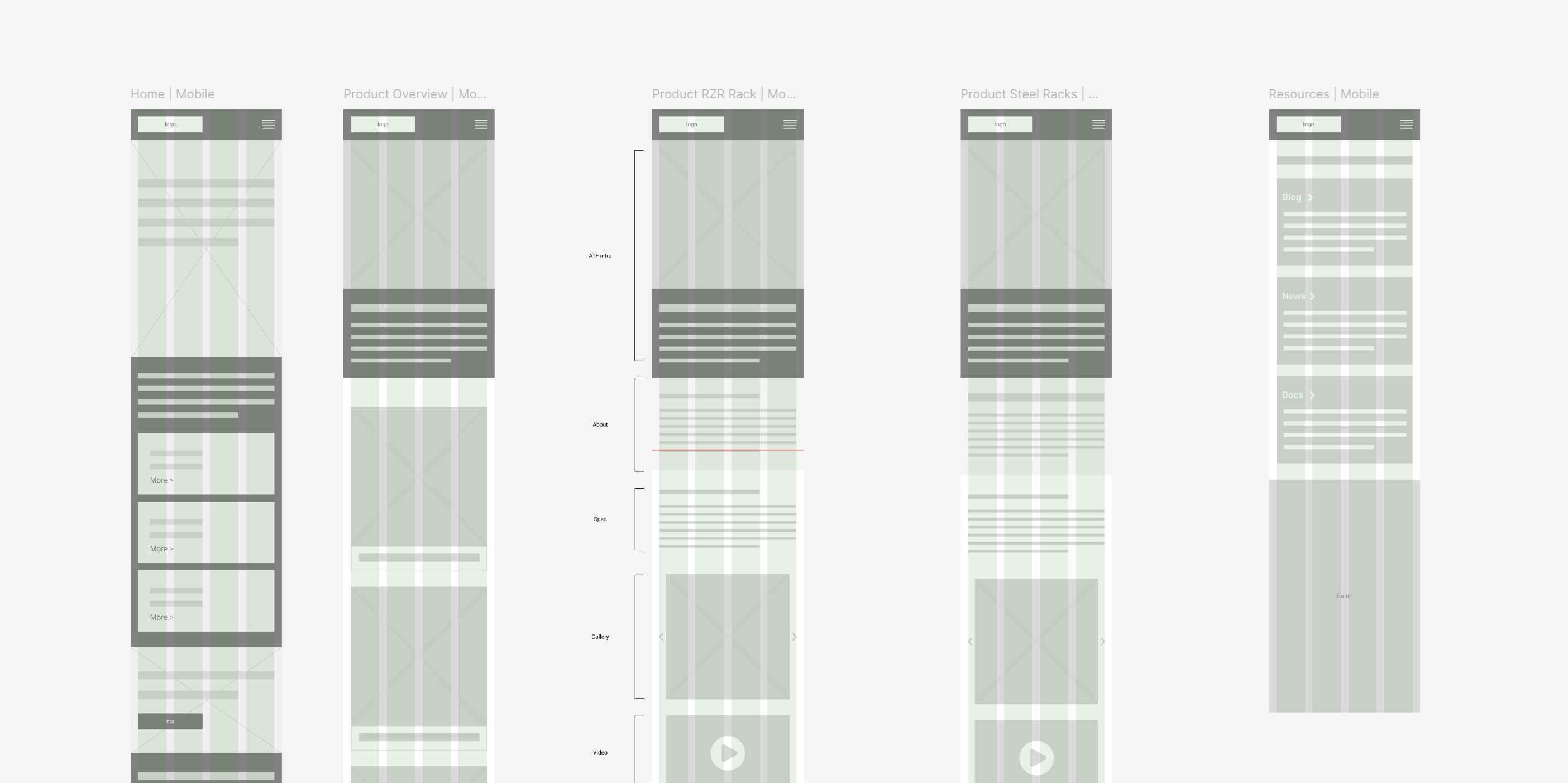
Wireframes
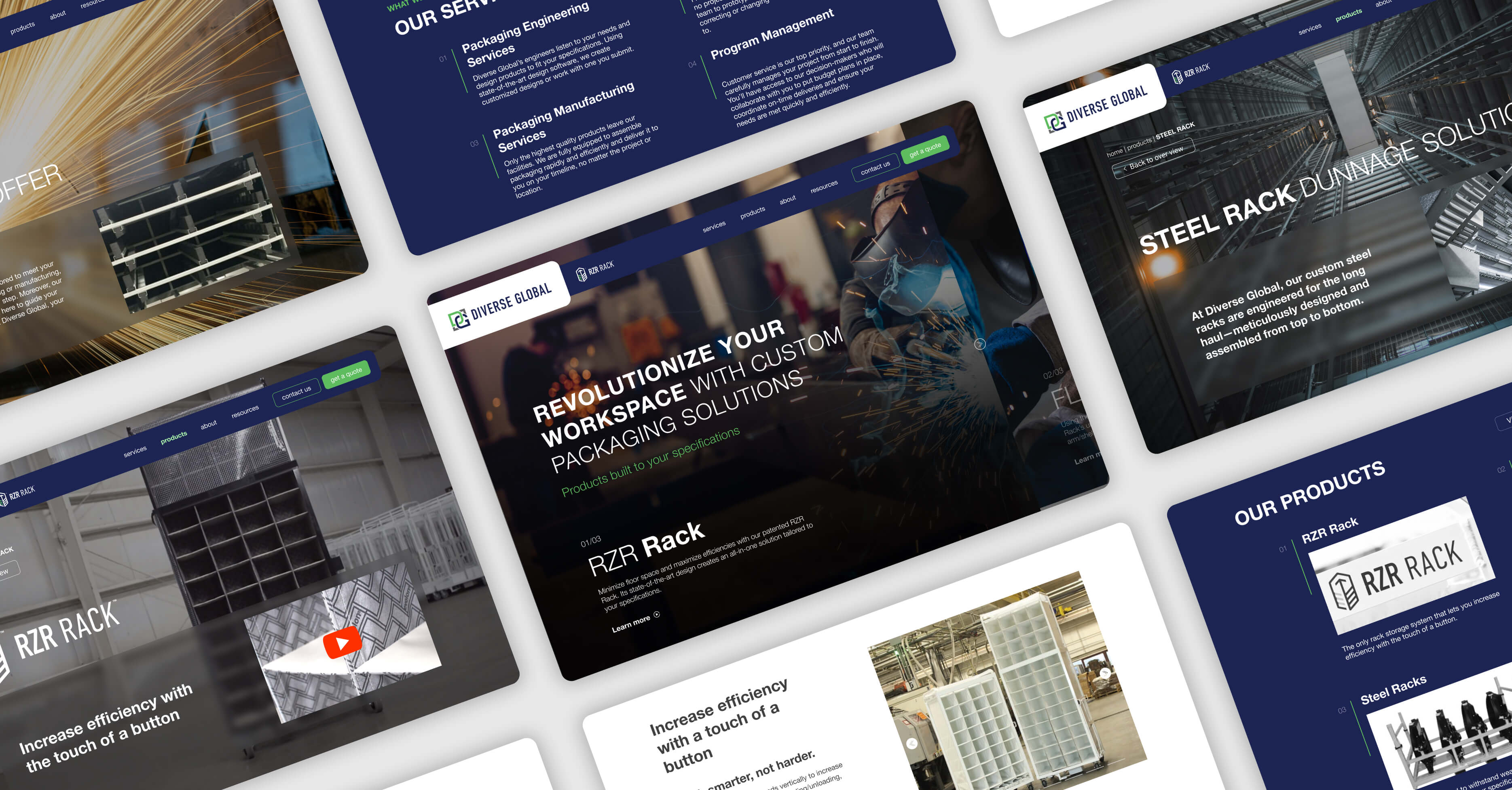
Wireframing began with low-fidelity sketches to map out key user journeys and develop a clean layout framework. The focus was on simplifying navigation, organizing content in a logical flow, and highlighting key actions. Iterative refinements ensured that each section flowed naturally into the next, creating a strong foundation for an intuitive and visually cohesive interface.
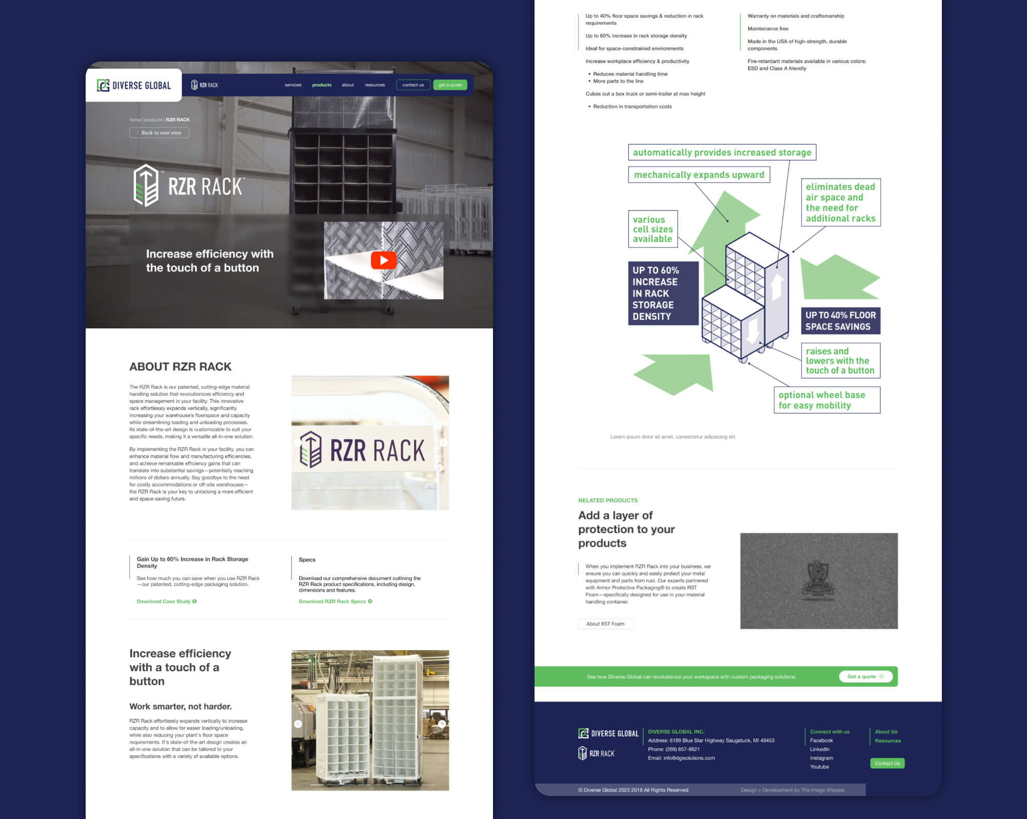
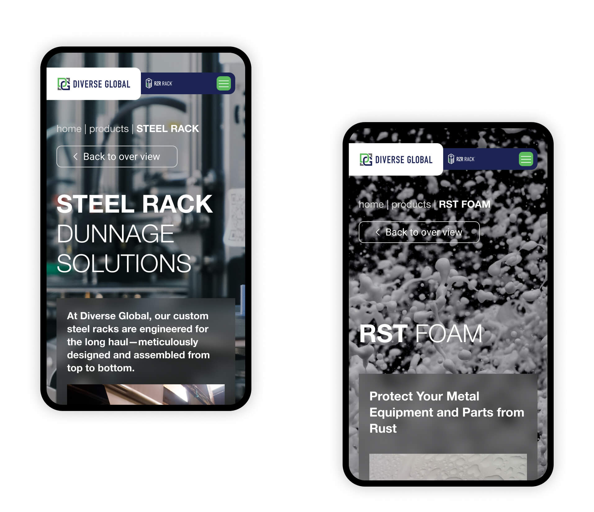
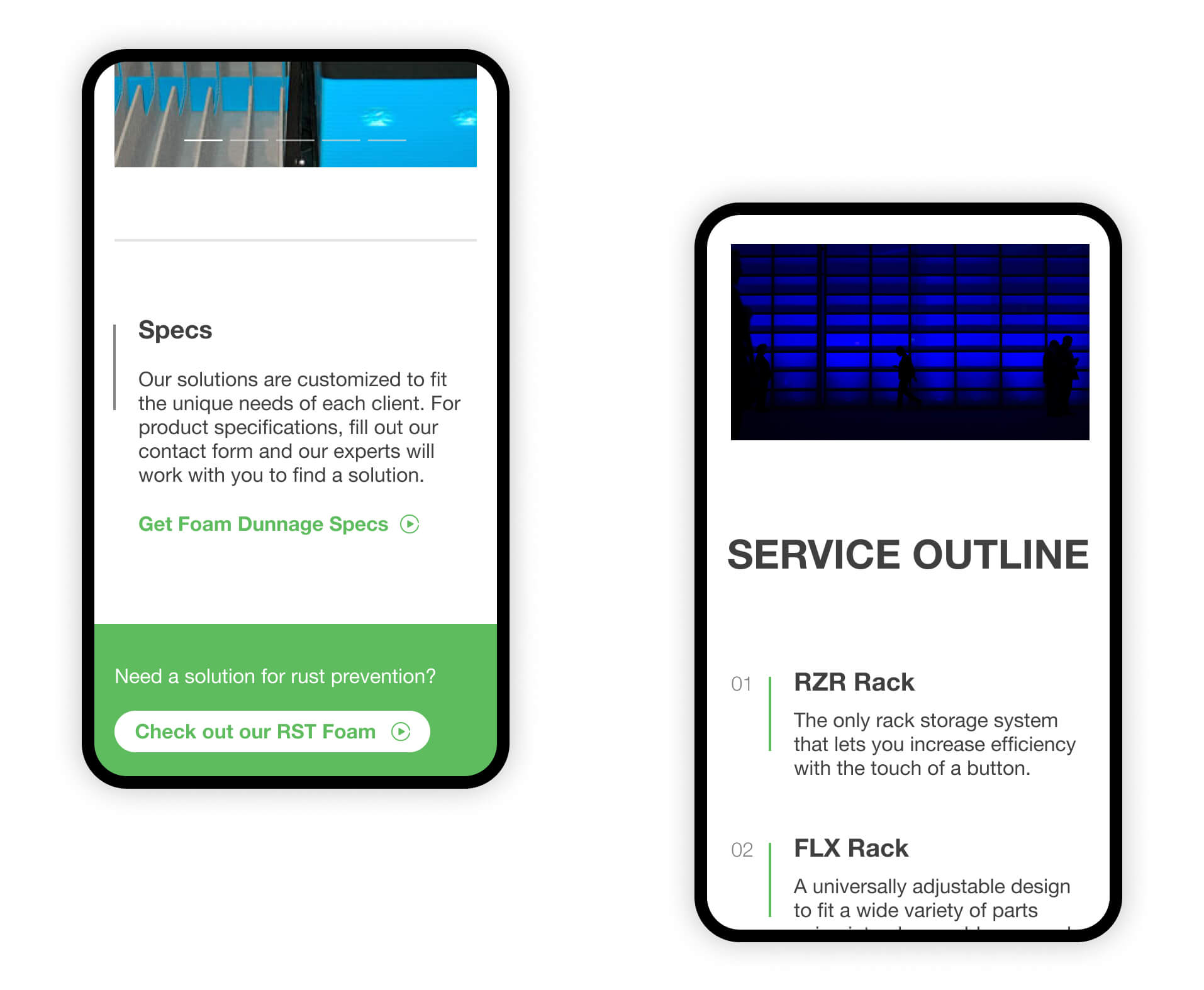
Informative Interface
The digital experience was designed to engage users through elements that highlight Diverse Global's products and services. Data, videos, and infographic structures create a comprehensive overview for clients to browse through the site and make informative decision, while intuitive navigation ensures accessibility for all users.
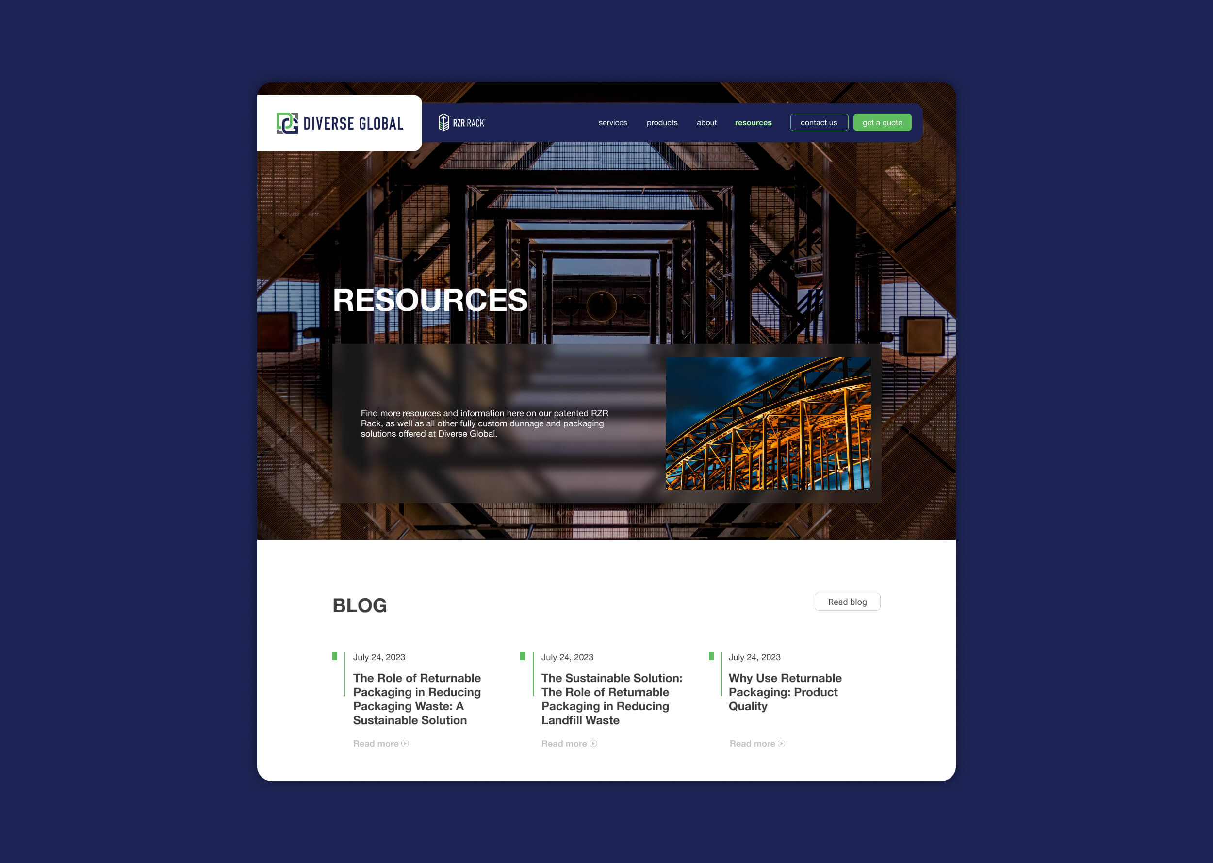
Visual Identity
The visual identity was designed to convey a modern and professional image, with simplicity and clarity being stressed. A cohesive color scheme and carefully selected typography offer consistency throughout the site. The design puts readability and usability first, and plenty of white space is employed to give a clean, easy-to-use user experience that reflects the values of the brand.